Web UX Designer
Redesigned enterprise flows (+3.2% conversions, +15% engagement)and built UX guidelines, workshops, and tests to cut errors 10% and lift key flows 3%.
Five9 Search Engine Marketing Page
If we redesign the Five9 site to reflect our heatmaps and user journey, then we can reduce cognitive load, enhancing trust signals, and using a consistent, modern visual hierarchy—then users will engage more deeply with the product, increasing demo sign-ups and improving perceived brand clarity.
- User: B2C
- June, 2022
- Team: UI/UX Designer(me)
- Tools
- Research: Hotjar, Google Analytics
- Ideation: Wireframes
- Visual Design: Figma, FigmaJam
- Duration
- 3 months
Problem
1. How might we: design a contact center website experience that feels intuitive and emotionally supportive for users exploring complex software solutions?
2. How might we: reduce cognitive overload and simplify the way information is presented to avoid overwhelming the user?
3. How might we: account for different business roles (executives, IT, marketing) and their unique expectations when choosing cloud contact center solutions?
4. How might we: effectively communicate Five9’s product capabilities and pricing in a clear, confident, and trustworthy way?
5. How might we: establish trust before pushing conversion — so visitors feel educated, empowered, and respected throughout their journey?
Research
A Mix of Quant + Qual Tells the Full Story
To understand the disconnect, I led a mixed-methods research process:
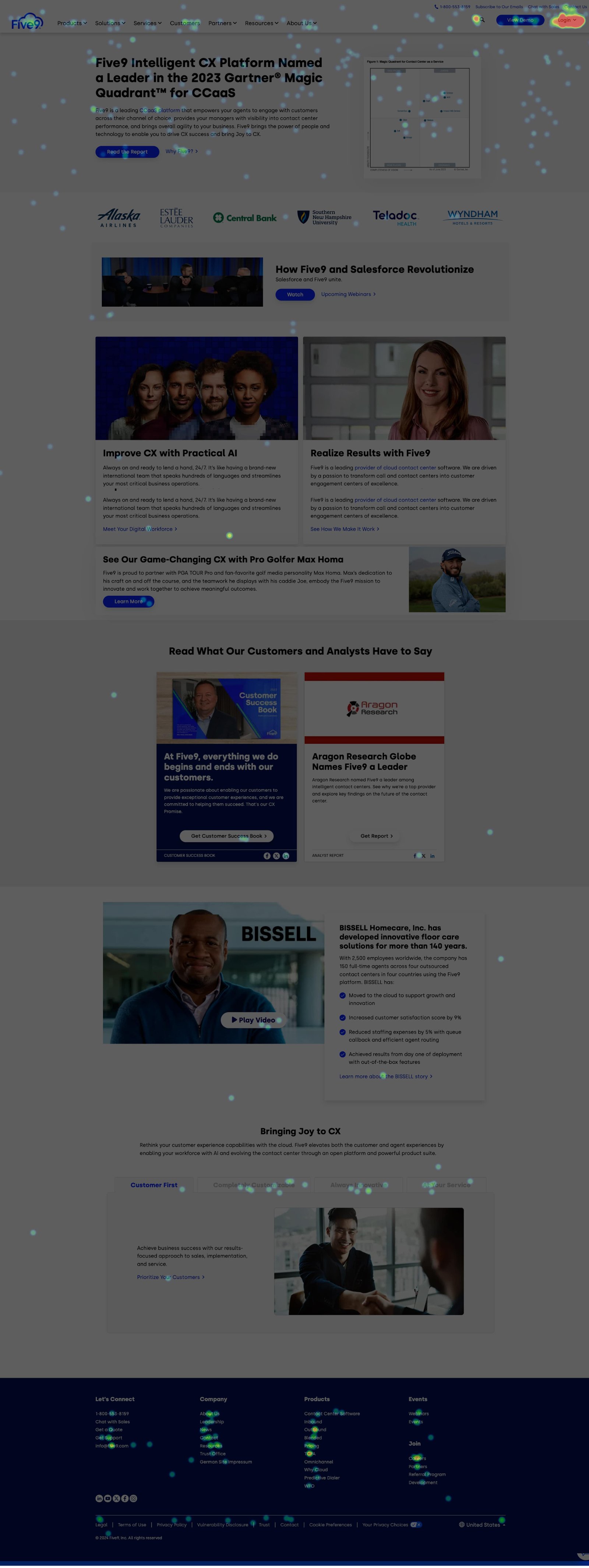
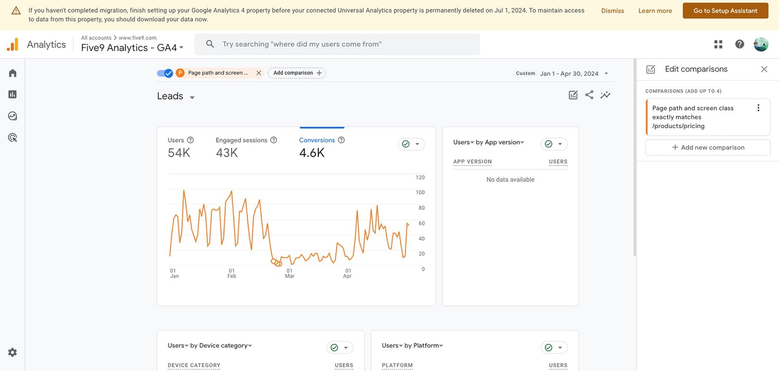
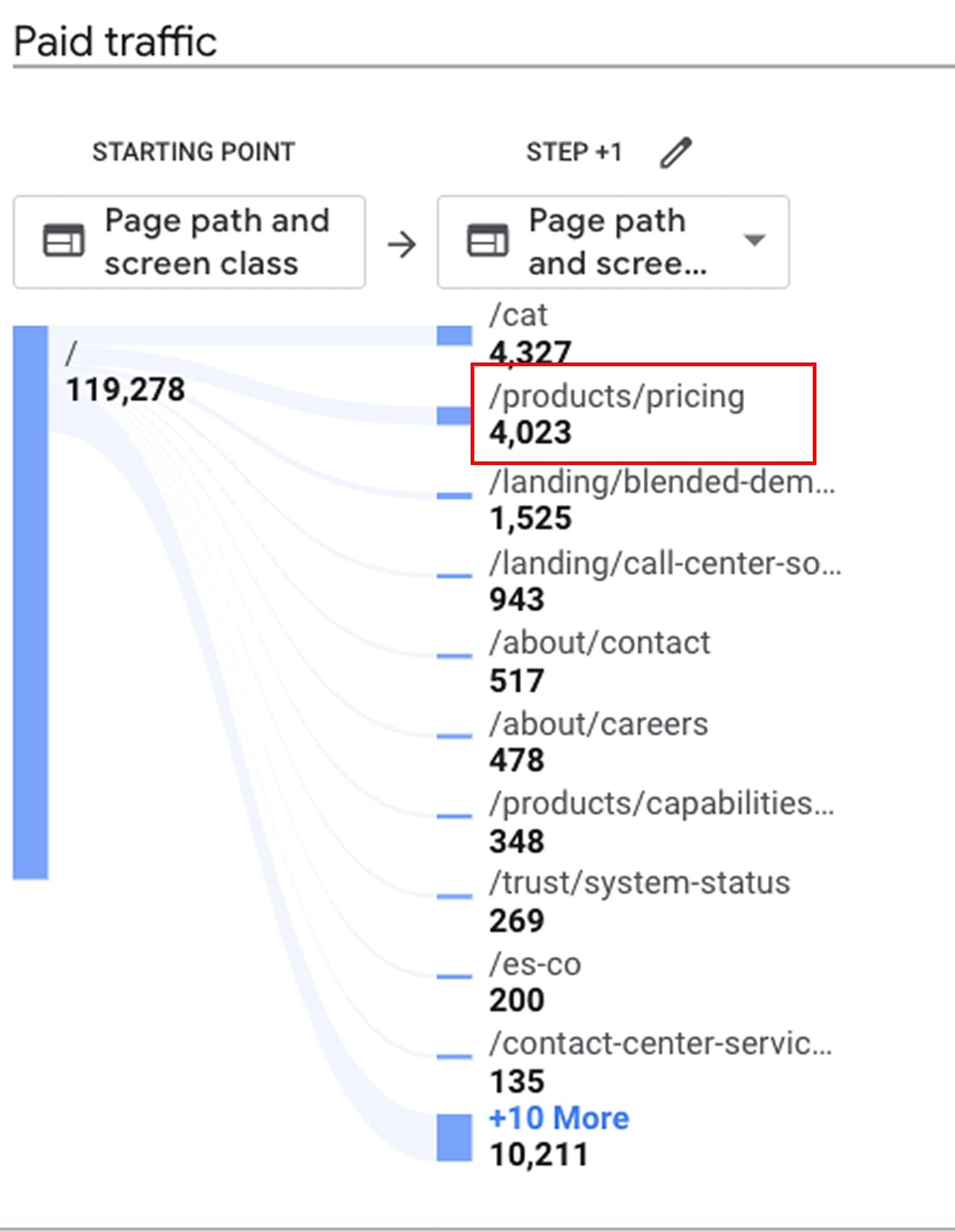
Heatmaps + Scroll Tracking via Hotjar
Google Analytics analysis to locate bounce points
5 user interviews with enterprise decision-makers.
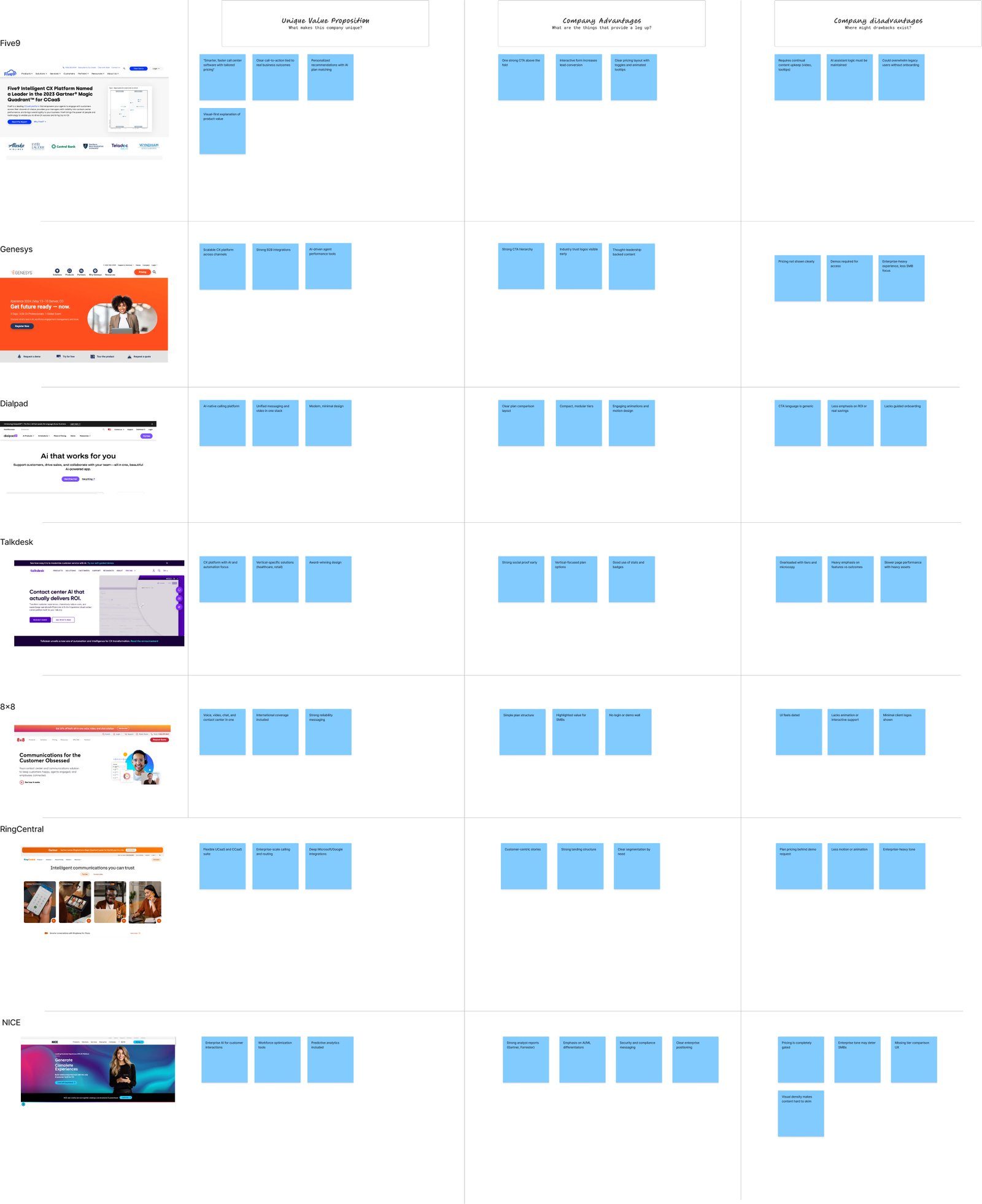
Helped Five9 Stand Out in a Crowded Market
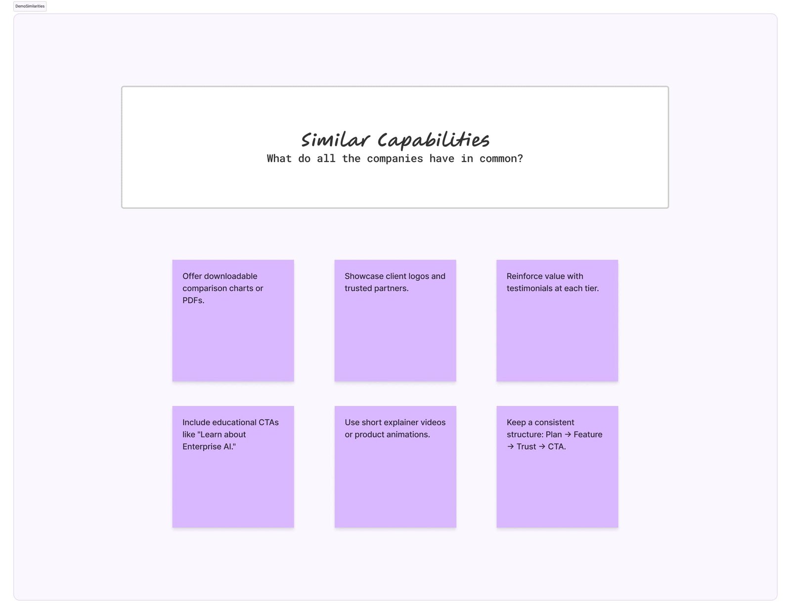
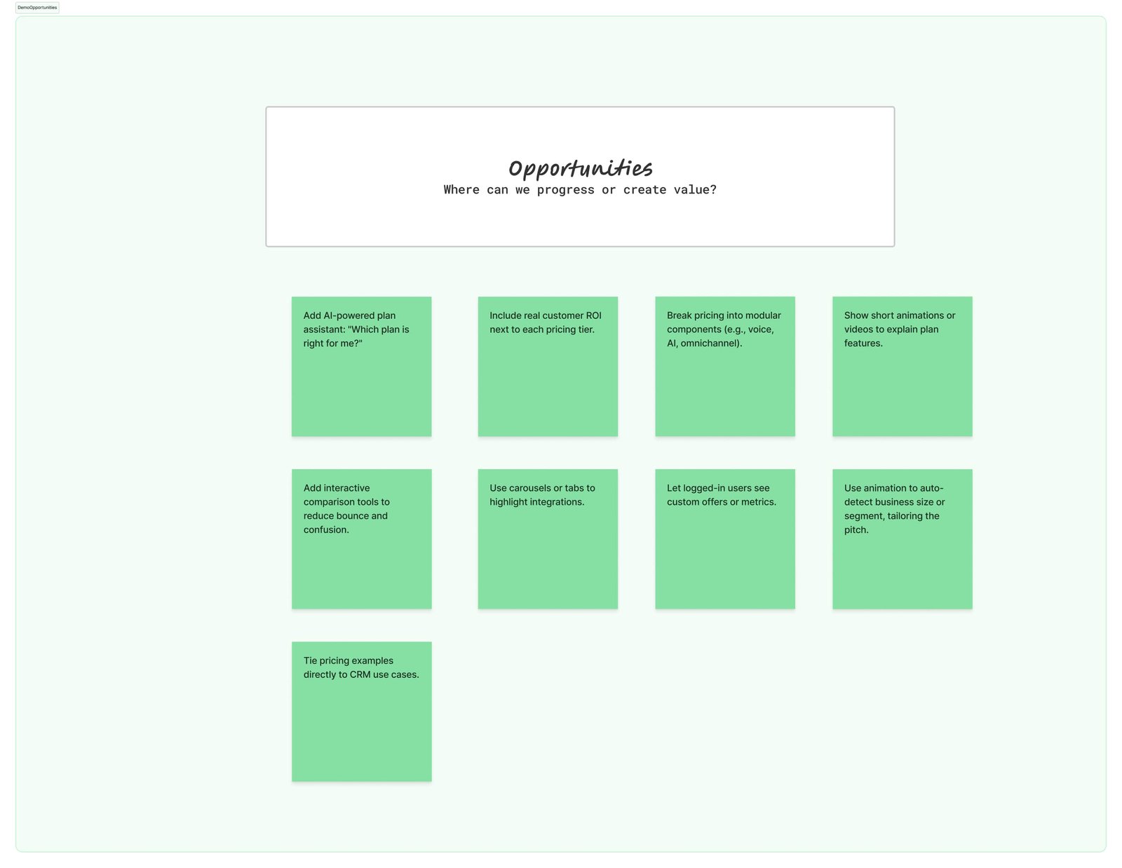
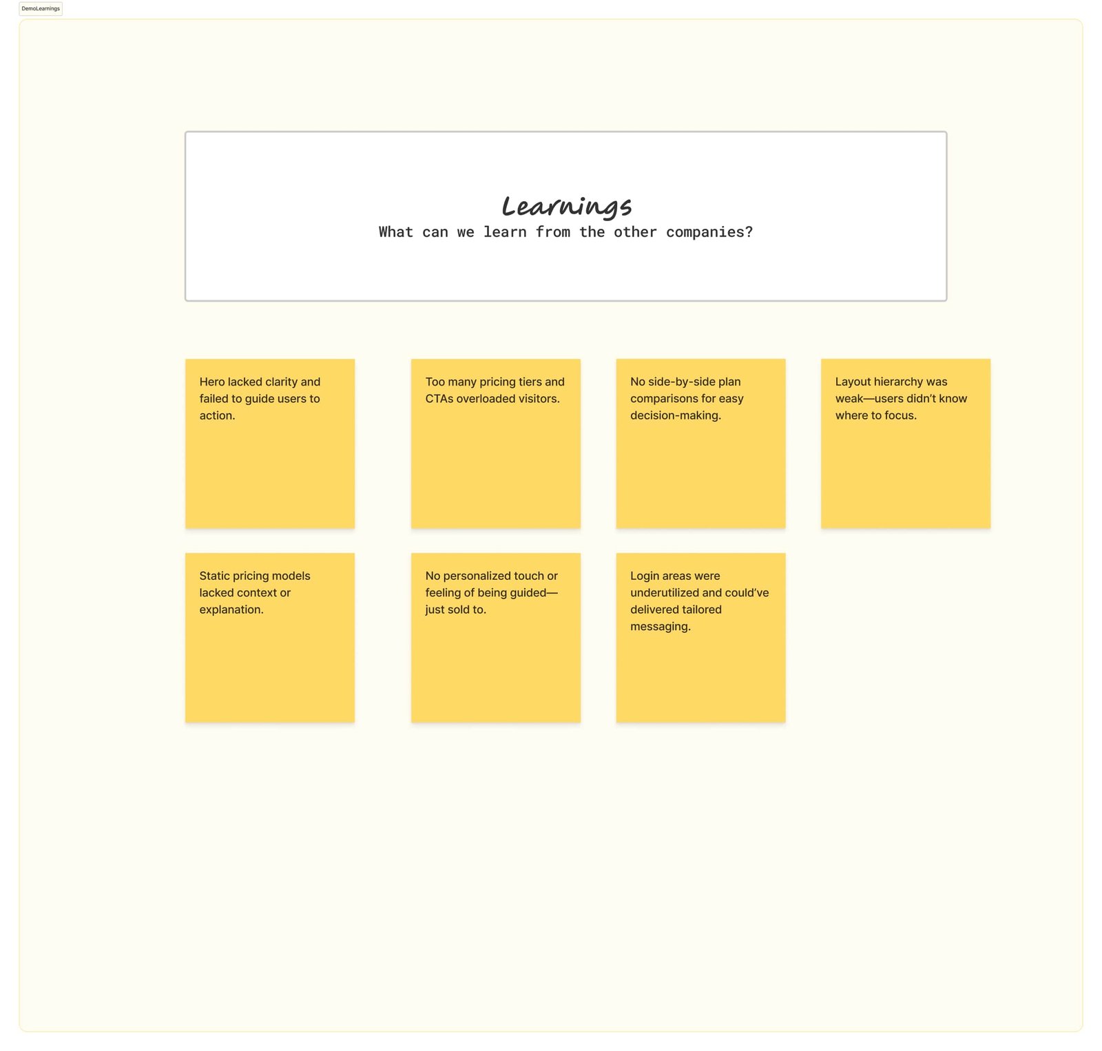
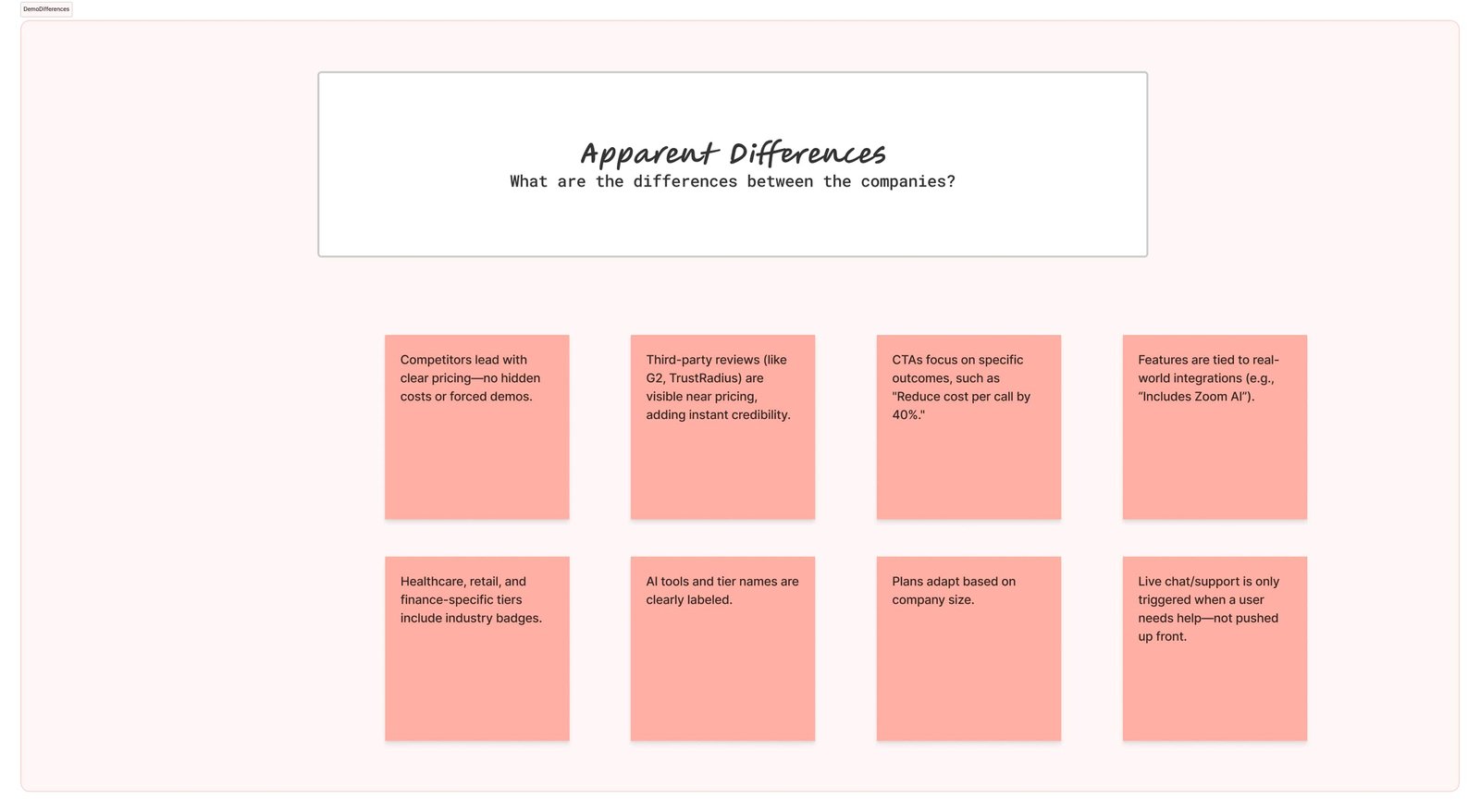
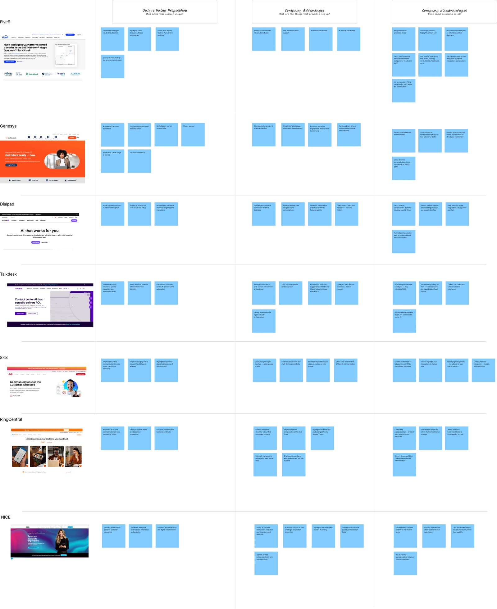
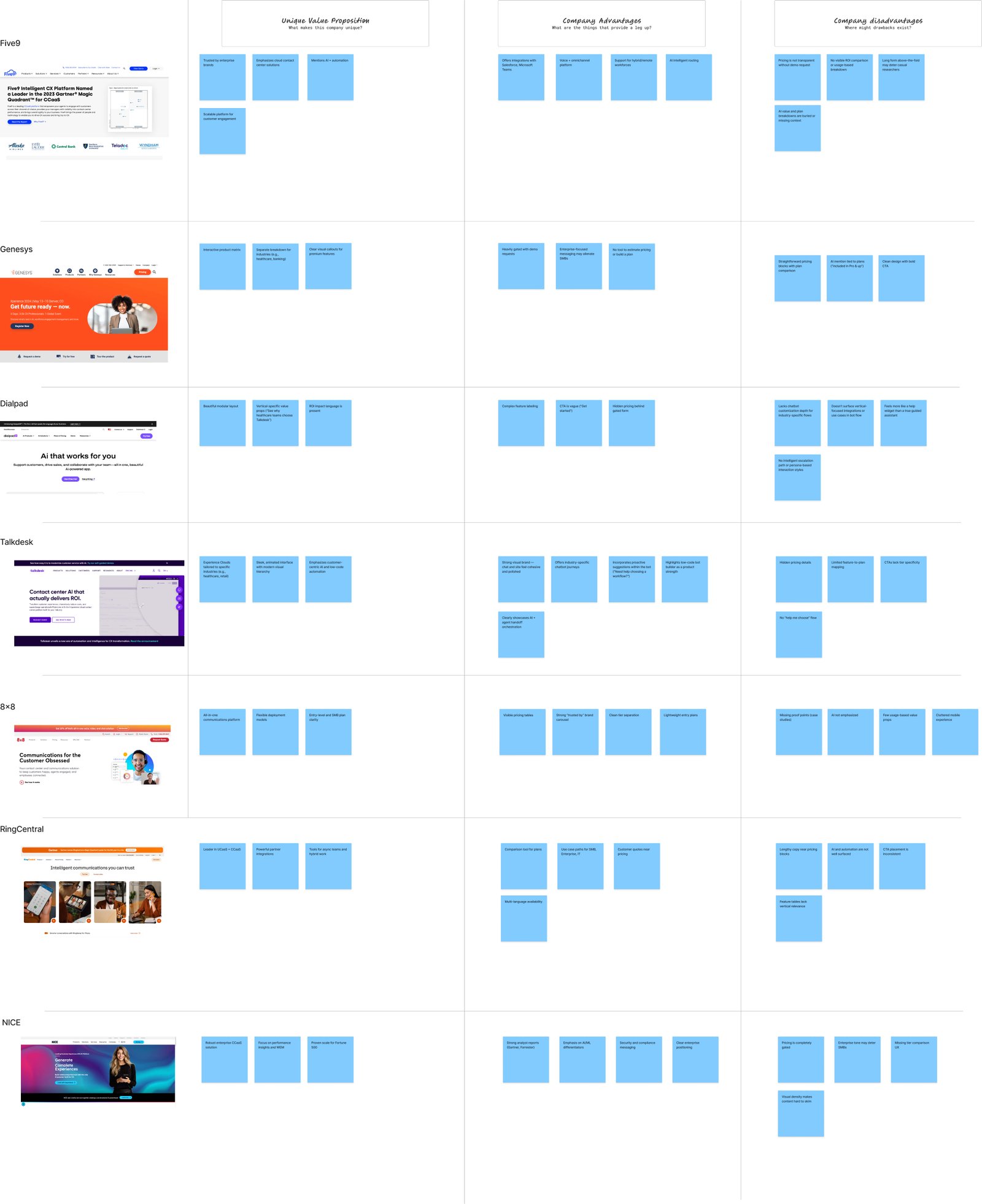
During the research phase, we analyzed Five9’s top competitors in the enterprise contact center space, including Genesys, Dialpad, Talkdesk, 8x8, RingCentral, and NICE. Each platform emphasized similar capabilities — automation, omnichannel support, AI-driven analytics — but user experience, messaging clarity, and first-impression trust varied dramatically. By mapping out unique value propositions, comparative advantages, and standardized industry features, we identified key strategic gaps and opportunities for Five9.
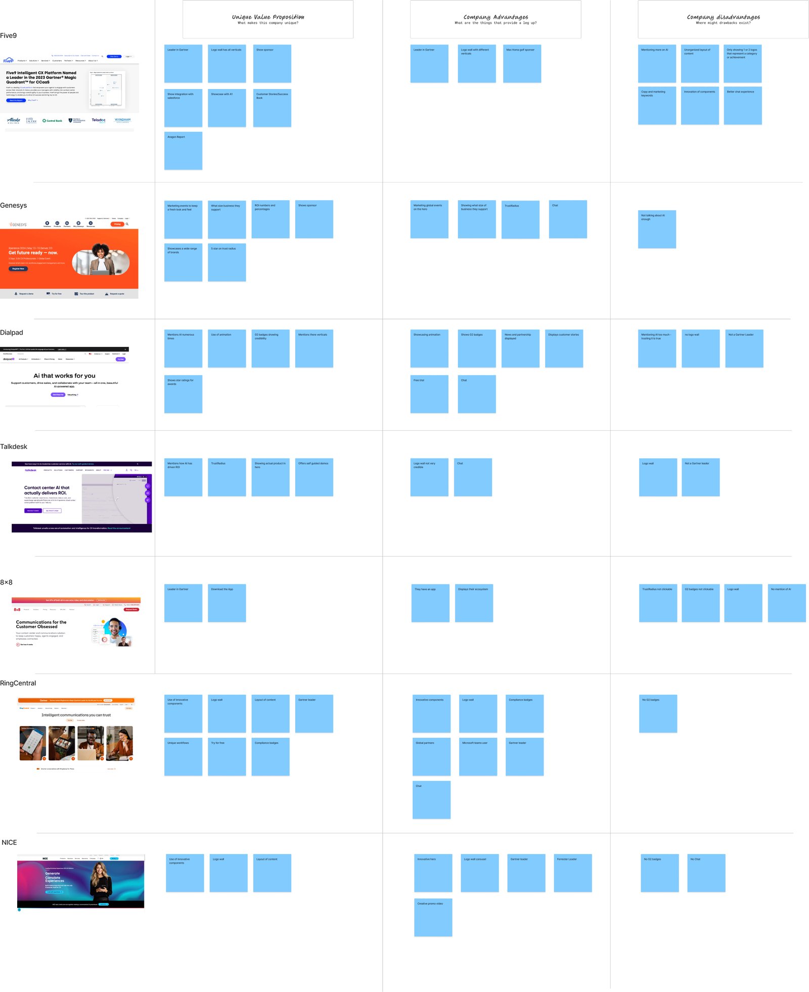
Key Findings:
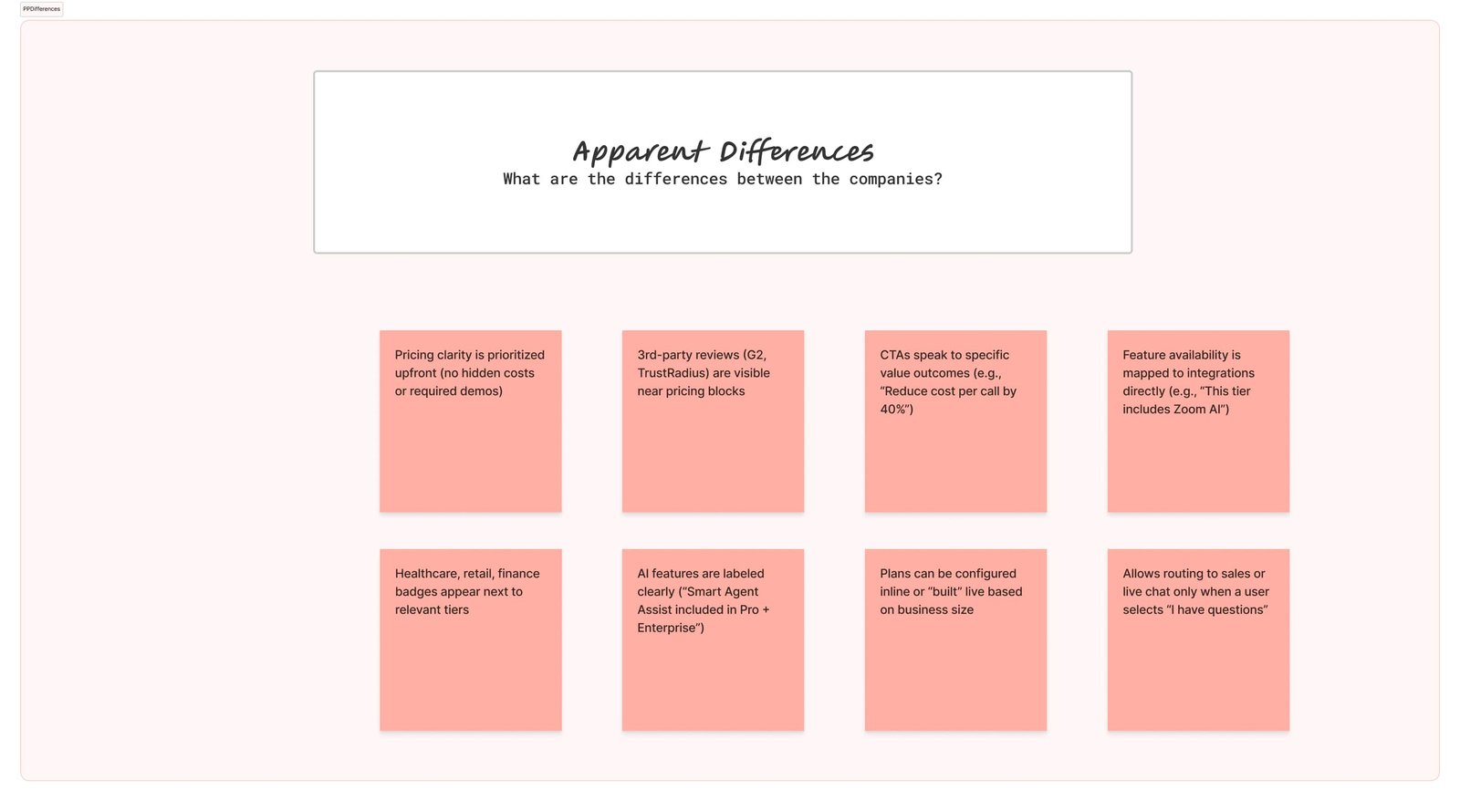
Differentiators to Elevate: Five9 had strong partnerships (Oracle, Zoom, Salesforce), robust AI features, and a proven enterprise track record. However, these were buried in page content rather than surfaced upfront.
Market Opportunity: Competitors like Talkdesk and Dialpad leaned heavily into modern UI and emotion-driven messaging. Five9 had an opportunity to modernize its UX while preserving its authoritative voice.
Standardization Fatigue: Many competitors used identical value props: “seamless CX,” “cloud contact,” and “omnichannel.” Our redesign rephrased and restructured content to emphasize business outcomes and ROI impact, helping Five9 stand apart.
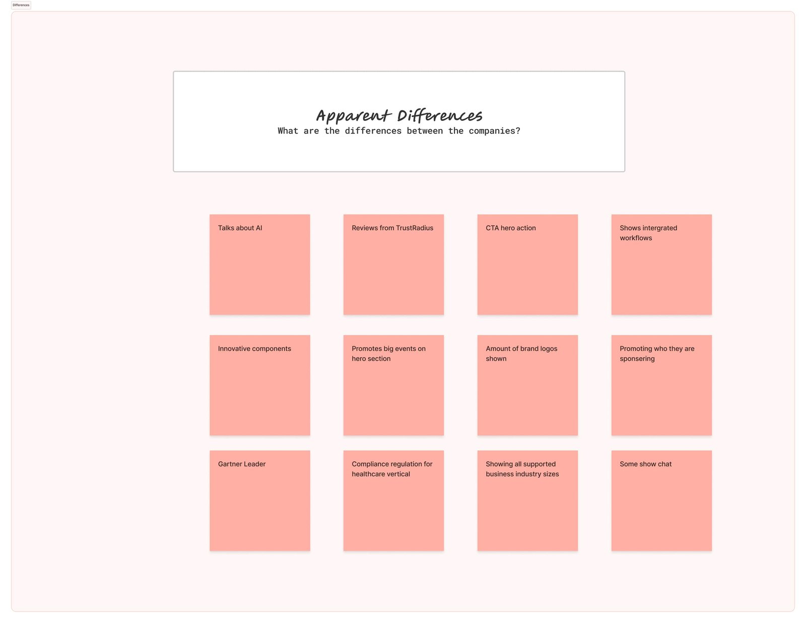
Key Findings:
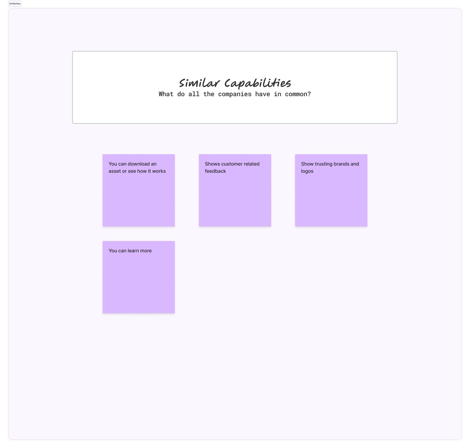
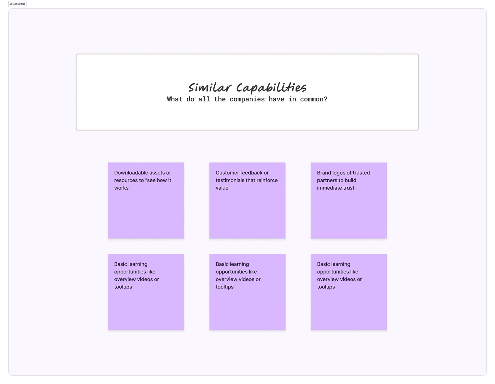
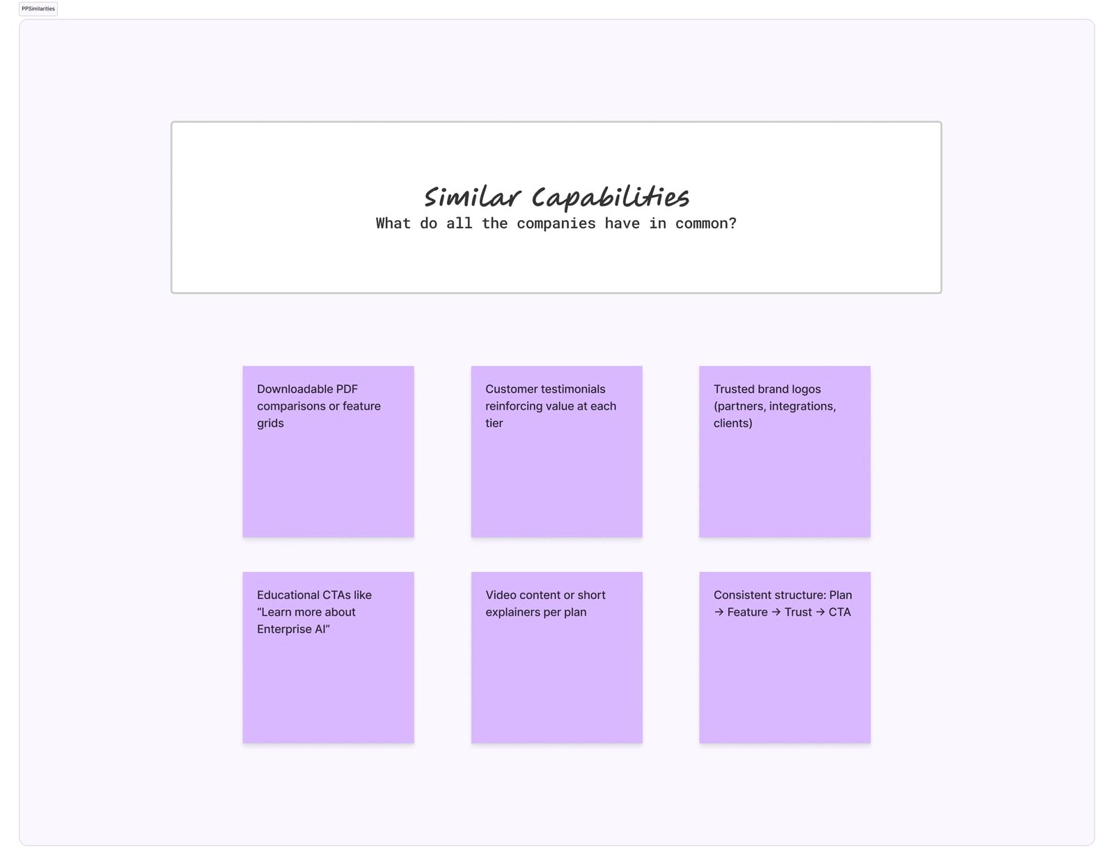
Similarities: All competitors featured customer logos, testimonials, and assets to build trust. But most stopped at surface-level proof points.
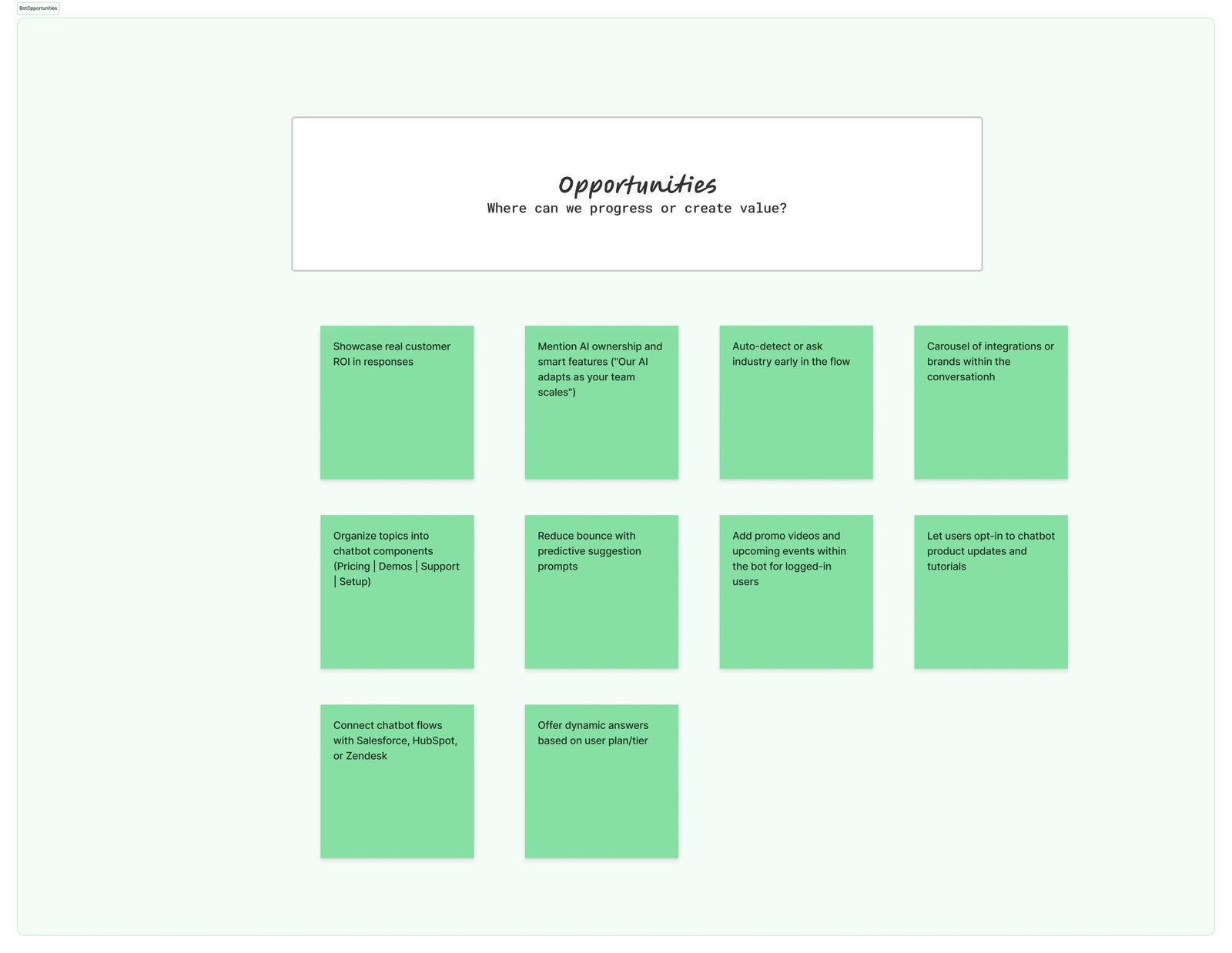
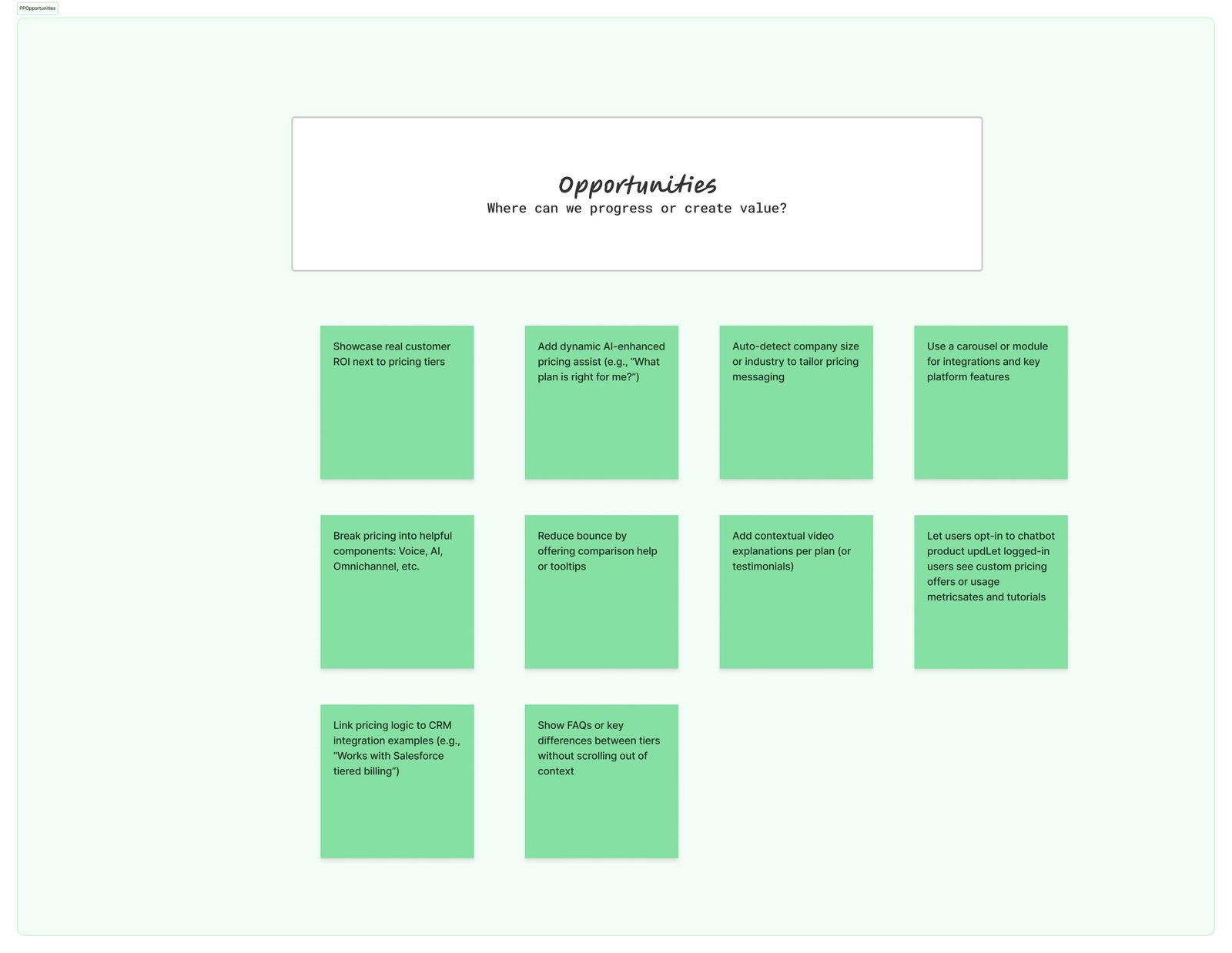
Opportunities: We mapped 7 competitors to identify common UX patterns: asset downloads, testimonials, “how it works” CTAs, and AI claims were universal. However, brand messaging and CTA placement were inconsistent.
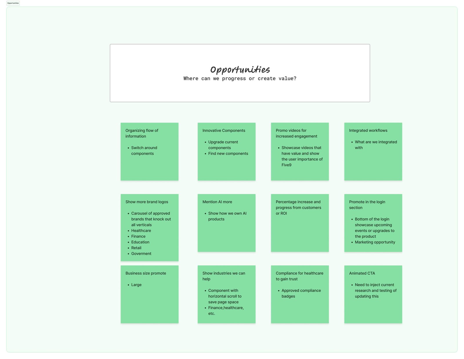
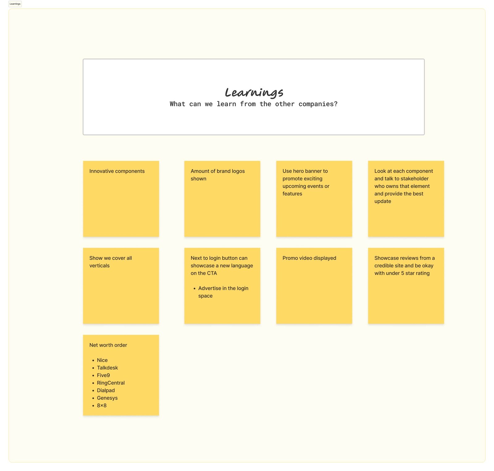
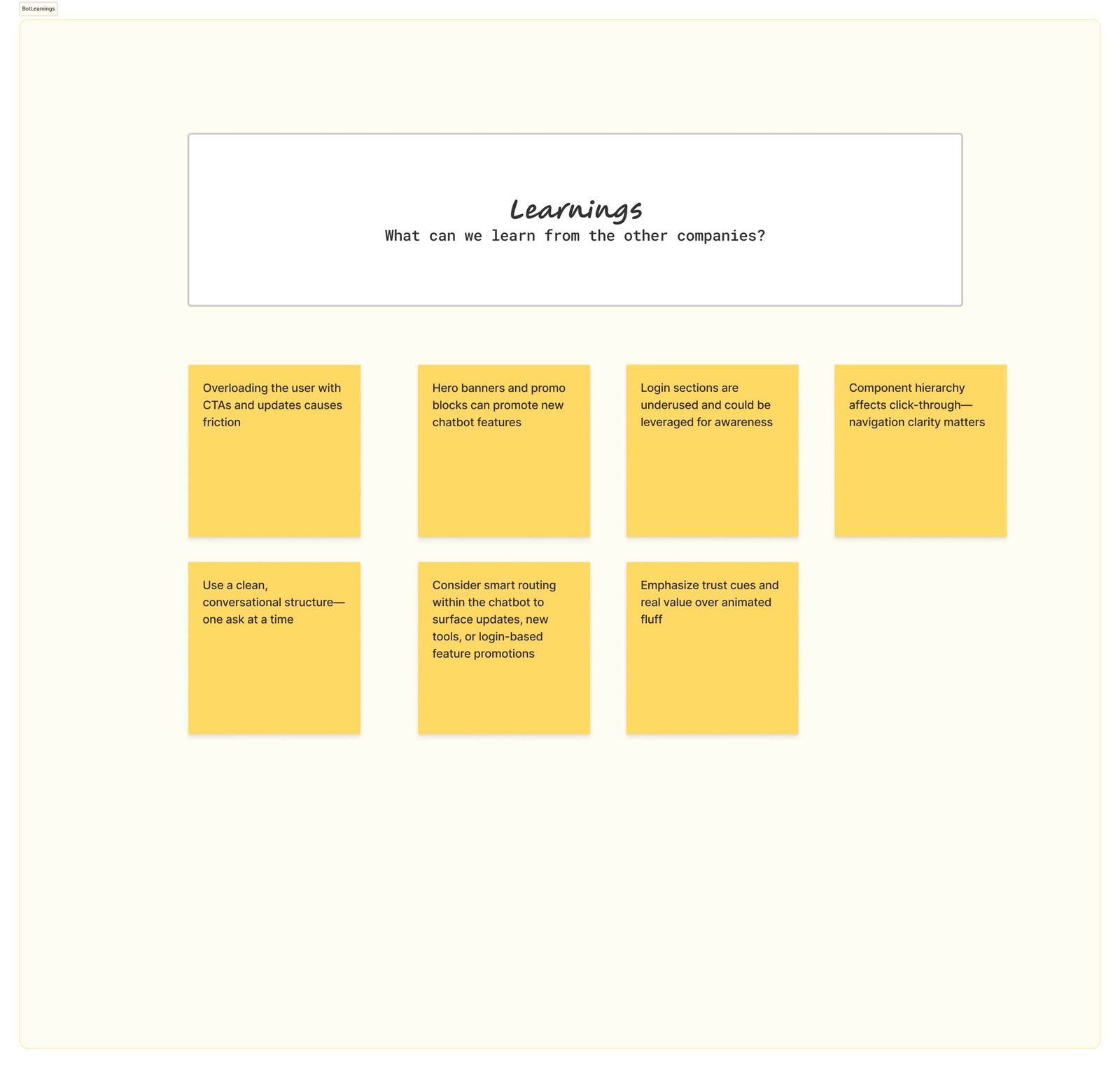
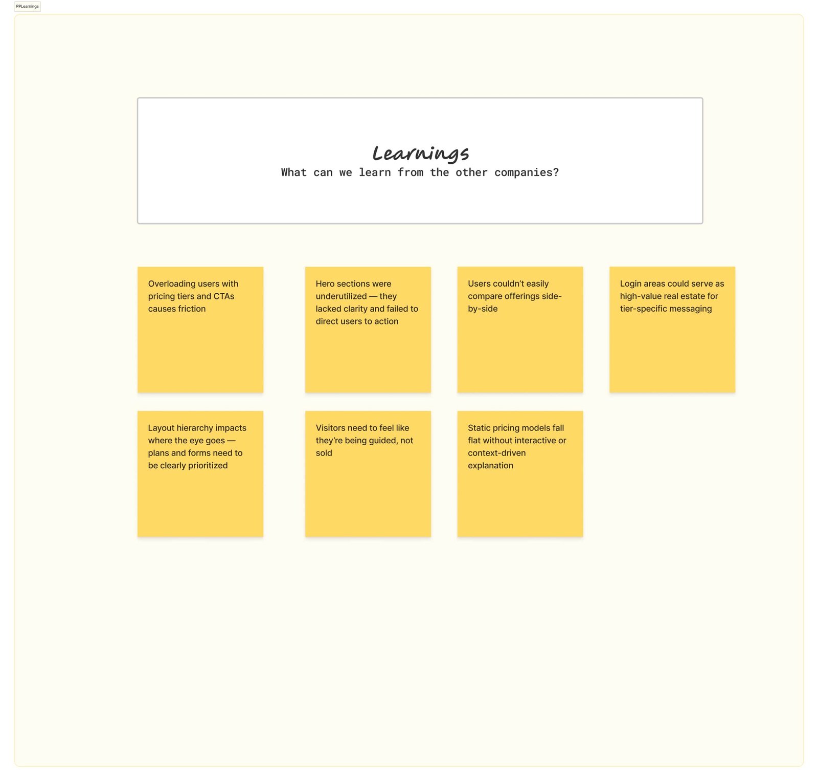
Learnings: We discovered missed opportunities in Five9’s own layout—like underusing brand logos, hiding AI capabilities, and not leveraging the login area for product promotion. A focus on compliance badges and vertical-specific content also helped competitors stand out.
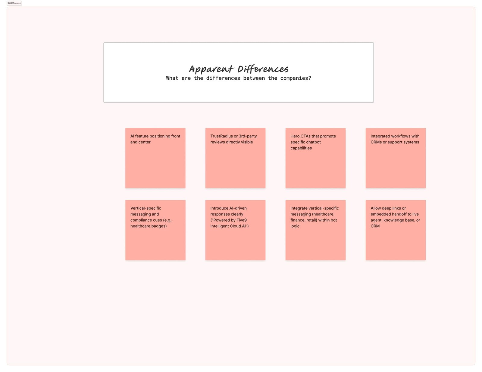
Differences: With insights from the matrix, we elevated Five9’s trust signals, added animated CTAs, injected updated ROI stats, and restructured content around business outcomes rather than technical features.
The 5 W's
1. Who — We are enhancing the Five9 website for users seeking clear, trustworthy, and easy-to-navigate product information.
2. What — A redesigned site that simplifies complex offerings through visuals, structure, and streamlined messaging.
3. Where — Accessible globally across desktop and mobile for seamless research and engagement.
4. When — Used any time users are exploring solutions, from initial interest to sales calls.
5. Why — To increase clarity, reduce friction, and guide users toward confident decision-making.
Through stakeholder feedback, we identified the need for a more intentional user journey focusing on clear product discovery before pushing calls to action. We also agreed the site should include interactive elements like explainer videos and trust markers to guide users without overwhelming them. Once alignment was reached, the next step was to wireframe and iterate on layout and content flow.
Impact
This research directly informed the landing page redesign. We revised the information hierarchy, restructured CTAs to better highlight competitive strengths, and simplified the visual flow to match the expectations set by competitor benchmarks—while showcasing what Five9 uniquely delivers.
Persona
The stakeholders’s goals were to roll out a website that is easy to navigate, clearly structured, and designed to build user trust quickly. Visitors are often decision-makers from industries like finance, healthcare, education, and enterprise-scale businesses. Their primary concerns include quickly understanding the product offering, trusting the brand through compliance and social proof, and seeing how the platform fits into their workflow. They need clarity around integrations, AI capabilities, and measurable ROI before engaging further.

Solution
Design a responsive website that communicates value clearly and builds trust through simplicity, modern visuals, and strategic content hierarchy. We focused on responsive design because users increasingly engage on both desktop and mobile devices. By streamlining navigation, minimizing cognitive load, and testing visual consistency across platforms, we created a scalable digital experience that supports user exploration and informed decision-making.
Key Takeaways
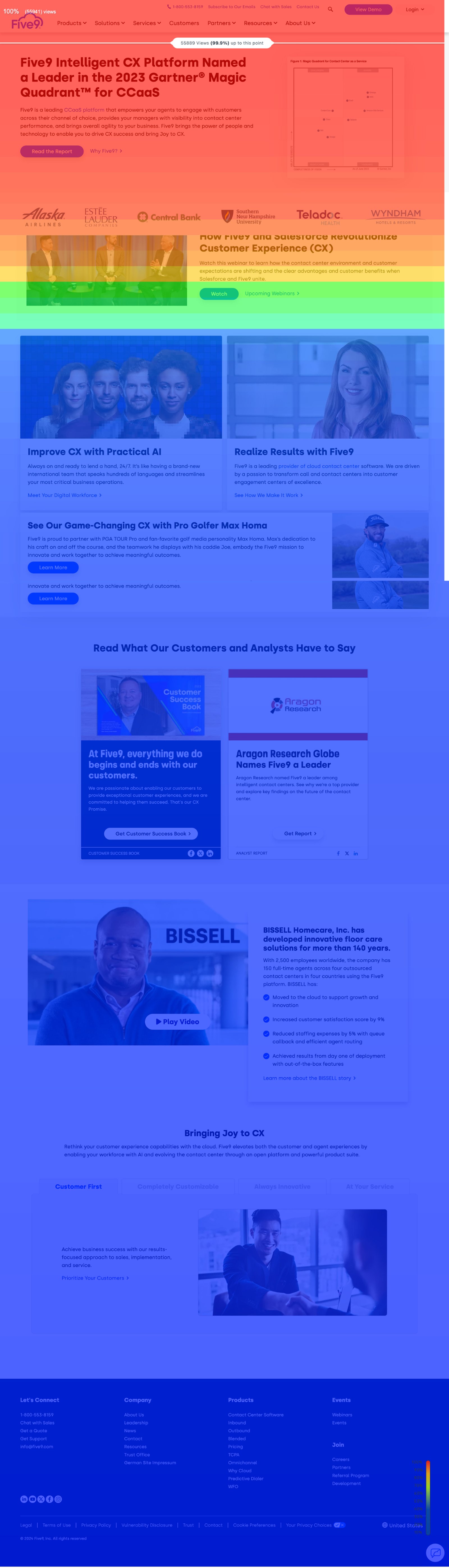
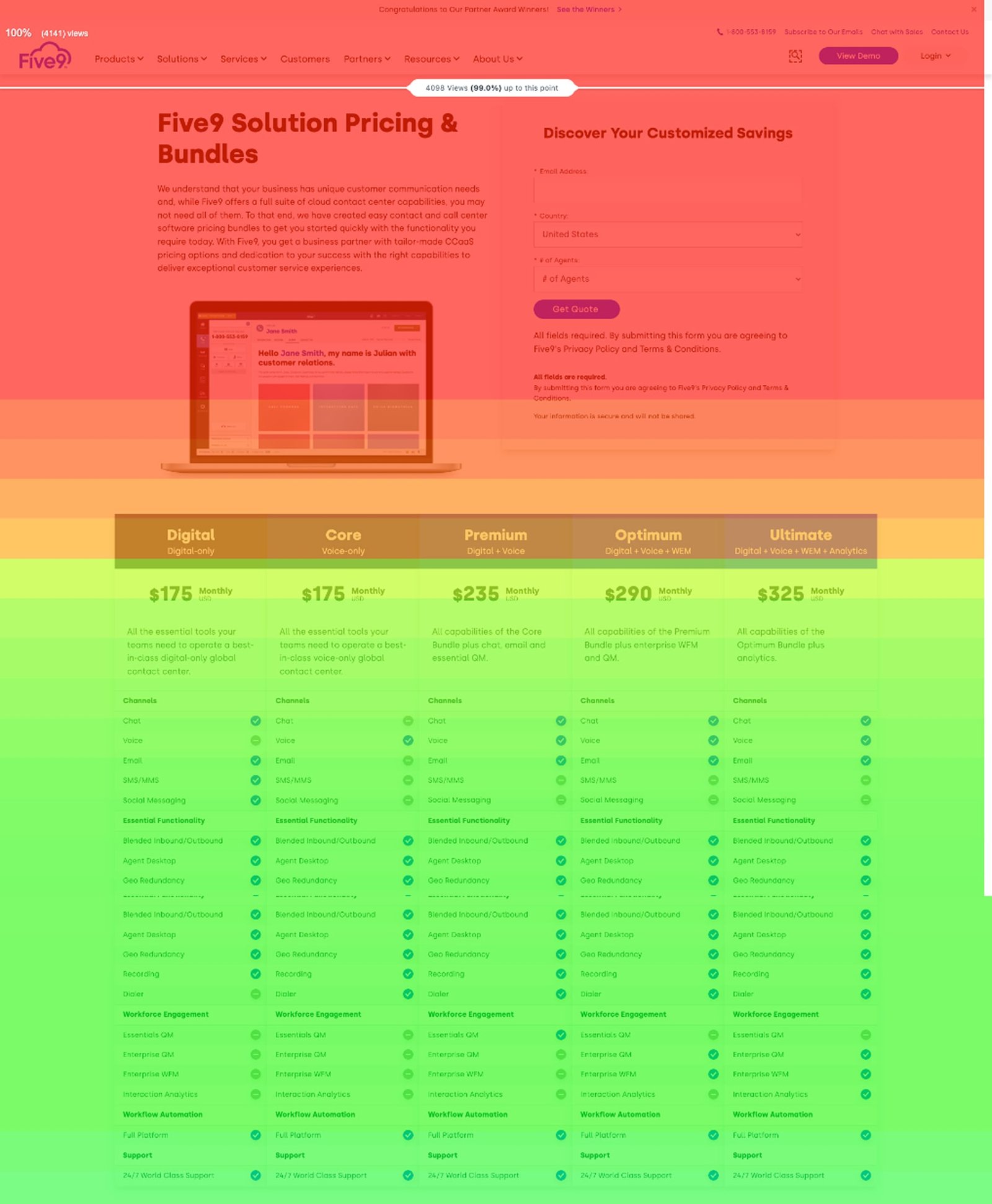
1. Empathy drives design clarity: What users engage with most is not always what we expect. The heatmap revealed intense focus only at the top section, proving the importance of capturing attention quickly with clear, immediate value.
2. Real-world interaction > internal assumptions: Despite careful planning, the scroll depth showed users weren’t reaching mid- or bottom-page content. We learned to test in context and revise based on real user behavior, not just internal goals.
3. Content flow is everything: The heatmap reinforced that a visual hierarchy—especially above the fold—is the foundation of engagement. Structured flowcharts helped guide design decisions to ensure content appeared where users are most active.
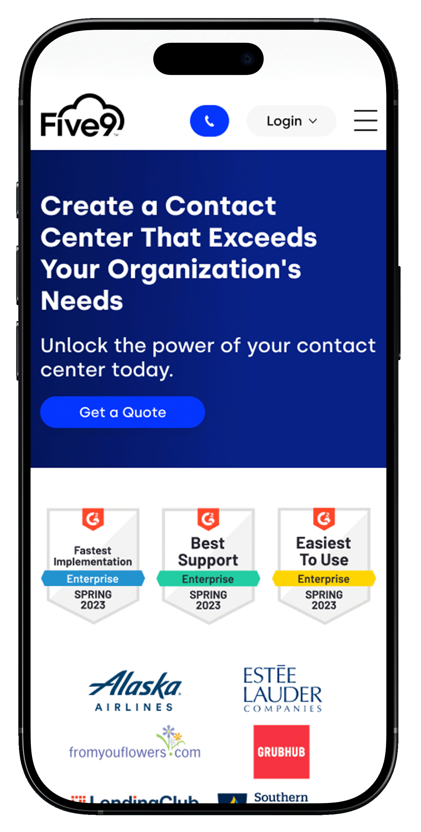
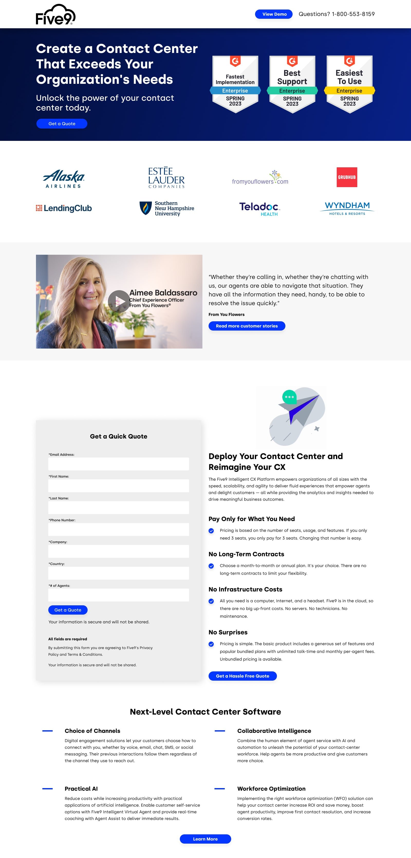
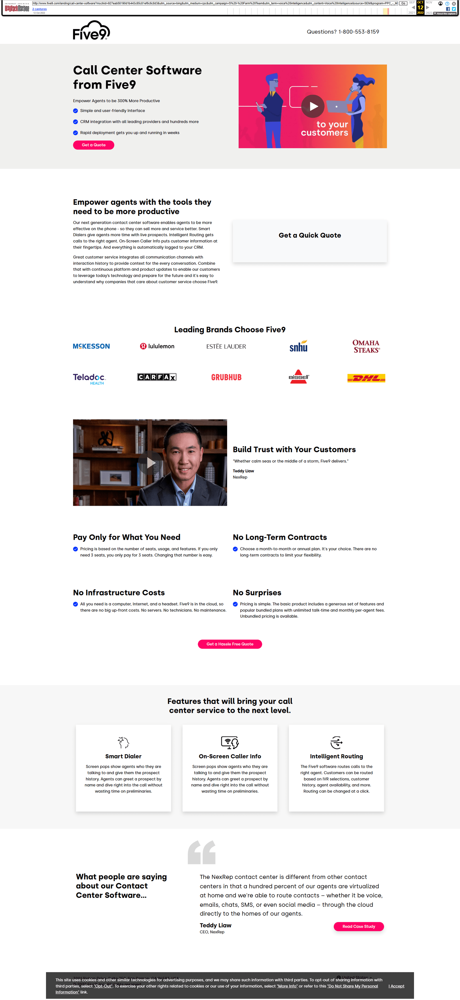
Demo Page Animation
The original Five9 call center software landing page provided valuable product information but lacked the conversion-driving clarity and visual engagement needed to optimize lead generation. Stakeholders expressed a need for a refreshed design that would immediately capture user attention, reduce friction, and improve form completion rates.
- User: B2C
- July, 2022
- Team: UI/UX Designer(me)
- Tools
- Research: Hotjar, Google Analytics
- Ideation: Wireframes
- Visual Design: Figma, FigmaJam
- Duration
- 1 month
Before Layout and Key Issues
- Visual Hierarchy Confusion: The headline, video, and CTA placement compete for attention, with the hero section lacking a strong above-the-fold conversion focus.
- Generic CTAs: Repeated "Get a Quote" and "Get a Quick Quote" buttons fail to differentiate user intent or guide them through a clear funnel.
- Information Overload: Feature details are text-heavy and scattered, making it difficult for users to quickly understand value propositions.
- Lack of Personalization or Urgency: Testimonials are buried and passive; there’s no visual or contextual urgency to act now.
Hypothesis
If we redesign the Five9 pricing page to feature a single, prominent call-to-action above the fold, streamline content into scannable sections with clear visual hierarchy, and implement a simplified multi-step quote form, then we will increase form completion rates and lead generation by at least 3% within the first 60 days post-launch.
Research
Competitive research showed that top providers use animation, dynamic content, and clear CTAs to drive engagement. In contrast, Five9’s static pricing page causes friction and drop-off. By introducing a focused CTA, animated plan highlights, and a simplified multi-step quote form, we aim to boost form completions and lead generation by 25% within 60 days.
How Might We
1. How might we redesign the Five9 pricing page to prioritize clarity, reduce friction, and guide users toward confident decision-making?
2. How might we minimize cognitive overload by simplifying plan comparison and reducing repetitive CTAs?
3. How might we support a thoughtful buyer journey by surfacing trust signals (testimonials, logos, reviews) earlier in the page flow?
4. How might we improve visual hierarchy so users can quickly find pricing, features, and value propositions without scrolling aimlessly?
5. How might we create a confident, modern brand experience that blends animation, interactivity, and clear messaging to convert leads faster?
Persona
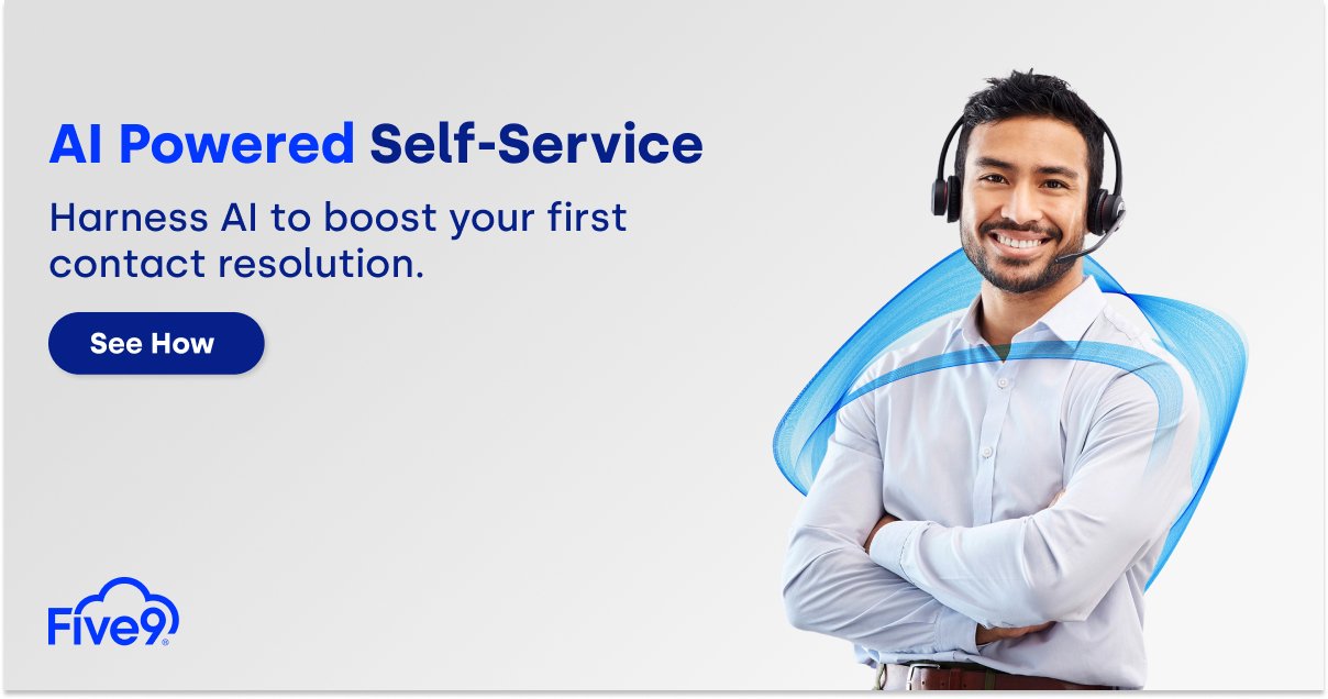
Animation was used to visually explain how Five9’s call center software works—without overwhelming users. From onboarding through customer routing, scroll-based sequences and light motion graphics were added to walk users through key features like Smart Dialer, On-Screen Caller Info, and Intelligent Routing. These animations help simplify complex workflows, making it easier for users to connect product functionality with real-world use cases in just a few seconds.
Animation
Animation was used to visually explain how Five9’s call center software works—without overwhelming users. From onboarding through customer routing, scroll-based sequences and light motion graphics were added to walk users through key features like Smart Dialer, On-Screen Caller Info, and Intelligent Routing. These animations help simplify complex workflows, making it easier for users to connect product functionality with real-world use cases in just a few seconds.
Conversion Results
Animation was strategically used to explain how Five9’s call center software works—from onboarding to intelligent routing—through scroll-based sequences and light motion graphics. These enhancements simplified complex workflows and improved user comprehension. As a result, usability improvements led to a 3.2% increase in conversions after launch.
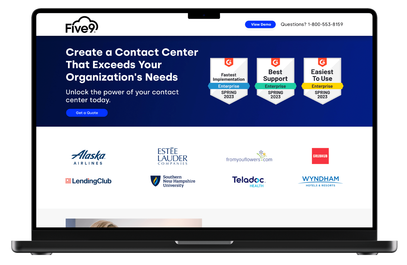
Full Page Solution
Animation was strategically used to explain how Five9’s call center software works—from onboarding to intelligent routing—through scroll-based sequences and light motion graphics. These enhancements simplified complex workflows and improved user comprehension. As a result, usability improvements led to a 3.2% increase in conversions after launch.
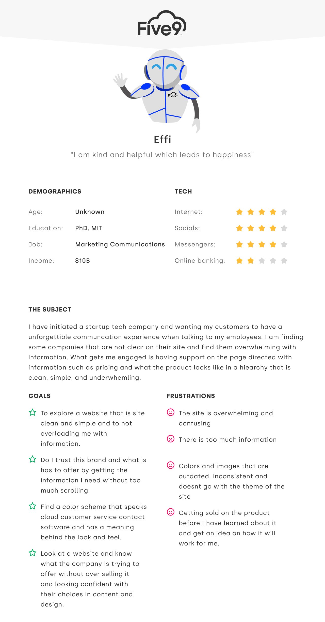
Five9 Chat Bot
Effi, the friendly Five9 chatbot, represents a user who values clarity, helpfulness, and emotional ease when navigating complex digital products. With frustrations around overwhelming content and unclear structure, Effi became a symbolic guide for the redesign process.
- User: B2C
- August, 2022
- Team: UI/UX Designer(me)
- Tools
- Research: Hotjar, Google Analytics
- Visual Design: Figma, Adobe Creative Suite
- Duration
- 2 months
Research
To improve the chatbot experience, I conducted a multi-layered research process:
- Hotjar heatmaps and session recordings revealed drop-off near key chatbot triggers
- Google Analytics showed low re-engagement from users who interacted with the old chatbot
- Competitive analysis of 7 platforms (e.g., Genesys, Talkdesk, NICE) revealed missed industry-specific flows and lack of personalization
- 5 user interviews highlighted a need for guided, task-based conversations and clear AI value messaging
Hypothesis
If we redesign the Five9 chatbot to offer personalized, industry-specific conversation flows, clearly surface AI capabilities, and guide users through task-based interactions—based on behavior data and competitor benchmarking—then users will engage more deeply, complete more high-value actions (like demo requests), and view the chatbot as a trusted CX advisor rather than just a support widget.
Problem
1. How might we design a contact center website experience that reflects Effi’s values of clarity, helpfulness, and simplicity?
2. How might we: minimize cognitive overload for users like Effi who are easily overwhelmed by excessive content and unclear navigation?
3. How might we: support a thoughtful user journey that mirrors Effi’s desire to explore, trust, and understand before committing?
4. How might we: improve the visual and content hierarchy so users, like Effi, can find pricing, product benefits, and support effortlessly?
5. How might we: create a confident, emotionally intelligent brand presence that aligns with Effi’s standard of helpful, joyful interactions?
Persona
Effi is a clarity-driven user who values ease, trust, and quick access to information. The site needed to feel simple, structured, and confident—avoiding clutter, long scrolls, or vague messaging. She responds best to guided experiences with clear value up front.
Solution
To reflect the principles embodied by Effi, we redesigned the Five9 website with a focus on intuitive flow, concise messaging, and visual calmness. The goal was to create a digital environment that feels kind, trustworthy, and empowering just like Effi. By decluttering layouts, prioritizing trust signals, and ensuring responsive performance across devices, we delivered an experience that makes users feel supported, not sold to. The result is a website that speaks like Effi — smart, clear, and genuinely helpful.
Complete Prototype
In December, I built a high-fidelity prototype in Figma and presented it to the full marketing team at our year-end gathering. The design focused on improving landing page clarity, CTA visibility, and aligning with user needs—earning strong engagement and positive feedback.
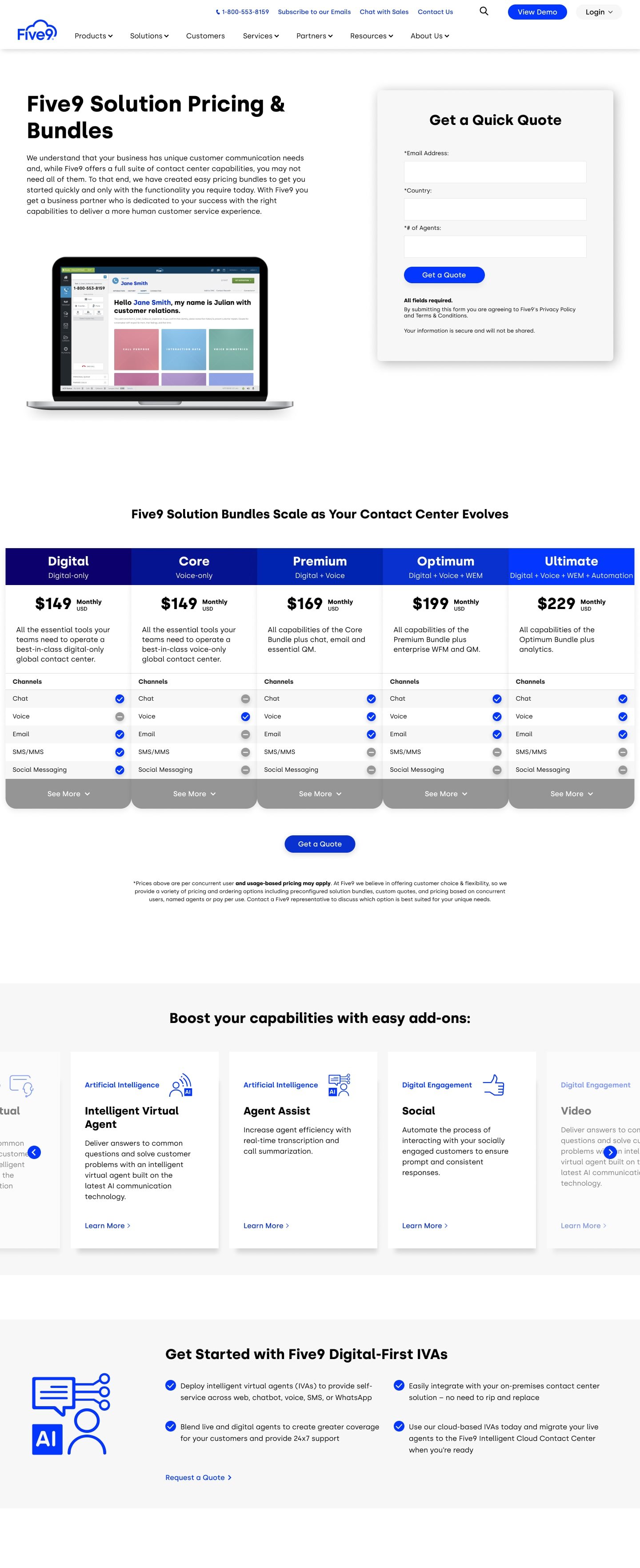
Five9 Pricing Page
I redesigned the pricing page based on insights from Google Analytics and Hotjar heatmaps. By moving the form higher on the page and simplifying the layout, we reduced friction and aligned the content flow with user behavior. These changes improved engagement, boosted form interaction, and made the decision-making process feel faster and clearer.
- User: B2C
- January, 2023
- Team: UI/UX Designer(me)
- Tools
- Research: Google Analytics, HotJar
- Visual Design: Figma
- Duration
- 1 month
Research
I redesigned the pricing page based on insights from Google Analytics and Hotjar heatmaps. By moving the form higher on the page and simplifying the layout, we reduced friction and aligned the content flow with user behavior. These changes improved engagement, boosted form interaction, and made the decision-making process feel faster and clearer.
Problem:
1. How might we redesign the Five9 pricing page to better reflect user behaviors uncovered in analytics and heatmaps—especially for users like Effi who value clarity and simplicity?
2. How might we minimize confusion and scroll fatigue by structuring pricing content in a way that aligns with what users are actually searching for?
3. How might we use behavioral data to guide a more effective content hierarchy, so users like Effi can immediately understand Five9's value and next steps?
4. How might we transform a traditionally dense pricing page into a more approachable, trust-building experience that supports exploration and conversion?
Competitive Analysis:
If we restructure the Five9 pricing page to prioritize clarity, reduce cognitive load, and surface key information (like features, integrations, and pricing tiers) earlier in the user journey—based on insights from Google Analytics and Hotjar—then users will engage more confidently, resulting in increased form completions and reduced bounce rates.
Hypothesis:
If we restructure the Five9 pricing page to prioritize clarity, reduce cognitive load, and surface key information (like features, integrations, and pricing tiers) earlier in the user journey—based on insights from Google Analytics and Hotjar—then users will engage more confidently, resulting in increased form completions and reduced bounce rates.
Persona:
If we restructure the Five9 pricing page to prioritize clarity, reduce cognitive load, and surface key information (like features, integrations, and pricing tiers) earlier in the user journey—based on insights from Google Analytics and Hotjar—then users will engage more confidently, resulting in increased form completions and reduced bounce rates.
Solution:
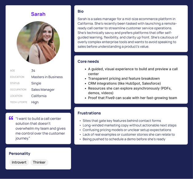
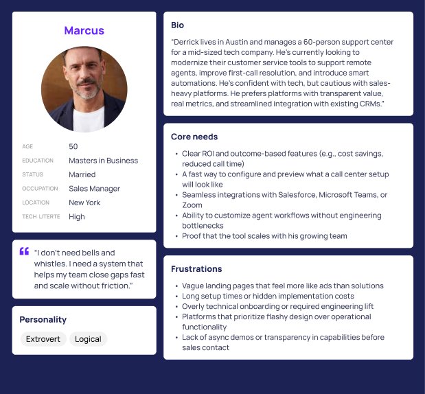
To address the needs of users like Marcus and Sarah, we redesigned the Five9 pricing page with a focus on clarity, ease of comparison, and faster access to decision-making tools. The goal was to reduce friction, highlight key differentiators like integrations and ROI, and make the experience feel more like guidance than a sales pitch. By repositioning the form, simplifying content hierarchy, and integrating behavior-based insights from heatmaps and analytics, we created a pricing page that supports confident choices. The result is a page that works like a great conversation—clear, relevant, and built to respect the user’s time.
Five9 Social Graphics
Effi, the friendly Five9 chatbot, represents a user who values clarity, helpfulness, and emotional ease when navigating complex digital products. With frustrations around overwhelming content and unclear structure, Effi became a symbolic guide for the redesign process.
- User: B2C
- March, 2023
- Team: UI/UX Designer(me)
- Tools
- Research: Competitors, online inspiration
- Visual Design: Figma, Adobe Creative Suite
- Duration
- 1 month

Problem
1. How might we: create a consistent and engaging visual identity across social channels to boost visibility and trust?
2. How might we: design content that reflects product value while feeling approachable and aligned with the Five9 brand?
3. How might we: increase demo sign-ups and conversions by making social ads more human-centered and emotionally resonant?
Solution
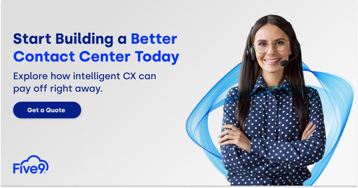
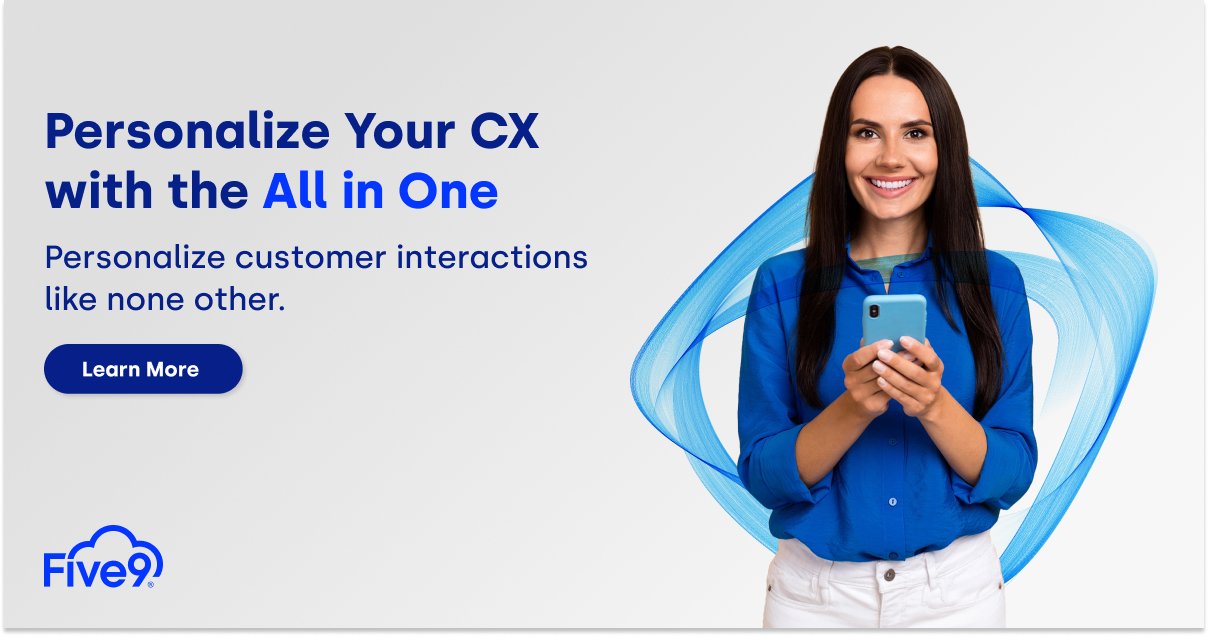
We developed a visual strategy for Five9’s social media campaigns that embraced clarity, professionalism, and a human touch. Using branded photography with real people, friendly color accents, and direct CTAs, we created posts that not only aligned with Five9’s tone but also sparked interest and action. This effort resulted in $100K in new revenue within two quarters by driving higher engagement and click-through rates from platforms like LinkedIn, Instagram, and paid search extensions.
Persona
Our audience included operations managers, CX directors, and IT leads exploring modern contact center solutions. They responded best to confident visuals, minimal text, and immediate clarity on value. We focused on clear action language like "Get a Quote" and “See How” to make each post feel like a solution, not an ad. The success came from making it easy to understand and even easier to click.