Product Design Consultant
Used motion design in Pristine Data’s dashboardsand onboarding, simplifying flows and lifting engagement 20%.
Pristine Data AI Logo Design
Designing a clean, modern identity that reflects Pristine Data AI’s mission to make complex data feel accessible, actionable, and human. The logo embodies clarity and intelligence—built to match the platform’s ability to simplify messy data and empower organizations to make smarter, faster decisions with confidence.
- User: B2B
- June, 2022
- Team: UI/UX Designer(me)
- Tools
- Research: Competitive Research
- Ideation: Sketches
- Visual Design: Illustrator, Figma
- Duration
- 1 month
What was the design challenge?
The challenge was to design a logo that reflects Pristine Data AI’s ability to simplify messy, complex data into clear, actionable insights. The identity needed to convey intelligence, precision, and innovation—while remaining approachable and trustworthy to both technical and non-technical users. The goal was to visually communicate clarity, speed, and human-centric AI in a clean, modern form.
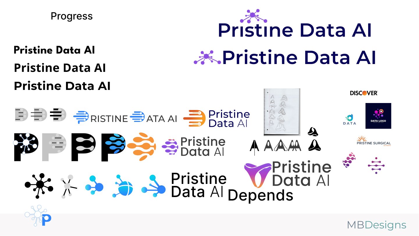
Design Process
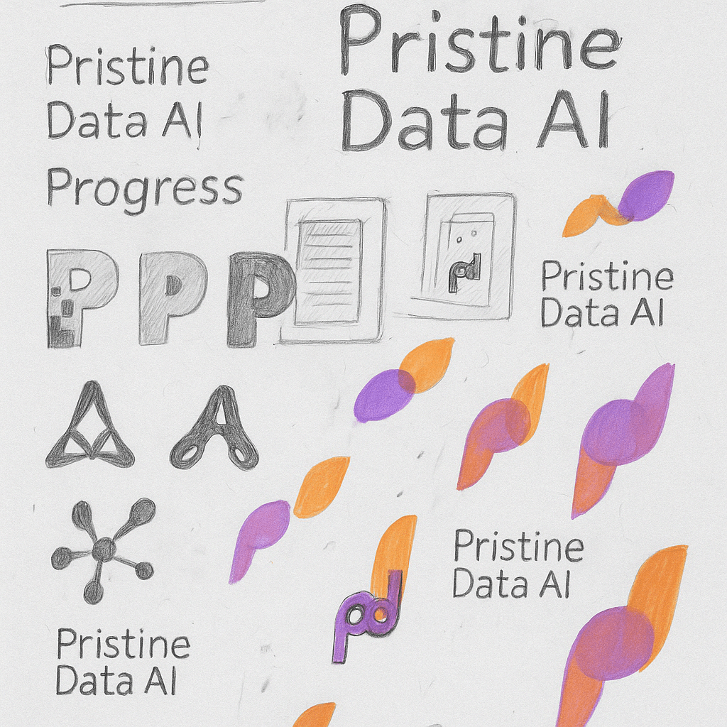
Sketching Concepts:
I started by loosely sketching different letterforms and abstract shapes that could capture Pristine Data AI’s focus on clarity, intelligence, and connection. Early ideas explored data flows, neural structures, and simplified network nodes.
Visual Exploration:
I experimented with different “P” shapes, data molecules, and fluid gradients to reflect transformation and motion. Some designs leaned toward bold and futuristic; others aimed to be more human-centric and clean.
Symbol Development:
The final symbol was inspired by the concept of pristine motion—data moving cleanly from one state to another. The mark evolved into an abstract form with layered transparency and circular movement, suggesting speed, flow, and clarity.
Color Selection:
I chose a warm orange and soft violet palette to balance energy with trust. Gradients were introduced to convey intelligence and forward momentum, aligning with Pristine’s tone of innovation and clarity.
Iteration & Feedback:
Throughout the process, I tested designs across dark and light modes, icon sizes, and paired logotypes. I refined alignment, kerning, and color balance based on feedback and UI mockups. Final assets were polished in vector format for consistency across use cases.
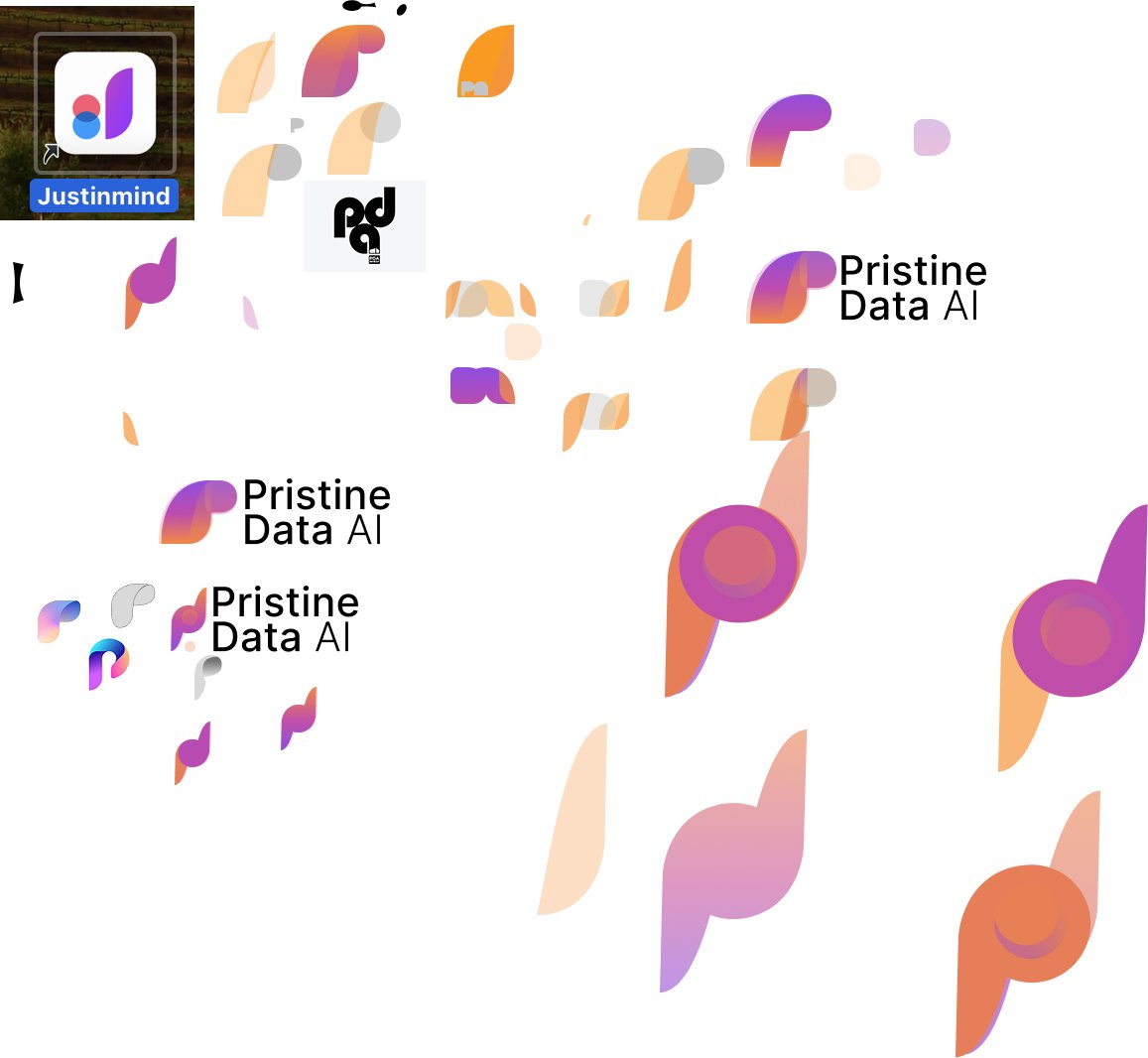
Digital Refinement
The final Pristine Data AI logo embraces a modern, abstract symbol that communicates clarity, intelligence, and forward momentum. It combines a fluid gradient form with circular and leaf-like shapes—representing data flow, motion, and human-centered AI.
I imported early sketches into Adobe Illustrator and used the Pen and Curvature tools to trace and refine the forms digitally. From there, I experimented with different shapes, stroke weights, and layout variations to balance visual movement and symmetry.
I explored multiple icon and wordmark combinations—adjusting spacing, layering gradients, and scaling proportions to ensure consistency and versatility across sizes. I also tested how the symbol behaved as a standalone “P,” in tight spaces like favicons or mobile app icons.
The gradient blend of violet and orange symbolizes transformation and duality: logic meets creativity, and technology meets human empathy. This palette brings warmth to a space often dominated by cold, corporate tech branding.
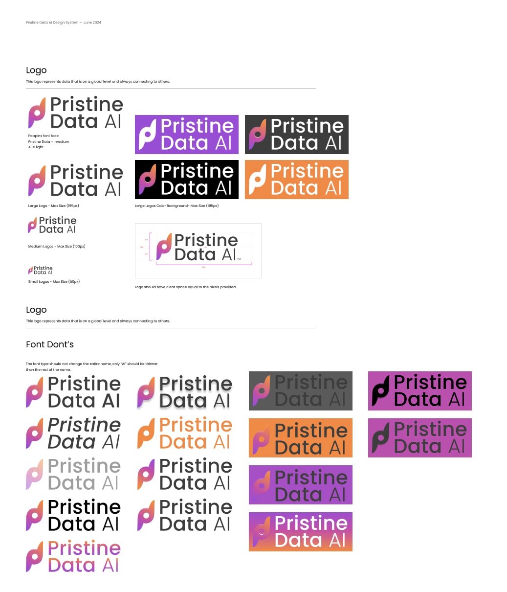
Logo Style Guide
The Pristine Data AI style guide establishes a bold yet approachable visual identity for a brand operating at the intersection of trust, clarity, and innovation in artificial intelligence. Designed using the Poppins typeface and a carefully calibrated color palette, the system ensures scalability and consistency across enterprise dashboards, startup decks, and user-facing products.
The primary mark consists of a custom “P” monogram with an abstract data flow motif, symbolizing structure, insight, and connectivity—core traits of the Pristine Data AI platform. The logotype pairs this symbol with a three-part text lockup, keeping “Pristine,” “Data,” and “AI” distinguishable while harmonizing them visually.
The style guide defines precise logo applications for various sizes—from 165px hero units to compact 50px usage—ensuring legibility in everything from mobile devices to enterprise software. It also includes usage guidance for color backgrounds, including light, dark, and bold tone applications, maintaining accessibility and contrast throughout.
A strict set of “Font Don’ts” reinforces brand clarity. The rules prevent misuse such as inconsistent weights, altered color gradients, unapproved type substitutions, or incorrect emphasis of “AI”—all of which can dilute the strength and reliability the logo is meant to convey.
Clear padding and pixel spacing guidelines help protect the mark’s integrity, ensuring it’s never visually crowded or misaligned. These boundaries are essential for maintaining professionalism and clarity—two principles that reflect Pristine Data AI’s value proposition of precise, intelligent insights delivered through beautifully simple design.
Final Outcome
This final outcome positions Pristine Data AI as a trustworthy, next-generation analytics brand that’s equally at home in enterprise dashboards, startup pitch decks, and user-first applications.

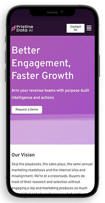
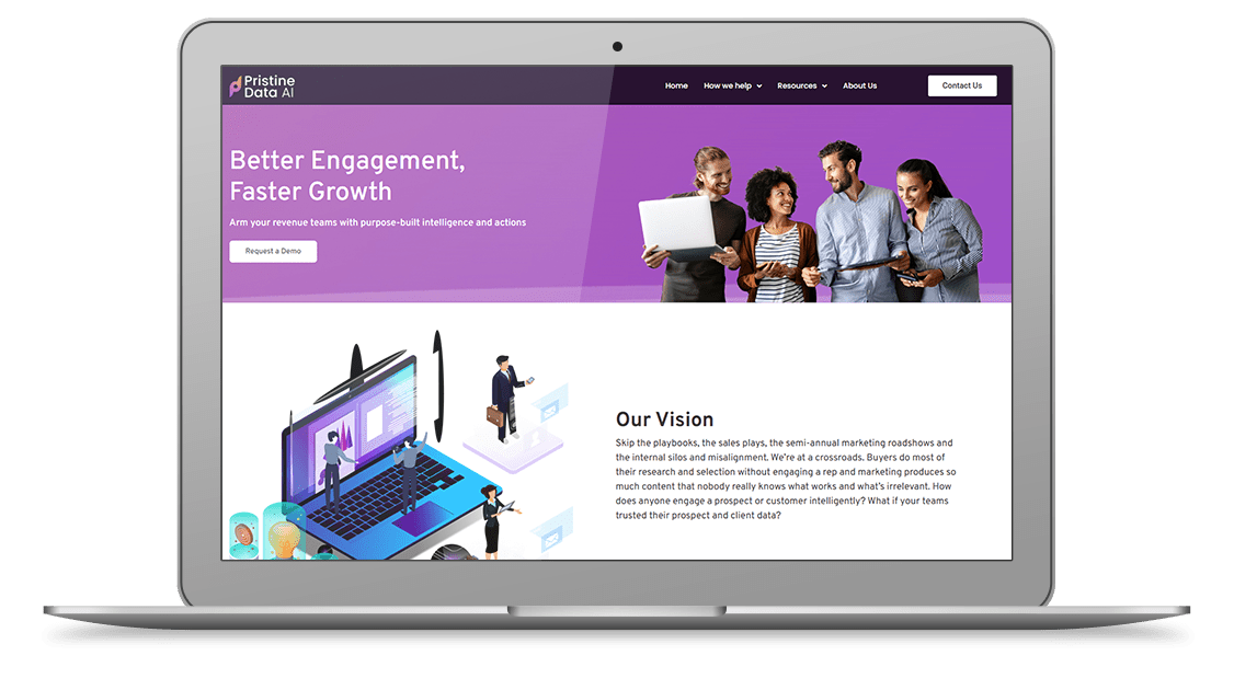
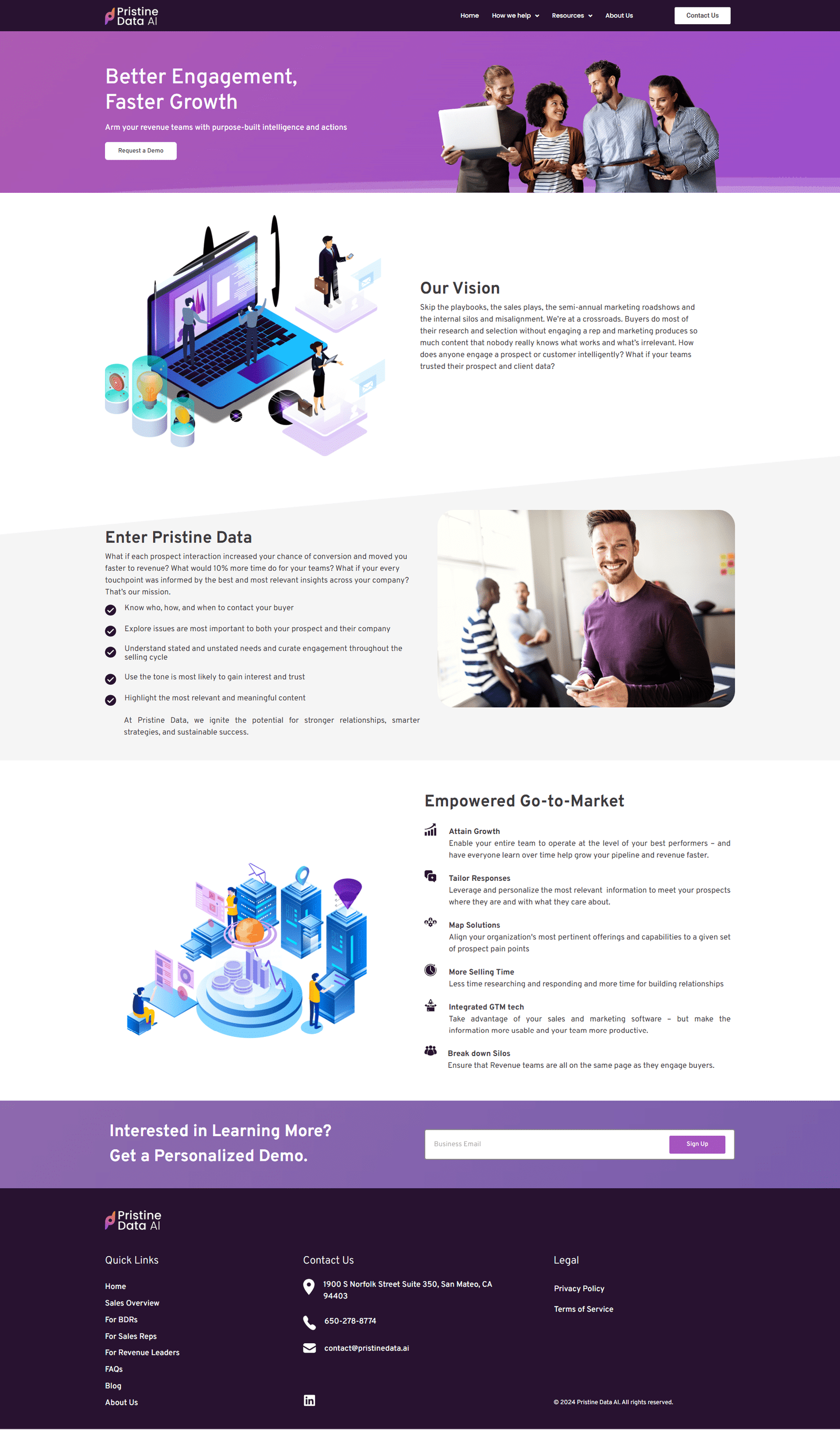
Pristine Data AI Website Landing
If we redesign the Pristine Data AI site to clearly communicate its value in data privacy and compliance, streamline navigation for enterprise buyers, elevate trust signals, and apply a consistent, modern visual hierarchy— then users will engage more deeply with the platform’s offerings, increasing demo requests and improving brand credibility in the competitive AI data security market.
- User: B2C,B2B
- June, 2022
- Product Designer (me)
- Tools
- Ideation: Wireframes
- Visual Design: Figma, FigJam
- Duration
- 1 month
Problem
1. How might we:
design a website that clearly communicates Pristine Data AI’s expertise in data privacy, compliance, and secure AI solutions?
2. How might we:
reduce cognitive overload by simplifying highly technical messaging so enterprise buyers, compliance officers, and IT leaders can quickly understand value?
3. How might we:
address different user roles—CISOs, legal teams, and data engineers—each with unique priorities when evaluating compliance and data protection tools?
4. How might we:
effectively highlight PDAI’s differentiators—privacy-first AI architecture, compliance automation, and secure data handling—in a clear, confident, and trustworthy way?
5. How might we:
establish credibility with enterprise audiences by using strong trust signals (case studies, certifications, regulatory alignment) to support conversion and long-term partnerships?
Helped Pristine Data AI Stand Out in a Crowded Market
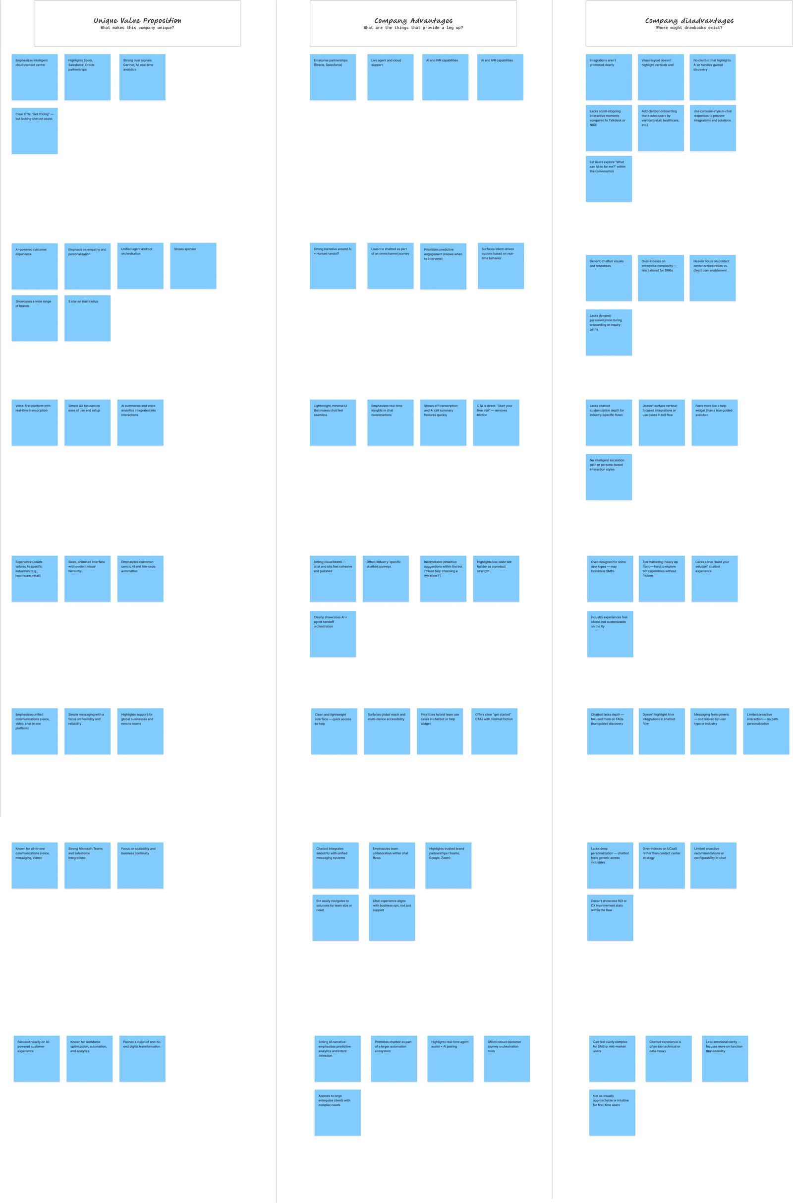
During the research phase, we analyzed leading data privacy, compliance, and AI security platforms. We found that many competitors relied on broad claims like “AI-powered compliance” or “secure data at scale,” which blurred differentiation. Enterprise buyers often faced fatigue from standardized messaging and struggled to identify unique value across vendors. By mapping Pristine Data AI’s strengths—privacy-first AI architecture, automated compliance workflows, and verifiable trust signals—we uncovered strategic opportunities to position PDAI as the partner that transforms complex regulatory demands into clear, actionable, and trustworthy solutions.
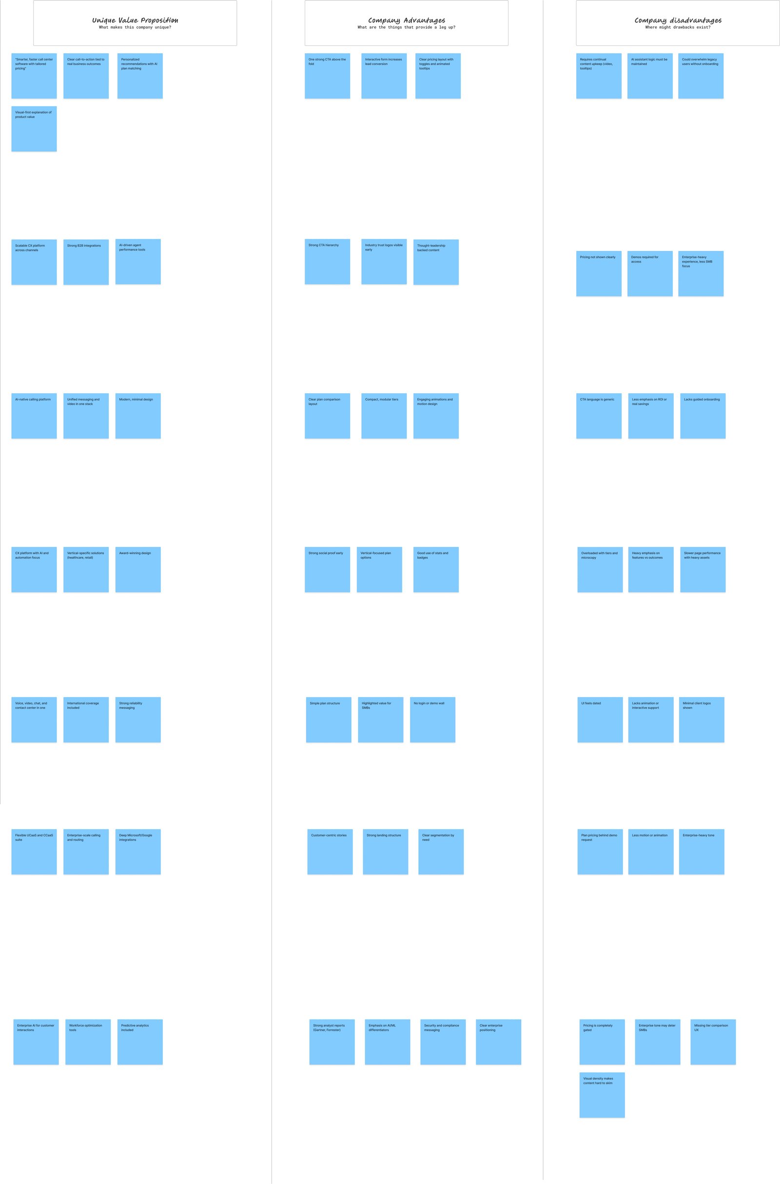
Key Findings:
Differentiators to Elevate: Pristine Data AI stands out with its privacy-first AI architecture, automated compliance workflows, and verifiable trust signals—offering enterprises more than just another “AI-powered” solution.
Market Opportunity: Competitors often highlight isolated features like data encryption or reporting dashboards. PDAI can differentiate by presenting an end-to-end compliance and data security story, reducing complexity for CISOs, legal teams, and IT leaders.
Standardization Fatigue: Across the industry, repeated claims like “secure AI” and “compliance at scale” blur differentiation. PDAI can reframe its messaging around outcomes: lower regulatory risk, faster audits, and improved enterprise confidence in data handling.
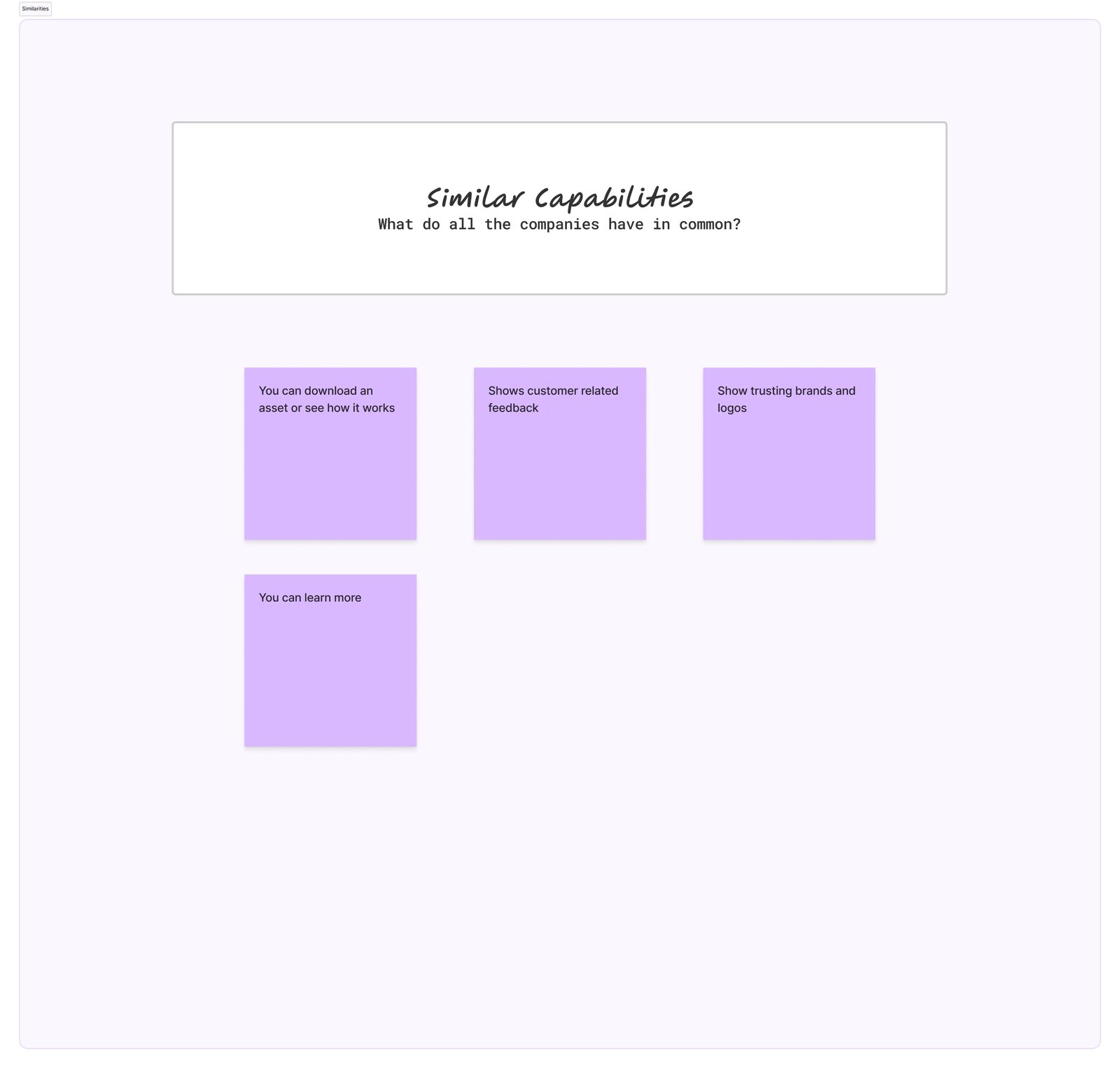
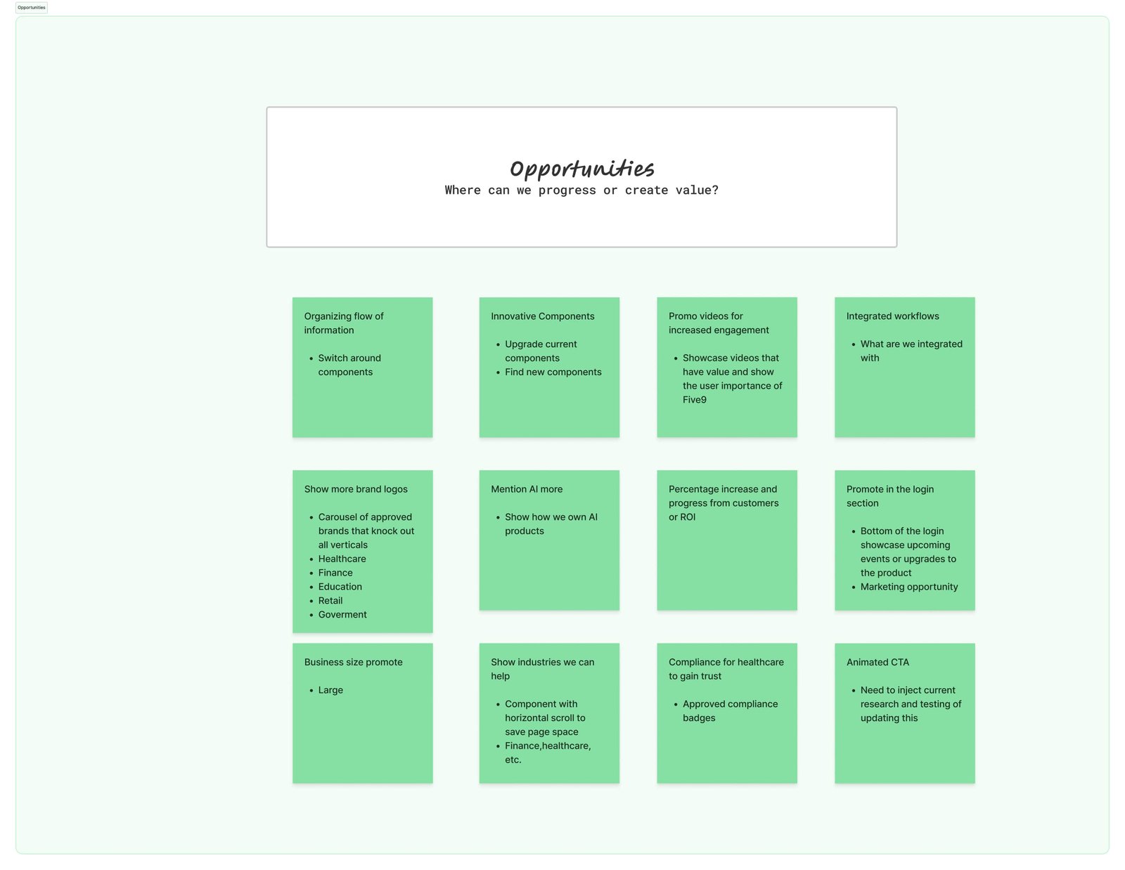
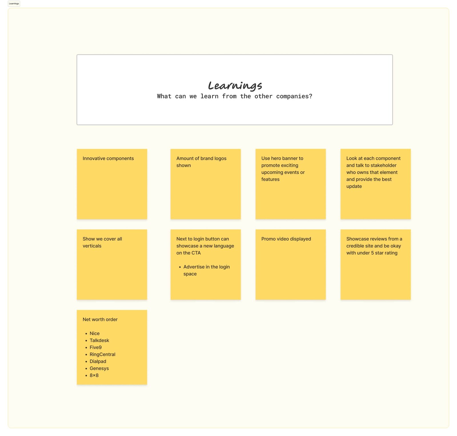
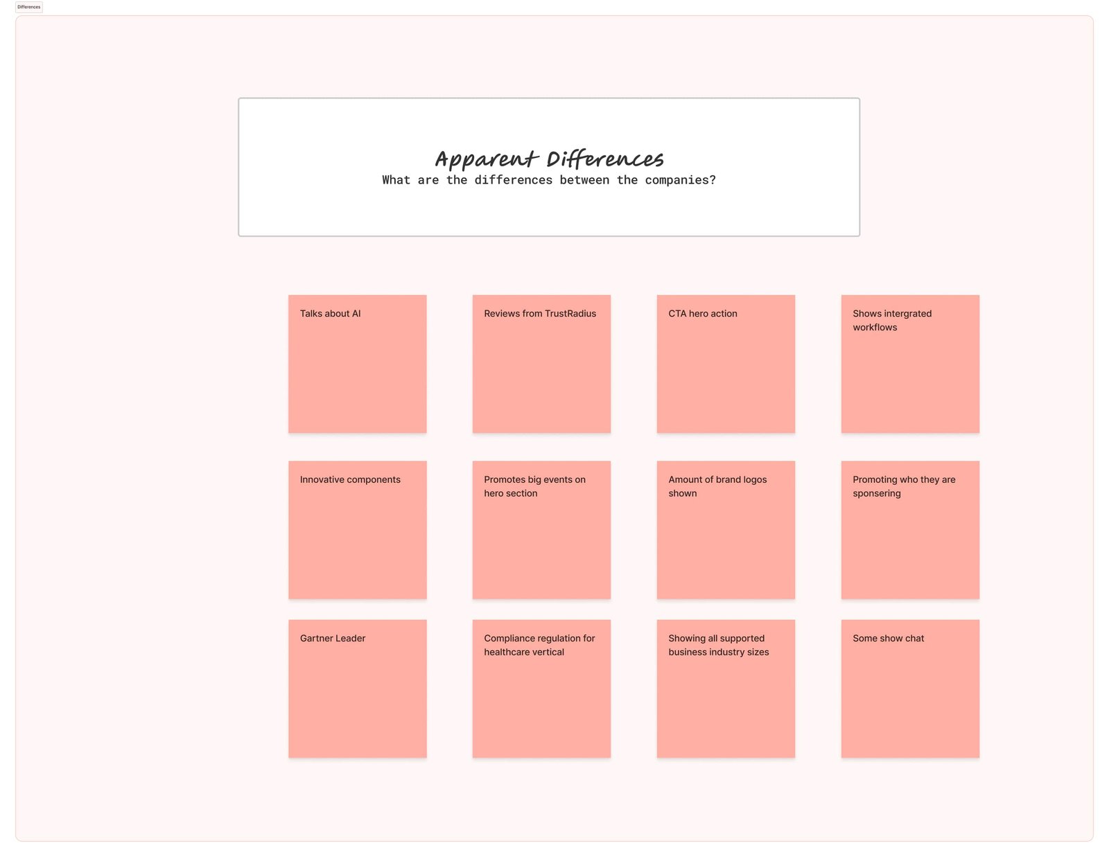
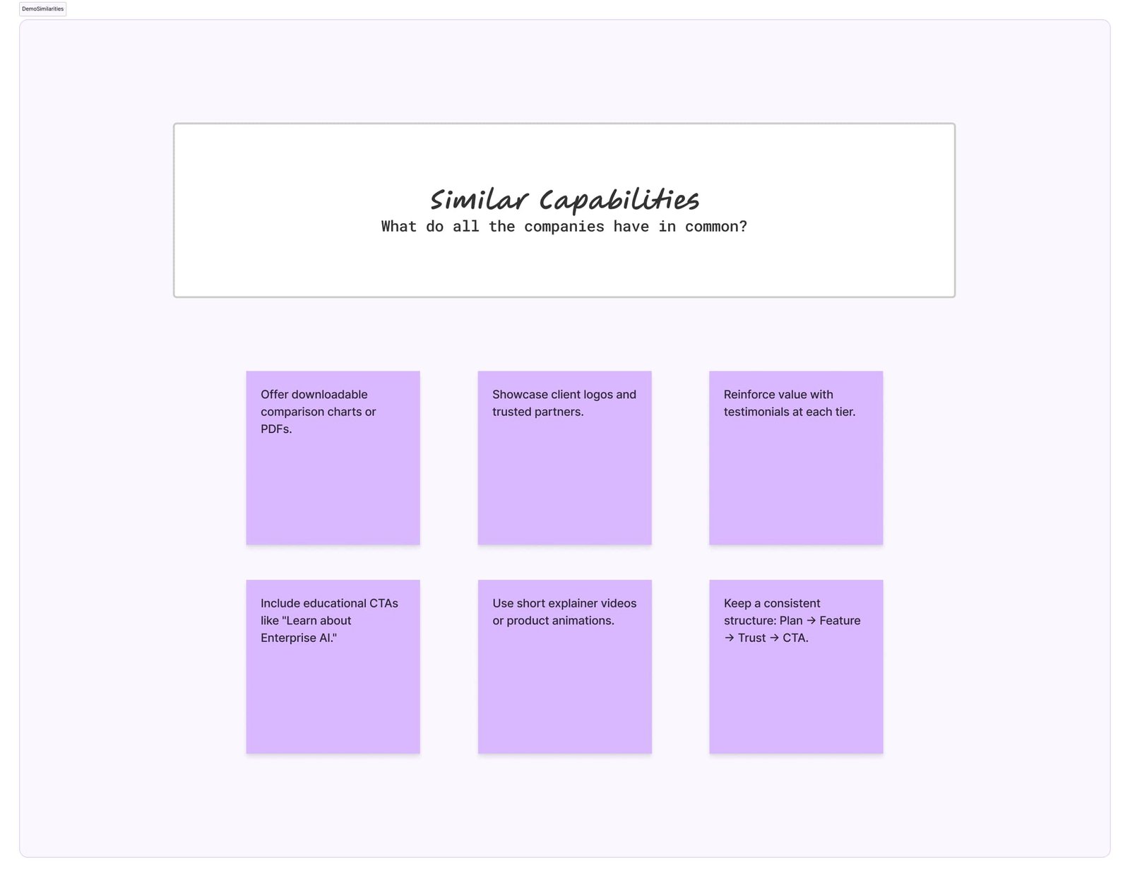
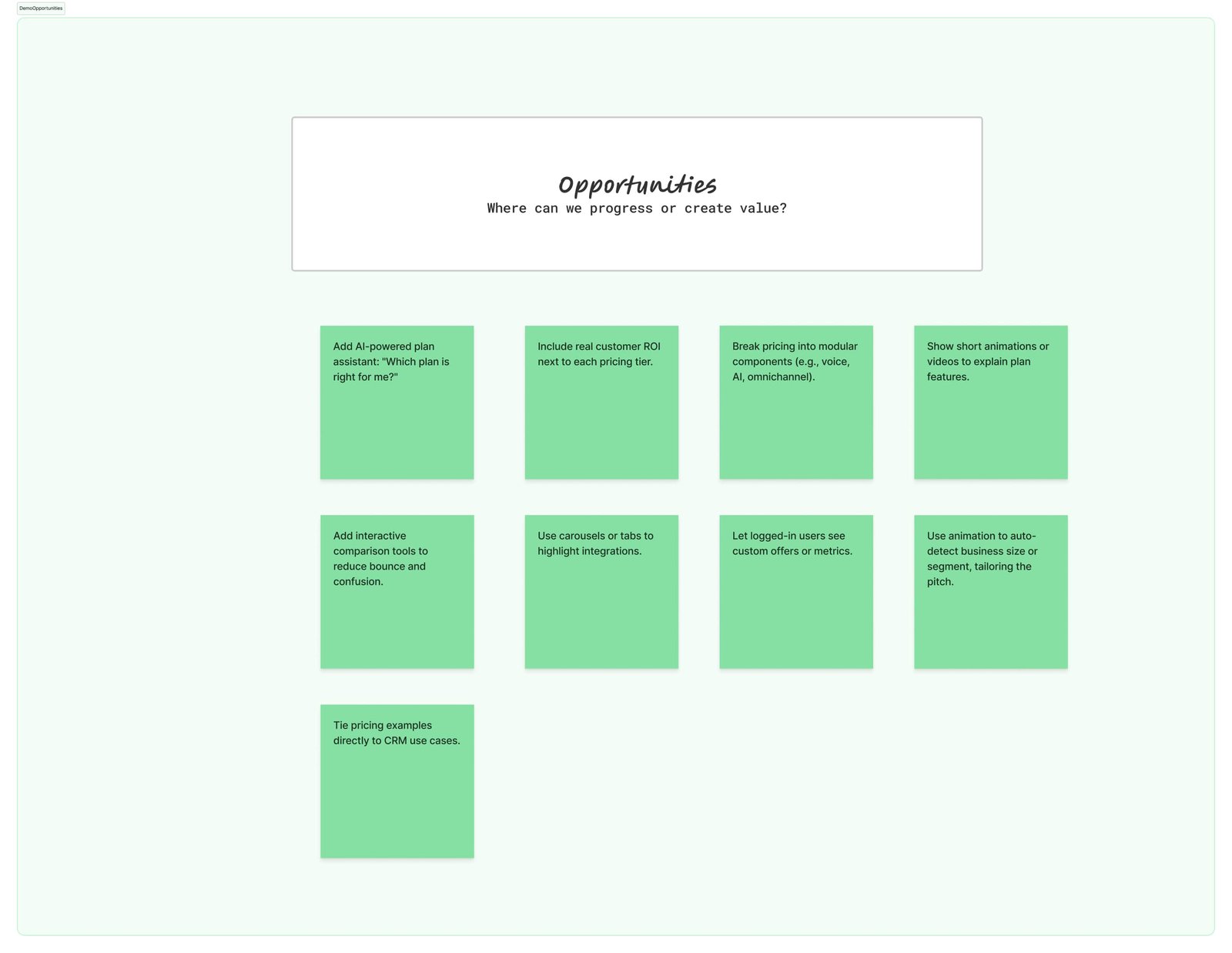
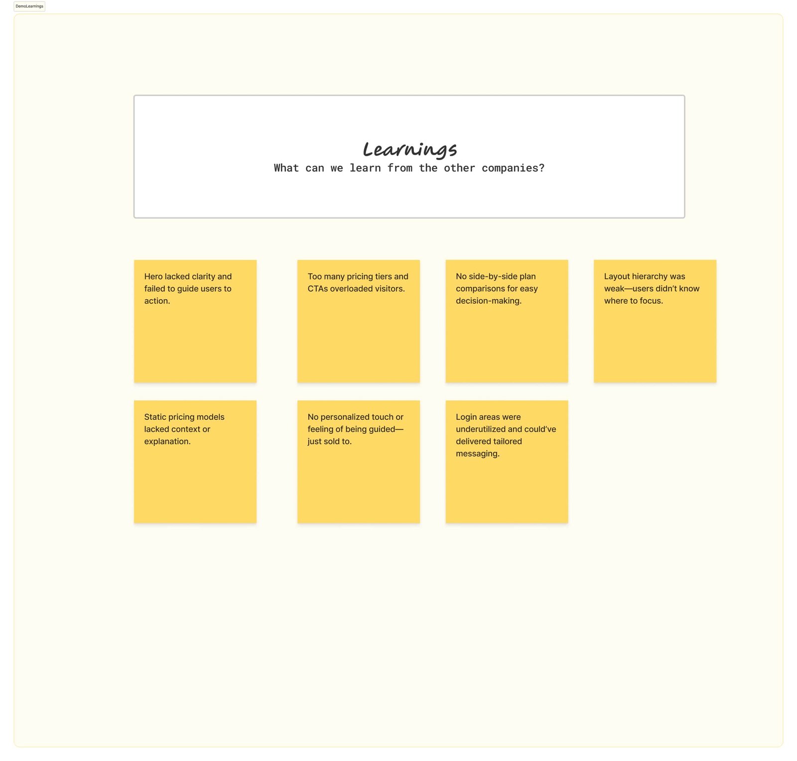
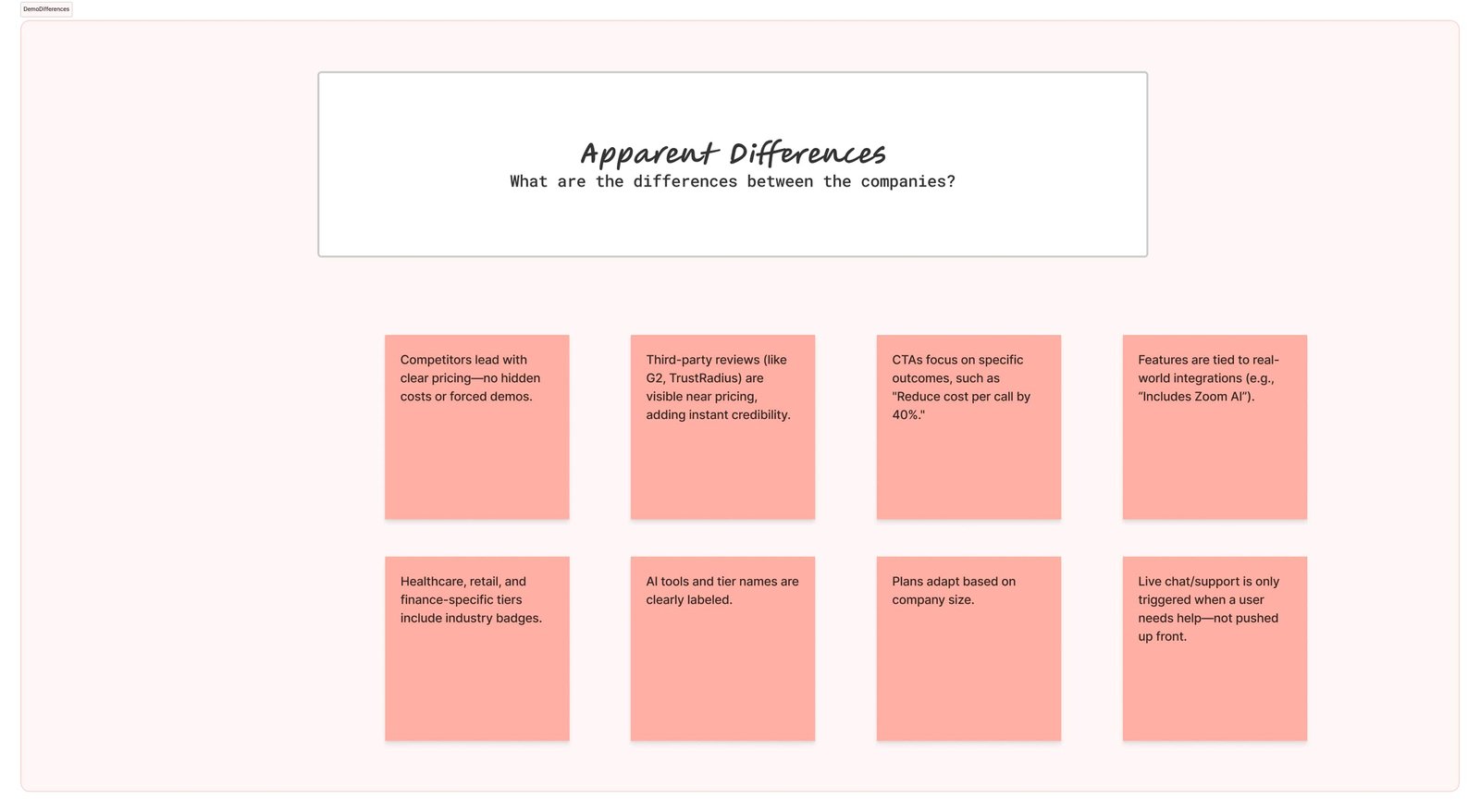
Key Findings:
Similarities: Competitors all showcase logos, certifications, and generic “secure AI” messaging—yet these often lack depth or proof of true compliance capabilities.
Opportunities: Position PDAI as the platform that simplifies compliance end-to-end, with a clear hierarchy around automated workflows, privacy-first AI infrastructure, and real-time audit readiness—delivered in a way that executives, legal teams, and engineers can all understand.
Learnings: Enterprise buyers want fewer silos and less cognitive friction when managing compliance across tools. PDAI’s “compliance made simple” narrative resonates when communicated early, with outcomes tied to reduced risk and faster audits.
Differences: We emphasized verifiable trust signals (certifications, regulatory alignment), highlighted PDAI’s ability to automate compliance across industries, and showcased how its privacy-first architecture protects data without slowing operations.
The 5 W's
1. Who
Enterprise leaders, CISOs, compliance officers, and IT teams responsible for protecting sensitive data and meeting regulatory requirements.
2. What
A privacy-first AI platform that automates compliance workflows, secures data end-to-end, and delivers verifiable trust signals.
3. Where
Works seamlessly across enterprise systems, cloud environments, and data pipelines, ensuring secure operations at every touchpoint.
4. When
During audits, regulatory reviews, and everyday data handling—any time compliance risk could impact trust, revenue, or operations.
5. Why
To reduce regulatory risk, simplify complex compliance processes, and give enterprises confidence in how their data is managed.
Through stakeholder feedback, we aligned on sequencing the story: highlight PDAI’s privacy-first AI foundation first, then expand into automated workflows, audit readiness, and industry-specific compliance support. With alignment set, we iterated on wireframes and content flows.
Impact
This research informed the Pristine Data AI website redesign: we clarified the privacy-first value proposition, restructured CTAs around demo requests and compliance audits, and simplified the visual flow to match enterprise buyer expectations. The redesign showcased PDAI’s unique differentiators—automated compliance workflows, verifiable trust signals, and secure AI architecture—positioning the brand as a credible, enterprise-ready solution in a crowded data security market.
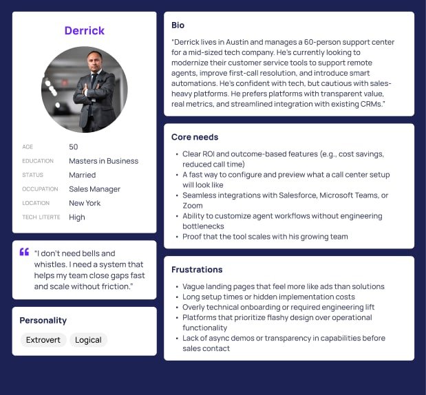
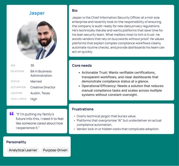
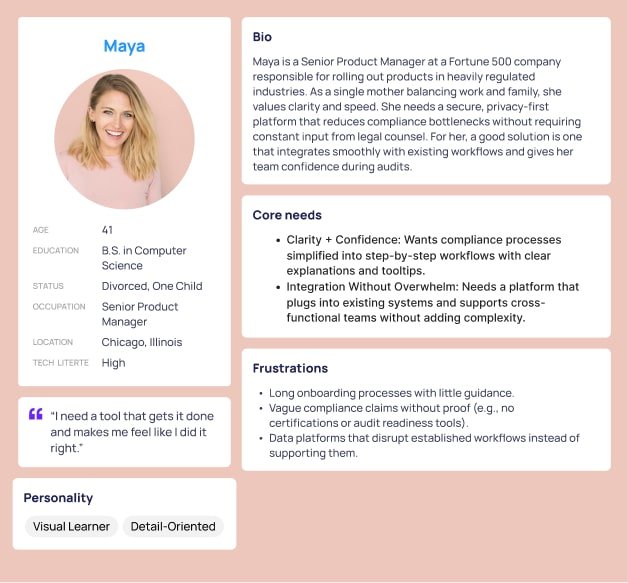
Persona
Stakeholders wanted a site that’s easy to navigate, clearly structured, and able to build trust quickly with enterprise buyers. Visitors are CISOs, compliance officers, legal teams, and IT leaders who need confidence that their sensitive data is secure, their workflows remain compliant, and their organization can adapt to evolving regulations without added complexity.

Solution
Designed a responsive website that communicates Pristine Data AI’s value clearly and builds trust with enterprise buyers through simplicity, modern visuals, and a strategic content hierarchy. By streamlining navigation and minimizing cognitive load, the site highlights PDAI’s differentiators—privacy-first AI, automated compliance workflows, and verifiable trust signals—while supporting exploration and driving demo requests from security and compliance decision-makers.
Key Takeaways
1. Trust is the entry point: Above-the-fold must immediately communicate PDAI’s privacy-first foundation and regulatory alignment to earn enterprise confidence.
2. Outcomes over features: Buyers engage more when messaging ties compliance automation and AI security directly to reduced risk, faster audits, and operational efficiency.
3. Flow shapes credibility: A clear sequence—problem of regulatory complexity → PDAI’s solution → proof through certifications and case studies → call-to-action—guides decision-makers smoothly toward conversion.
Web Platform
This was the first time building a web platform presence for Pristine Data AI. Working directly with the founder on a daily basis, I translated complex ideas about privacy-first AI and compliance automation into a clear, conversion-focused design. The platform page was structured to immediately convey PDAI’s core value—secure, regulation-ready data intelligence—while using a modern layout, strategic trust signals, and outcome-driven CTAs to engage enterprise buyers and drive demo interest from day one.
- User: B2C,B2B
- June, 2022
- Product Designer (me)
- Ideation: Wireframes
- Visual Design: Figma, FigJam
- Duration
- 3 months
Hypothesis
If we lead with a single, prominent CTA and a clear, outcome-focused headline about privacy-first AI and automated compliance, then structure the content into scannable sections that highlight differentiators and trust signals, we’ll increase demo requests and enterprise engagement within the first 60 days post-launch.
Research
Competitive scans showed top players lean on animation, dynamic content, and focused CTAs. By introducing a clear CTA, animated highlights, and a simplified flow, we aimed to boost conversions significantly.
How Might We
1. How might we prioritize clarity, reduce friction, and guide enterprise buyers toward confident demo requests?
2. How might we simplify complex compliance messaging so CISOs, legal teams, and IT leaders can quickly understand value?
3. How might we surface trust signals (certifications, case studies, regulatory alignment) earlier in the buyer journey?
4. How might we improve visual hierarchy so users can quickly grasp PDAI’s differentiators—privacy-first AI, compliance automation, and secure data handling?
5. How might we create a confident, modern brand experience that blends credibility, interactivity, and clear outcome-driven messaging?
Persona
For the Pristine Data AI web platform, we designed around enterprise buyers who need clarity and confidence when evaluating compliance solutions. The experience highlights how PDAI automates complex workflows—like audit readiness, regulatory alignment, and secure data handling—without overwhelming users. By structuring information into clear, outcome-driven sections with supporting visuals, we made highly technical processes feel simple and trustworthy.
UX Design
For the Pristine Data AI web platform, we grounded the UX in both user needs and a close study of competitors in the data privacy and compliance space. We benchmarked leading platforms to identify common structures—hero sections with bold CTAs, trust signals such as certifications, and segmented solution overviews—then refined these patterns to highlight PDAI’s differentiators. The resulting experience was designed around enterprise buyers who demand clarity and confidence, showcasing how PDAI automates complex workflows like audit readiness, regulatory alignment, and secure data handling. By combining proven best practices with PDAI’s unique value, we created a web platform UX that feels both familiar and trustworthy while setting the brand apart in a crowded market.

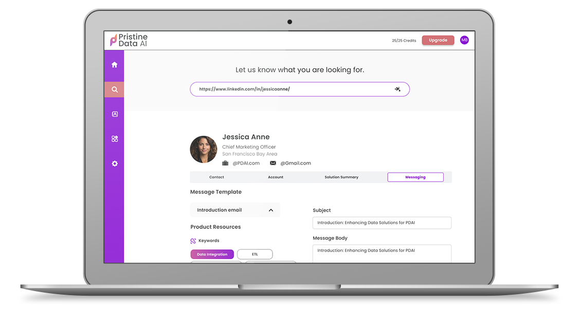
Full Page Solution
The redesigned page validates the “better together” story from headline to CTA, reinforcing why email, messaging, and calling belong in one place.