Graphic Designer
Created logos still in use today, helping startups in software and brick-and-mortar drive brand growth.These identities contributed to over $1M revenue.
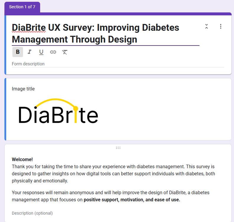
DiaBright Logo Design
Designing a Warm, Uplifting Identity for a Mental Health & Type 1 Diabetes Support Platform
- User: B2C
- August, 2023
- Team: UI/UX Designer(me)
- Tools
- Research: User surveys
- Ideation: Sketches
- Visual Design: Illustrator, Figma
- Duration
- 3 months
What was the design challenge?
The challenge was to create a logo that captured the essence of DiaBright—a mental wellness app that supports individuals with Type 1 diabetes. The identity needed to balance a clinical association (clean, modern, trustworthy) with emotional warmth, safety, and a sense of upliftment. The goal was to make the brand feel approachable and positive without losing clarity or professionalism..
Survey Insights
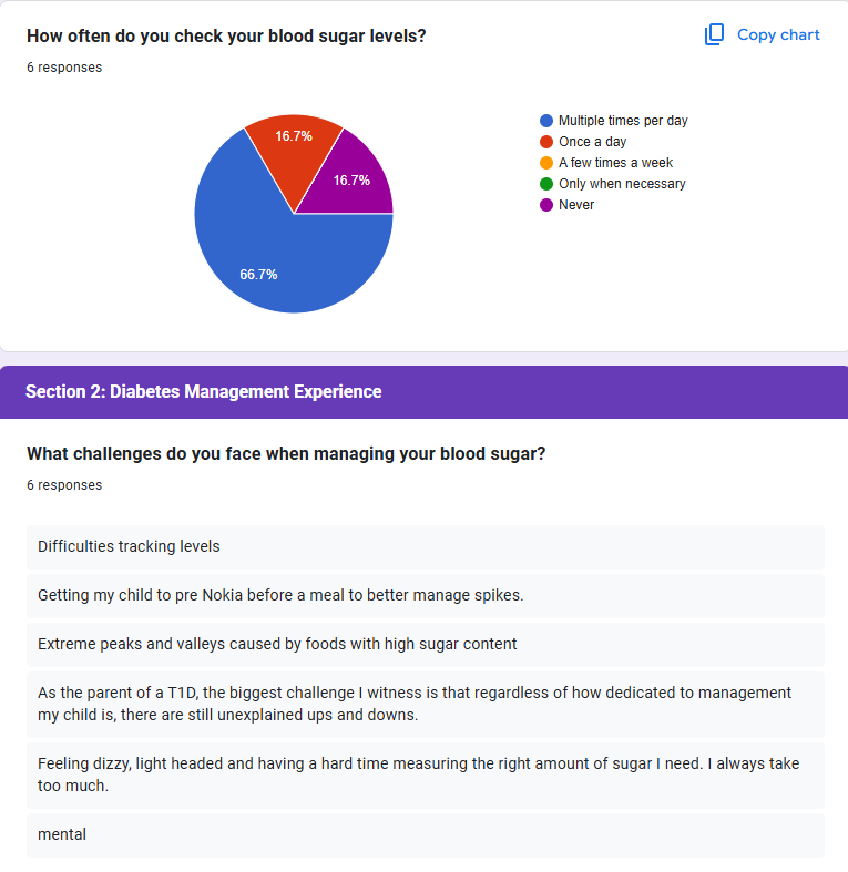
Before starting the design, I wanted to understand what people truly need from a diabetes app—especially those living with or supporting someone with Type 1 diabetes.
I created an anonymous survey to gather honest input about their daily challenges, emotional needs, and what they felt was missing from existing tools.
What I heard was clear: people wanted more than just another tracker. They were looking for emotional support, simple visuals, and something that didn’t feel overly clinical.
Responses like “I want something that doesn’t feel sterile,” “I need help balancing mental health and blood sugar swings,” and “Make it easy to use when I’m exhausted” stuck with me.
These insights became the heart of DiaBright. I designed the app and brand to feel like a source of light—calm, warm, and supportive.
The goal wasn’t just to deliver data—it was to create an experience that supported users emotionally as much as it did physically.
Design Process
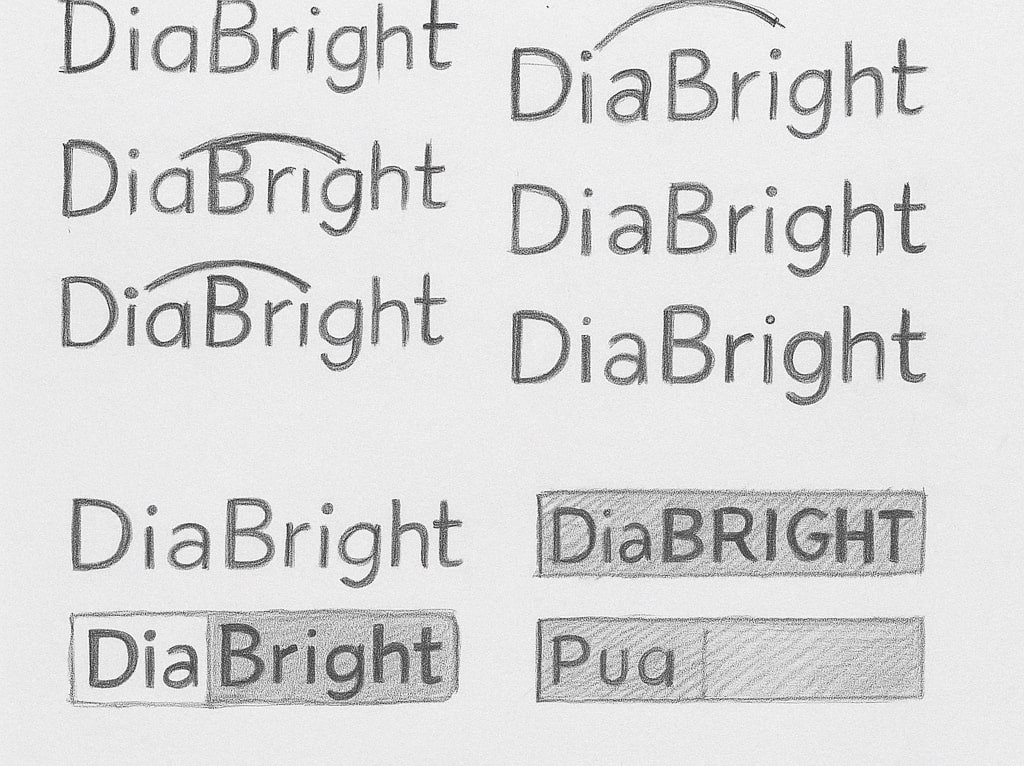
Sketching Concepts:
I began with loose sketches to explore how the letter “B” or “Bright” could embody light, movement, or emotional uplift. Several ideas focused on curve dynamics to create a bridge or arc motif.
Visual Exploration:
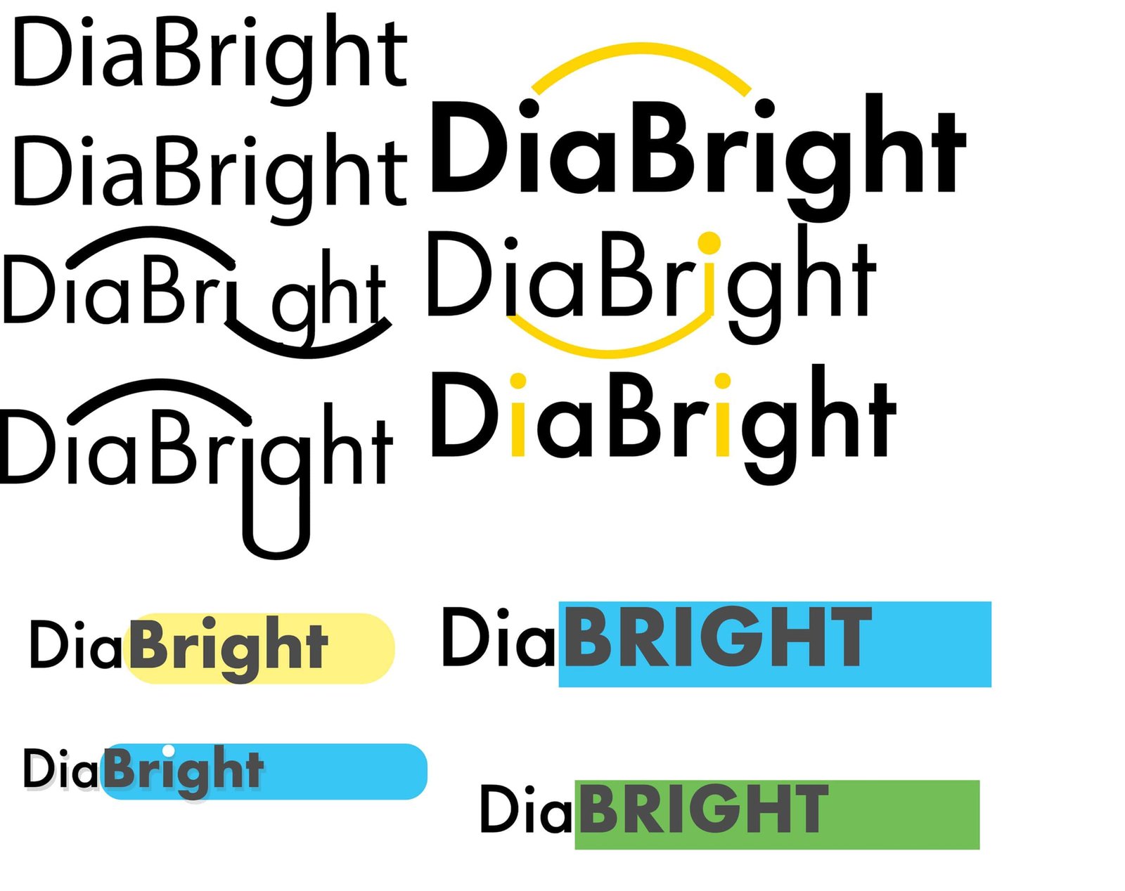
I explored multiple wordmark arrangements, including variations in weight, hierarchy, and combinations of rounded vs. geometric sans-serif fonts. From there, I tested where emphasis should lie: "Dia," "Bright," or both equally.
Arc Development:
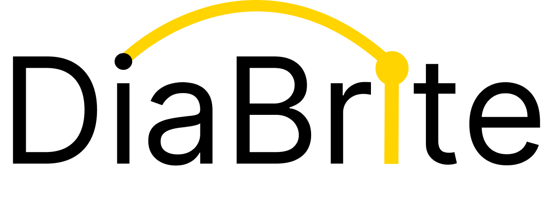
Inspired by a rising sun or a guiding arc, I drew from the imagery of journeys and balance. This evolved into a yellow arc leading from the dot of the “i” to the stem of the “t”—subtly guiding the viewer’s eye across the name.
Color Selection:
After releasing a public survey, the majority of feedback leaned toward warm tones like yellow for energy and optimism, paired with black for professionalism and contrast. I tested color blocking with accent backgrounds to explore scalability and visibility.
Iteration & Feedback:
I tested logo lockups in real-world settings—mockups on app screens, website banners, and cards—and refined spacing, stroke balance, and arc thickness. A final version was created using Adobe Illustrator to maintain precision.
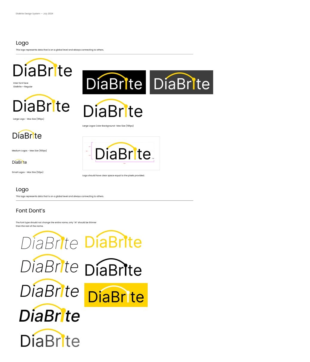
Logo Style Guide
The DiaBrite style guide serves as a foundation for consistent, clear, and emotionally supportive branding. Beyond just a logo, it outlines a system that governs visual expression across platforms—anchored by a geometric sans-serif typeface (Inter Regular) and a signature yellow arc symbolizing connection, clarity, and hope.
The style guide defines logo usage across multiple scales—large, medium, and small—to ensure clarity and legibility on everything from mobile screens to printed collateral. It also includes spacing rules that maintain visual breathing room around the mark, preserving its impact in both digital and physical environments.
Color contrast plays a critical role in accessibility, and the style guide provides logo variations on dark and light backgrounds to accommodate different use cases while remaining inclusive to all users.
A section dedicated to "Font Don’ts" reinforces consistency by showing common mistakes—such as misalignments, unapproved font weights, and incorrect color applications—that could dilute brand integrity. By establishing what not to do, the guide protects the essence of DiaBrite’s visual identity.
During development, I discovered a trademark conflict with the original name, “DiaBright.” To stay true to the brand while ensuring legal clarity, I modified the spelling to “DiaBrite.” This change allowed me to move forward without compromising the concept—still highlighting brightness and support, but now with a distinctive visual identity backed by a robust style system.
Final Outcome
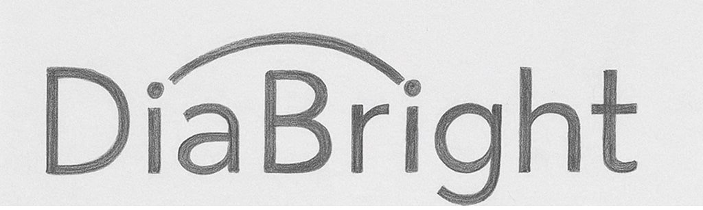
The final DiaBright logo features a clean geometric sans-serif wordmark with subtle friendliness, designed to feel calm and approachable without losing its professional tone.
A bold yellow arc reinforces the name “Bright” while also serving as a metaphor for connection, clarity, and hope—qualities at the heart of both diabetes care and emotional well-being.
Strong contrast and clean composition ensure the logo is accessible and legible at any size, from mobile apps to printed collateral.
The visual identity has been praised for being both professional and emotionally supportive—a perfect match for a mental health platform built around empathy and empowerment.
During the design phase, I discovered that another company had already trademarked the name “DiaBright” with the “gh” ending. To protect the brand and still honor the original vision, I pivoted the spelling to end with a “t”—becoming DiaBrite.
This small change allowed me to maintain the same meaning while opening up new creative opportunities for the visual identity.
Pristine Data AI Logo Design
Designing a clean, modern identity that reflects Pristine Data AI’s mission to make complex data feel accessible, actionable, and human. The logo embodies clarity and intelligence—built to match the platform’s ability to simplify messy data and empower organizations to make smarter, faster decisions with confidence.
- User: B2B
- June, 2024
- Team: UI/UX Designer(me)
- Tools
- Research: Competitive Research
- Ideation: Sketches
- Visual Design: Illustrator, Figma
- Duration
- 1 month
What was the design challenge?
The challenge was to design a logo that reflects Pristine Data AI’s ability to simplify messy, complex data into clear, actionable insights. The identity needed to convey intelligence, precision, and innovation—while remaining approachable and trustworthy to both technical and non-technical users. The goal was to visually communicate clarity, speed, and human-centric AI in a clean, modern form.
Design Process
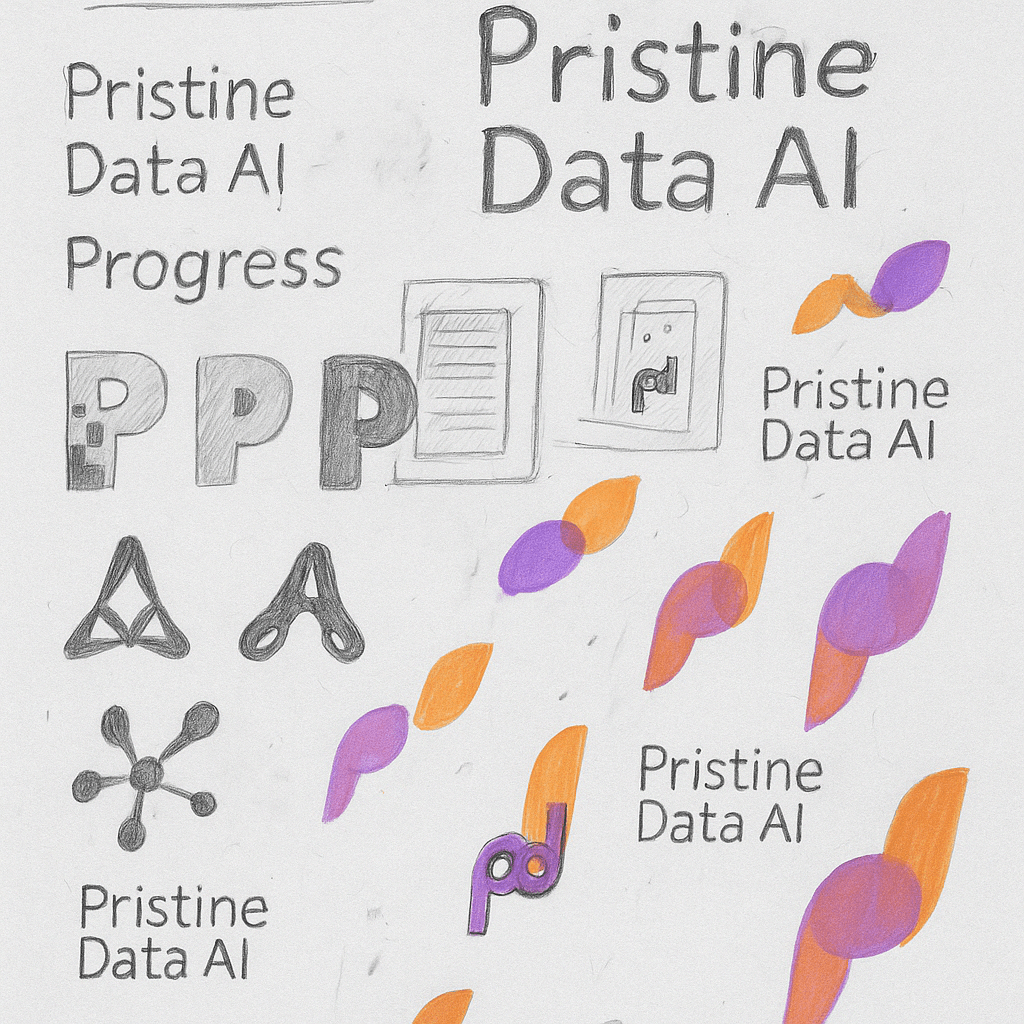
Sketching Concepts:
I started by loosely sketching different letterforms and abstract shapes that could capture Pristine Data AI’s focus on clarity, intelligence, and connection. Early ideas explored data flows, neural structures, and simplified network nodes.
Visual Exploration:
I experimented with different “P” shapes, data molecules, and fluid gradients to reflect transformation and motion. Some designs leaned toward bold and futuristic; others aimed to be more human-centric and clean.
Symbol Development:
The final symbol was inspired by the concept of pristine motion—data moving cleanly from one state to another. The mark evolved into an abstract form with layered transparency and circular movement, suggesting speed, flow, and clarity.
Color Selection:
I chose a warm orange and soft violet palette to balance energy with trust. Gradients were introduced to convey intelligence and forward momentum, aligning with Pristine’s tone of innovation and clarity.
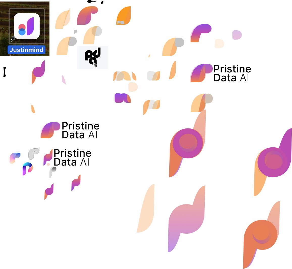
Iteration & Feedback:
Throughout the process, I tested designs across dark and light modes, icon sizes, and paired logotypes. I refined alignment, kerning, and color balance based on feedback and UI mockups. Final assets were polished in vector format for consistency across use cases.
Digital Refinement
The final Pristine Data AI logo embraces a modern, abstract symbol that communicates clarity, intelligence, and forward momentum. It combines a fluid gradient form with circular and leaf-like shapes—representing data flow, motion, and human-centered AI.
I imported early sketches into Adobe Illustrator and used the Pen and Curvature tools to trace and refine the forms digitally. From there, I experimented with different shapes, stroke weights, and layout variations to balance visual movement and symmetry.
I explored multiple icon and wordmark combinations—adjusting spacing, layering gradients, and scaling proportions to ensure consistency and versatility across sizes. I also tested how the symbol behaved as a standalone “P,” in tight spaces like favicons or mobile app icons.
The gradient blend of violet and orange symbolizes transformation and duality: logic meets creativity, and technology meets human empathy. This palette brings warmth to a space often dominated by cold, corporate tech branding.
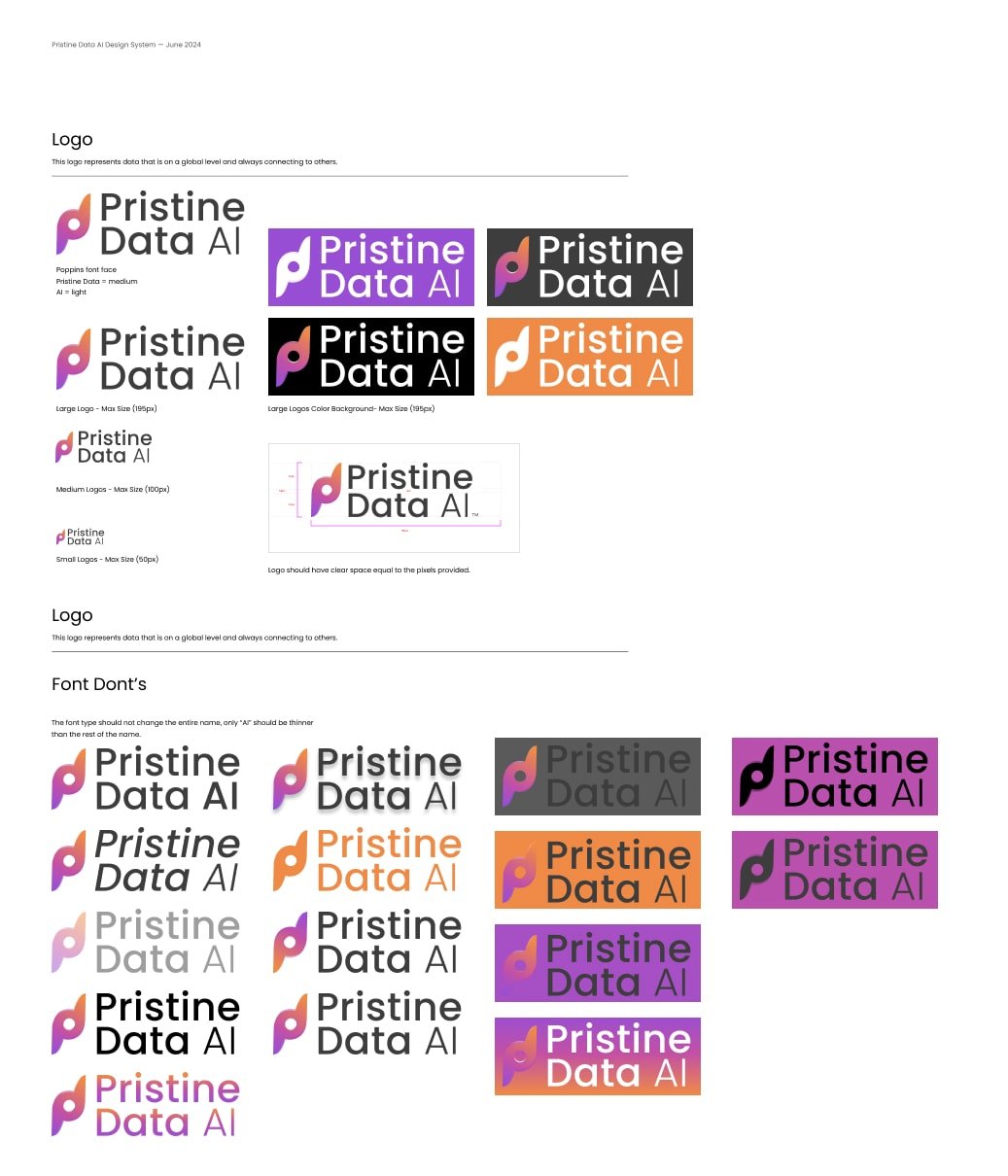
Logo Style Guide
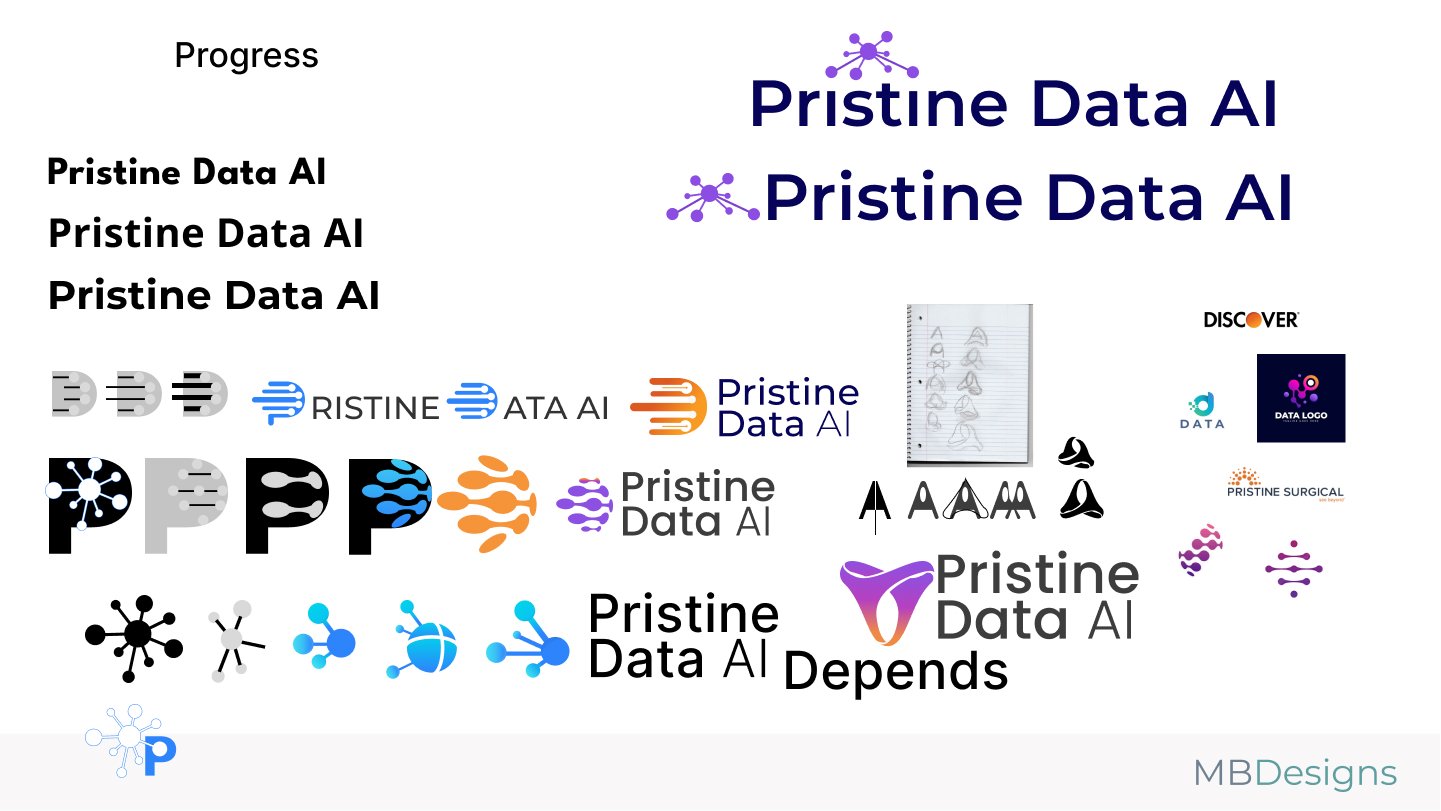
The Pristine Data AI style guide establishes a bold yet approachable visual identity for a brand operating at the intersection of trust, clarity, and innovation in artificial intelligence. Designed using the Poppins typeface and a carefully calibrated color palette, the system ensures scalability and consistency across enterprise dashboards, startup decks, and user-facing products.
The primary mark consists of a custom “P” monogram with an abstract data flow motif, symbolizing structure, insight, and connectivity—core traits of the Pristine Data AI platform. The logotype pairs this symbol with a three-part text lockup, keeping “Pristine,” “Data,” and “AI” distinguishable while harmonizing them visually.
The style guide defines precise logo applications for various sizes—from 165px hero units to compact 50px usage—ensuring legibility in everything from mobile devices to enterprise software. It also includes usage guidance for color backgrounds, including light, dark, and bold tone applications, maintaining accessibility and contrast throughout.
A strict set of “Font Don’ts” reinforces brand clarity. The rules prevent misuse such as inconsistent weights, altered color gradients, unapproved type substitutions, or incorrect emphasis of “AI”—all of which can dilute the strength and reliability the logo is meant to convey.
Clear padding and pixel spacing guidelines help protect the mark’s integrity, ensuring it’s never visually crowded or misaligned. These boundaries are essential for maintaining professionalism and clarity—two principles that reflect Pristine Data AI’s value proposition of precise, intelligent insights delivered through beautifully simple design.
Final Outcome
This final outcome positions Pristine Data AI as a trustworthy, next-generation analytics brand that’s equally at home in enterprise dashboards, startup pitch decks, and user-first applications.

The Floor Doctor Logo Design
Designing a bold, trustworthy identity that reflects The Floor Doctor’s commitment to quality craftsmanship and reliable service.
- User: B2C
- June, 2024
- Team: UI/UX Designer(me)
- Tools
- Research: Competitive Research
- Ideation: Sketches
- Visual Design: Illustrator, Figma
- Duration
- 1 month
What was the design challenge?
The challenge was to redesign The Floor Doctor’s logo to better reflect the company’s trusted reputation and hands-on expertise in flooring care and restoration. The identity needed to feel professional and dependable while also standing out in a highly service-driven industry. The goal was to create a visual mark that communicates cleanliness, craftsmanship, and confidence—mirroring the brand’s mission to bring floors back to life with precision and pride.
Design Process
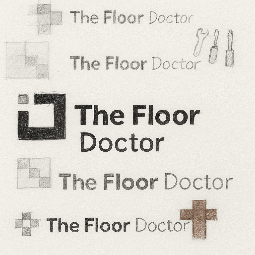
Sketching Concepts:
I began by sketching different wordmark styles and simple tool-based icons that could visually connect to The Floor Doctor’s core services—restoration, repair, and cleanliness. Early concepts played with bold letterforms and subtle references to flooring tools and surfaces.
Visual Exploration:
I explored various typefaces and icon arrangements that balanced strength and approachability. Some directions leaned into bold, industrial looks, while others embraced cleaner, more modern layouts with simple floorboard cues or checker patterns.
Symbol Development:
The final logo direction was inspired by the idea of precision and craftsmanship—clean lines that reflect freshly finished floors, paired with a trustworthy, no-nonsense typeface. I refined these into a mark that conveys restoration, reliability, and pride in the craft.
Color Selection:
A deep slate tone was chosen for its professionalism and contrast, paired with a warm neutral accent to suggest cleanliness and care. The palette works well across uniforms, vehicles, and web applications—ensuring visibility and cohesion in all environments.
Digital Refinement
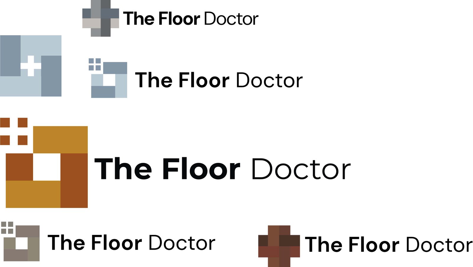
The final Floor Doctor logo pairs bold, geometric tile shapes with clean, modern typography to reflect the brand’s hands-on craftsmanship and trustworthy service. The visual balance between structure and simplicity was key in capturing both professionalism and approachability.
I brought the initial sketches into Adobe Illustrator and began tracing the modular square concepts using the Shape Builder and Pen tools. I experimented with different tile formations—grids, crosses, and corner blocks—each representing care, precision, and restoration.
Various color options were tested—ranging from cool concrete tones to warm hardwood hues. In the end, earthy shades of brown and gold were chosen to reflect warmth, durability, and grounded expertise.
I refined proportions, alignment, and color blocking to ensure the mark was scalable and clear across digital and print use cases—from vehicle decals and uniforms to social icons and invoices. The final mark delivers a sense of restoration, order, and trust—core to The Floor Doctor’s identity.
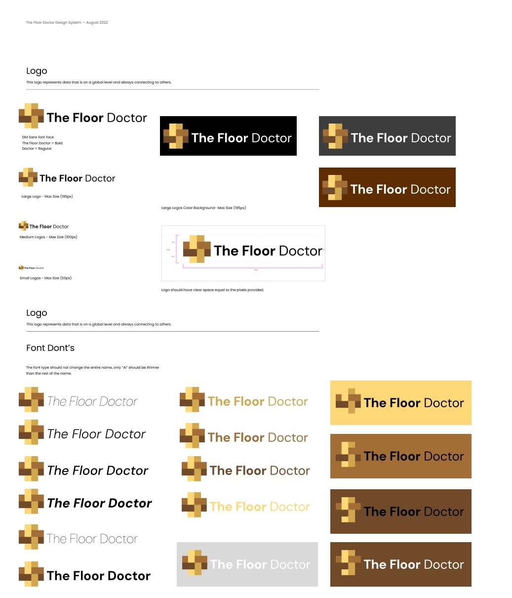
Logo Style Guide
The Floor Doctor’s style guide outlines a robust visual system built to evoke trust, craftsmanship, and reliability. The design centers around a pixel-like woven tile icon—representing structure, repair, and precision—all core attributes of the brand’s flooring expertise. This distinctive mark pairs seamlessly with a bold and modern wordmark using DM Sans, with “The Floor” in bold and “Doctor” in regular weight for subtle contrast and emphasis.
The style guide provides detailed rules for logo sizing, ensuring clarity across use cases—from vehicle wraps and uniforms to business cards and mobile sites. Logo sizes are clearly defined as large (165px), medium (90px), and small (50px), and spacing rules ensure ample breathing room, preserving legibility and visual impact in every context.
Multiple background color variations are included to support flexible branding—whether placed on white, black, warm browns, or golden yellows. These color choices reinforce the warmth and durability associated with wood, tile, and premium craftsmanship.
A dedicated “Font Don’ts” section educates users on what not to do: incorrect fonts, improper color combinations, inconsistent weights, and poor contrast applications that dilute brand recognition. These examples protect the brand’s integrity and ensure consistent, professional presentation wherever the logo appears.
Altogether, the style guide equips The Floor Doctor with a scalable, dependable identity system that communicates quality and care—whether you're seeing the logo on a construction site or browsing a digital quote form.
Final Outcome
This final outcome positions The Floor Doctor as a dependable, high-quality service brand with a modern and confident identity. The woven tile-inspired mark conveys restoration, structure, and craftsmanship—values at the heart of the company’s flooring work. Paired with a bold and clean wordmark, the logo is built to stand out across trucks, uniforms, signage, and digital platforms—reflecting professionalism, trust, and a job well done.
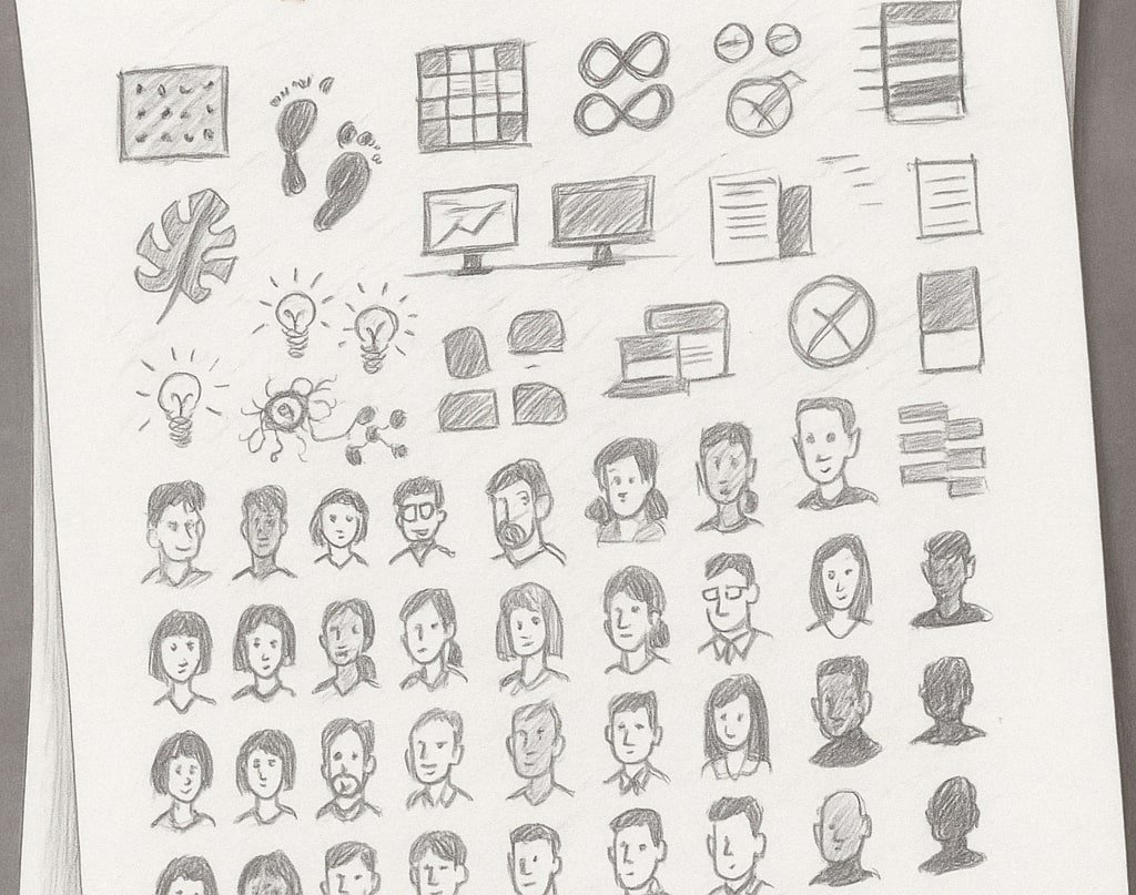
Icon work
Invoke Giant
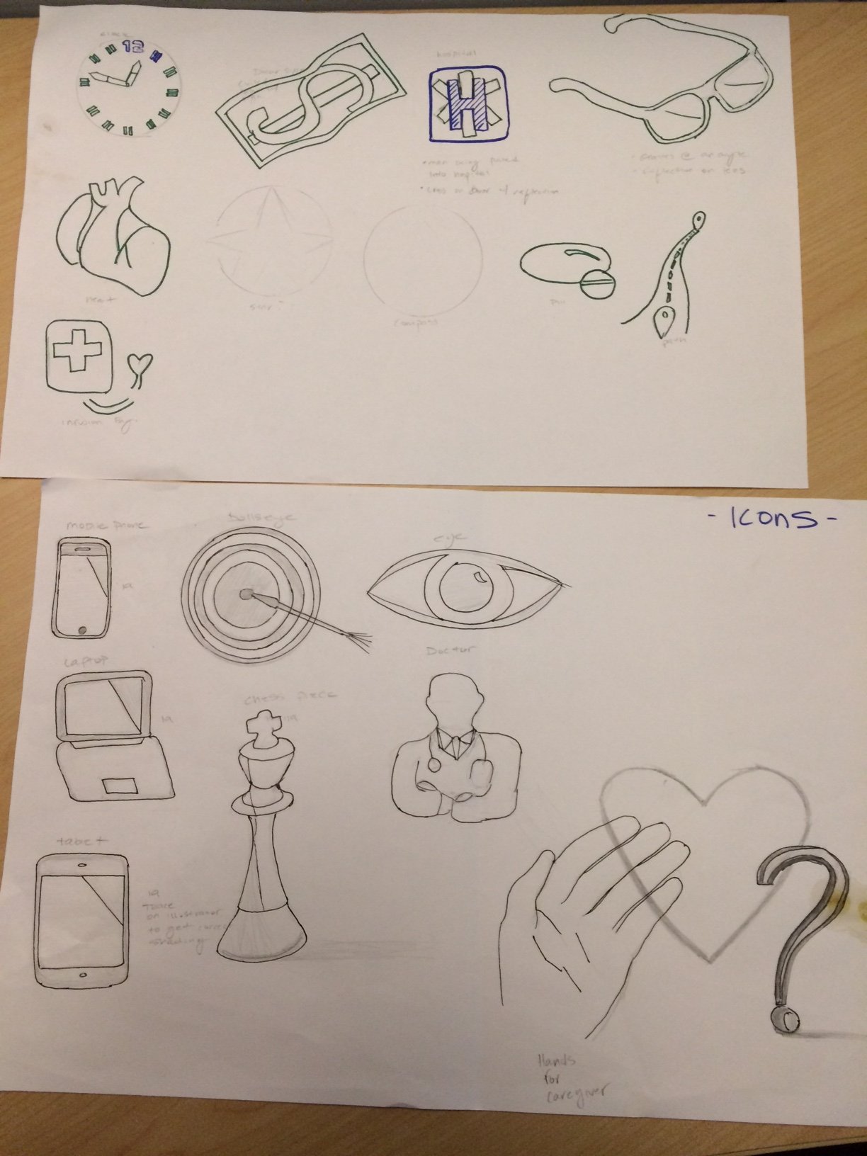
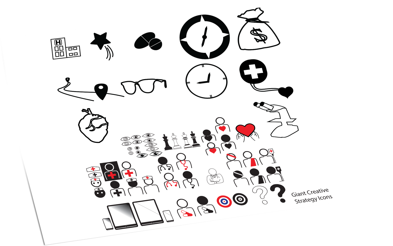
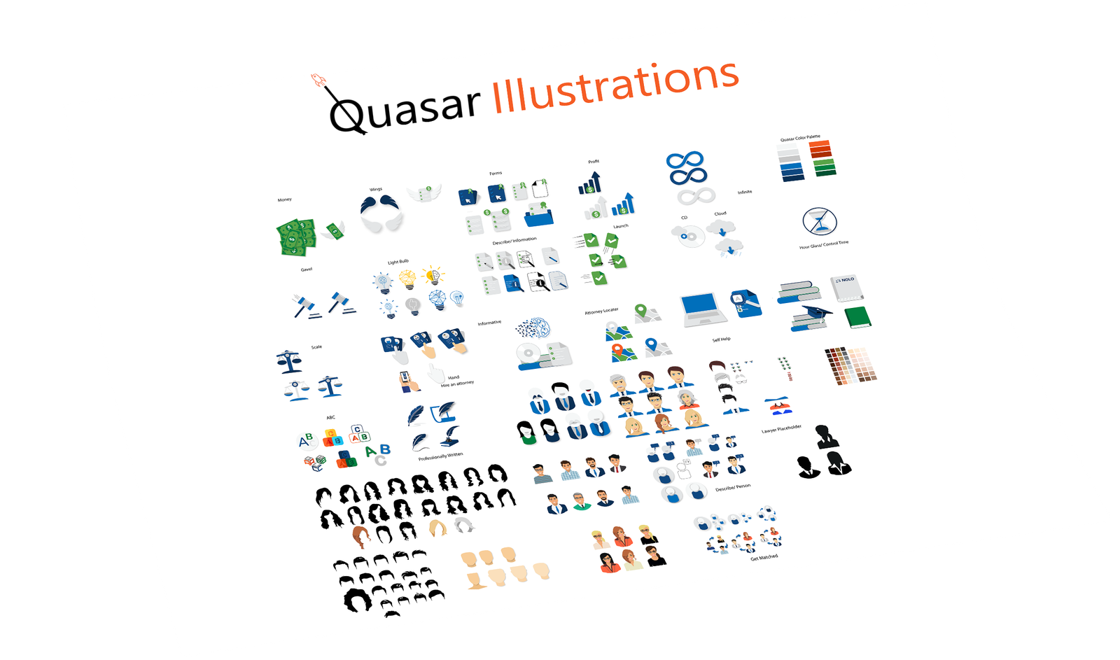
Icon work
Internet Brands