Senior Product Designer
Designed scalable UI systems for Illumy’s AI SaaS,streamlining secure communication workflows and improving task speed by 25%.
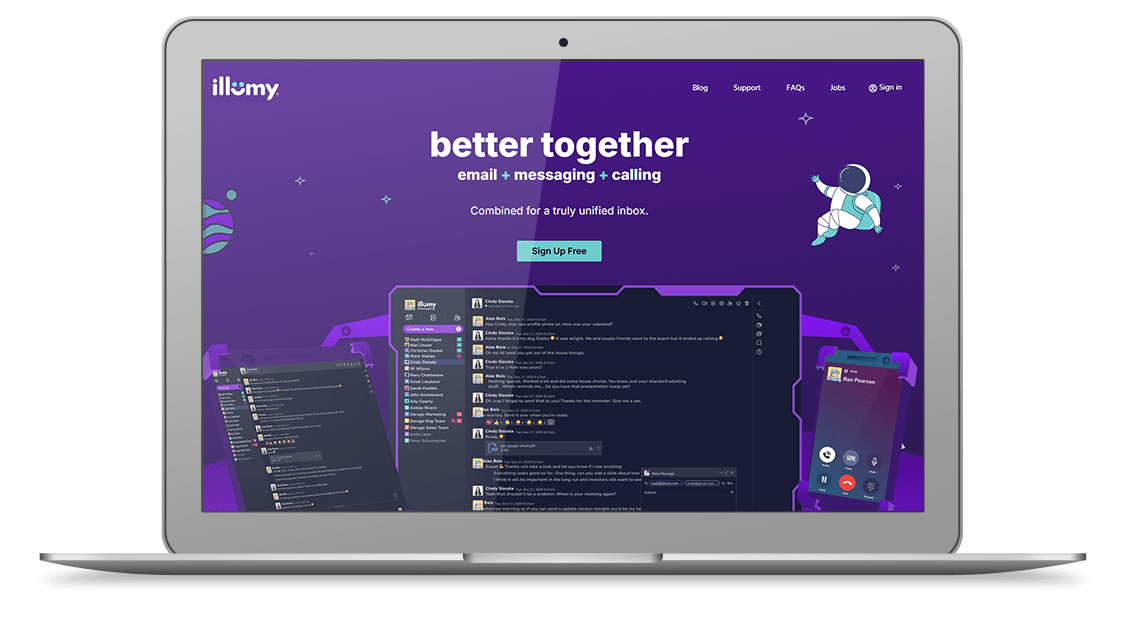
illumy Unified Communications Landing
If we redesign the illumy site to reflect our heatmaps and user journey, reduce cognitive load, elevate trust signals, and use a consistent, modern visual hierarchy—then users will engage more deeply with the unified inbox (email + messaging + calling), increasing sign-ups and improving perceived brand clarity.
- User: B2C
- June, 2022
- Team: UI/UX Designer (me)
- Tools
- Research: Hotjar, Google Analytics
- Ideation: Wireframes
- Visual Design: Figma, FigJam
- Duration
- 3 months
Problem
1. How might we:
design a unified communications website experience that feels intuitive and emotionally supportive for users exploring a combined inbox?
2. How might we:
reduce cognitive overload and simplify how features (email, messaging, calling) are presented to avoid overwhelming the user?
3. How might we:
account for different user roles (everyday consumers, prosumers) and their unique expectations when choosing a single app for everything?
4. How might we:
effectively communicate illumy’s capabilities—instant messaging, email, and HD calling—in a clear, confident, and trustworthy way?
5. How might we:
establish trust before pushing conversion—so visitors feel educated, empowered, and respected throughout their journey?
Research
Competitive Analysis and Best Practices
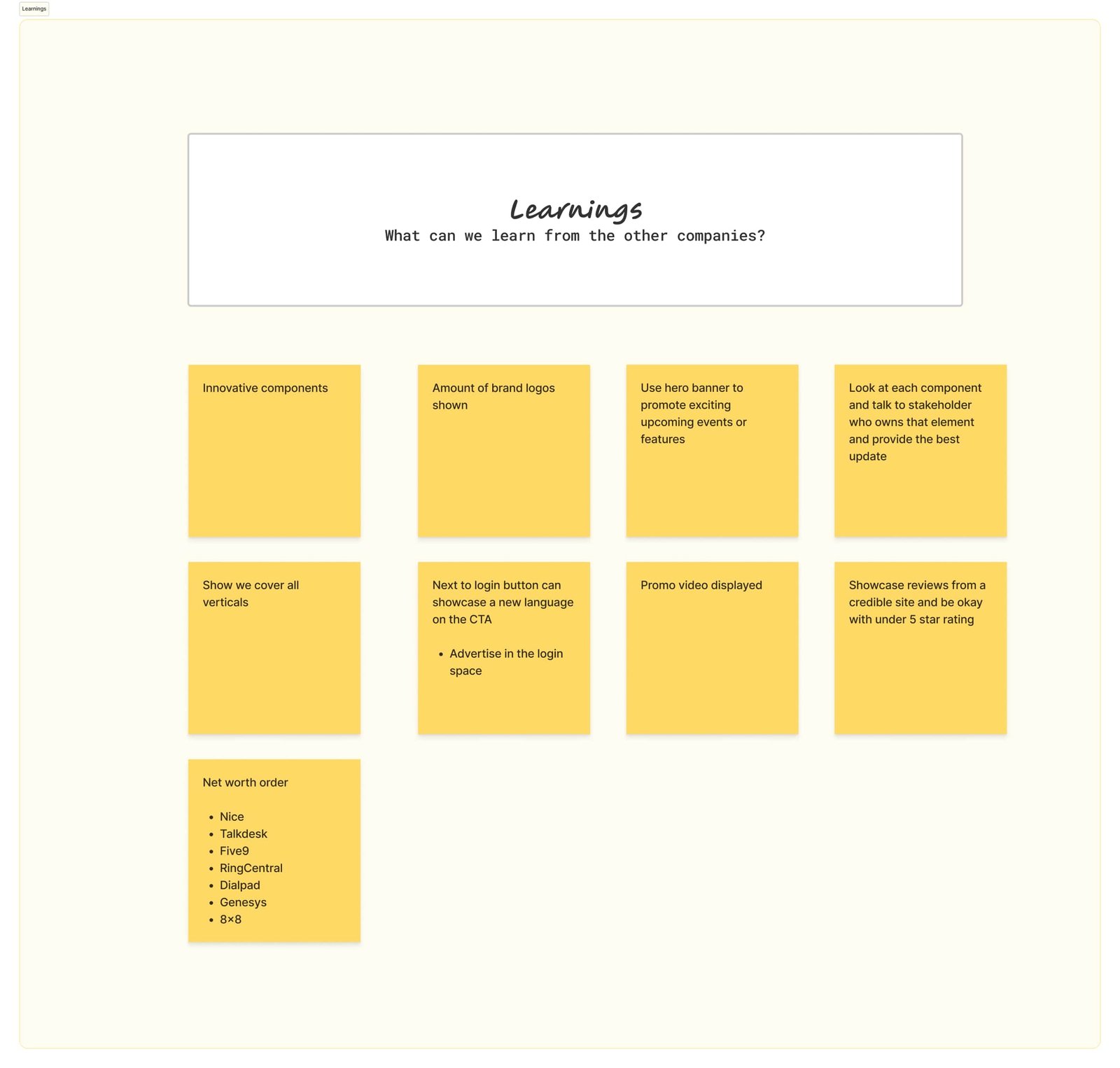
Since no internal user data was available, I relied on competitive research and industry best practices to guide Illumy’s redesign.
• Analyzed competing communication platforms (email, messaging, and calling apps) to identify common design patterns and gaps.
• Reviewed best practices around onboarding, feature clarity, and trust signals to reduce friction for new users.
• Compared visual hierarchies and CTA strategies to determine how to present Illumy’s unified inbox in the clearest way possible.
• Synthesized insights into actionable guidelines that shaped the information architecture, content sequencing, and visual direction for the platform.
Helped illumy Stand Out in a Crowded Market
During the research phase, we analyzed popular tools consumers use together—email (Gmail/Outlook), messaging (iMessage/WhatsApp/Signal/Telegram), and calling apps. Feature overlap was common, but the absence of a truly unified inbox created switching costs and fatigue. By mapping value props around “one place for email + messaging + calling,” we found strategic opportunities for illumy.
Key Findings:
Differentiators to Elevate: illumy combines email, messaging, and calling into a single inbox, reducing app-switching fatigue while keeping conversations private and secure.
Market Opportunity: Competitors emphasize single-channel excellence; illumy can modernize the UX around a multi-channel hub without sacrificing clarity.
Standardization Fatigue: Common claims like “secure messaging” and “HD calling” need reframing around outcomes—less fragmentation, more flow, one place to communicate.
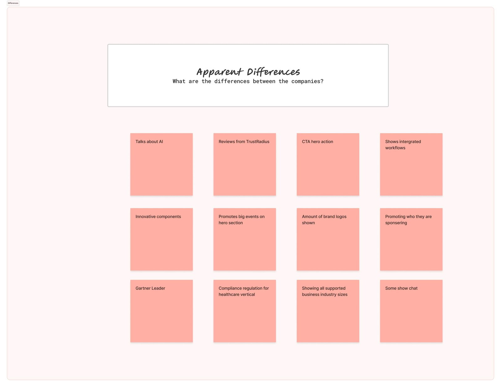
Key Findings:
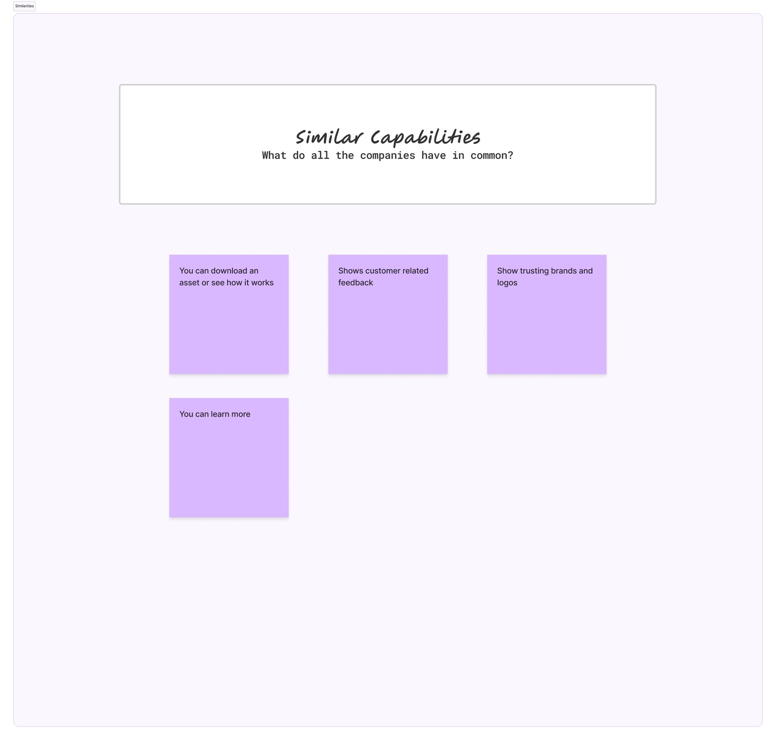
Similarities: Logos, testimonials, and “secure” messaging claims are everywhere—but often shallow.
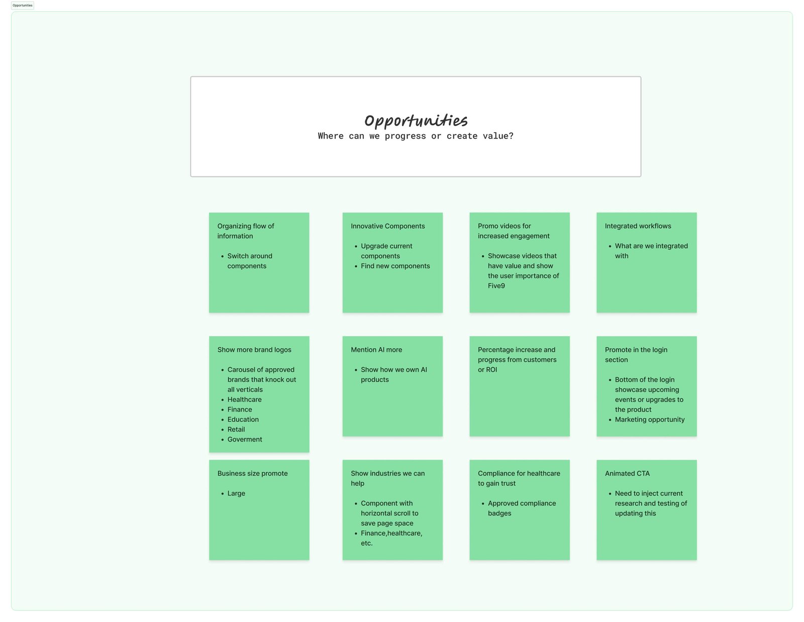
Opportunities: Elevate the unified inbox narrative with clearer hierarchy: instant messaging, email, and calling in one view—plus mobile apps and “smart contacts.”
Learnings: Users want fewer tabs and less cognitive friction. Illumy’s “better together” story resonates when surfaced early and simply.
Differences: We emphasized trust signals, clarified the benefits of one inbox across devices, and showcased how “smart contacts” keep info current without hassle.
The 5 W's
1. Who
People tired of juggling multiple apps who want their conversations in one place.
2. What
A unified inbox—email + messaging + calling—modern, private, and secure.
3. Where
Works on desktop and mobile, across platforms.
4. When
From quick texts to long-form emails to HD calls—any time connection matters.
5. Why
To reduce fragmentation and guide users toward clear, confident communication.
Through stakeholder feedback, we aligned on sequencing the story: unified inbox first, then details like mobile apps and smart contacts. With alignment set, we iterated on wireframes and flows.
Impact
This research informed the landing redesign: we clarified the unified value prop, restructured CTAs, and simplified the visual flow to match user expectations while showcasing what illumy uniquely delivers.
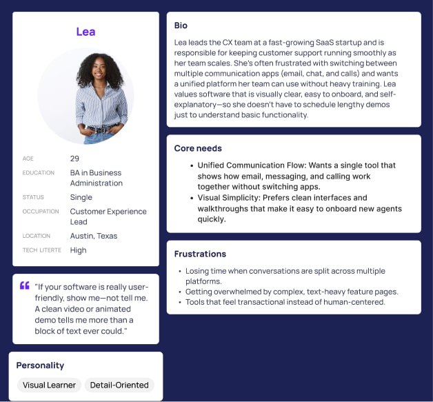
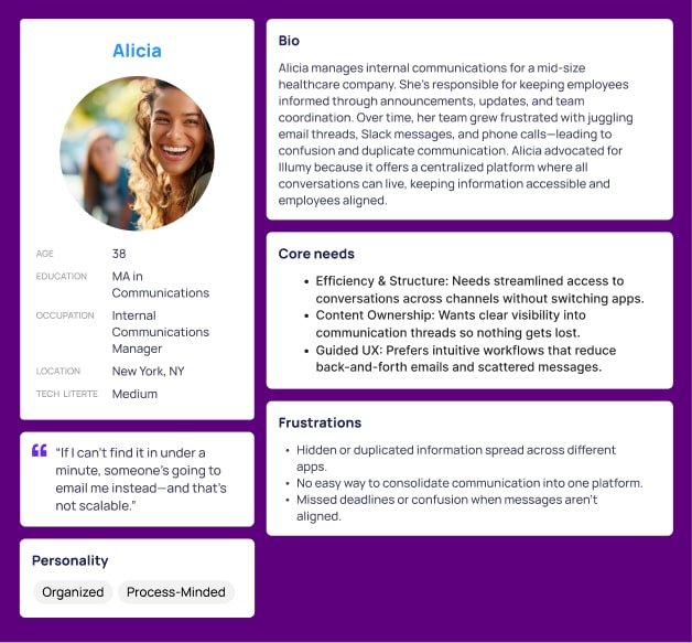
Persona
Stakeholders wanted a site that’s easy to navigate, clearly structured, and fast to build trust. Visitors are everyday consumers and prosumers who want email, messaging, and calling together—without losing privacy, clarity, or control.
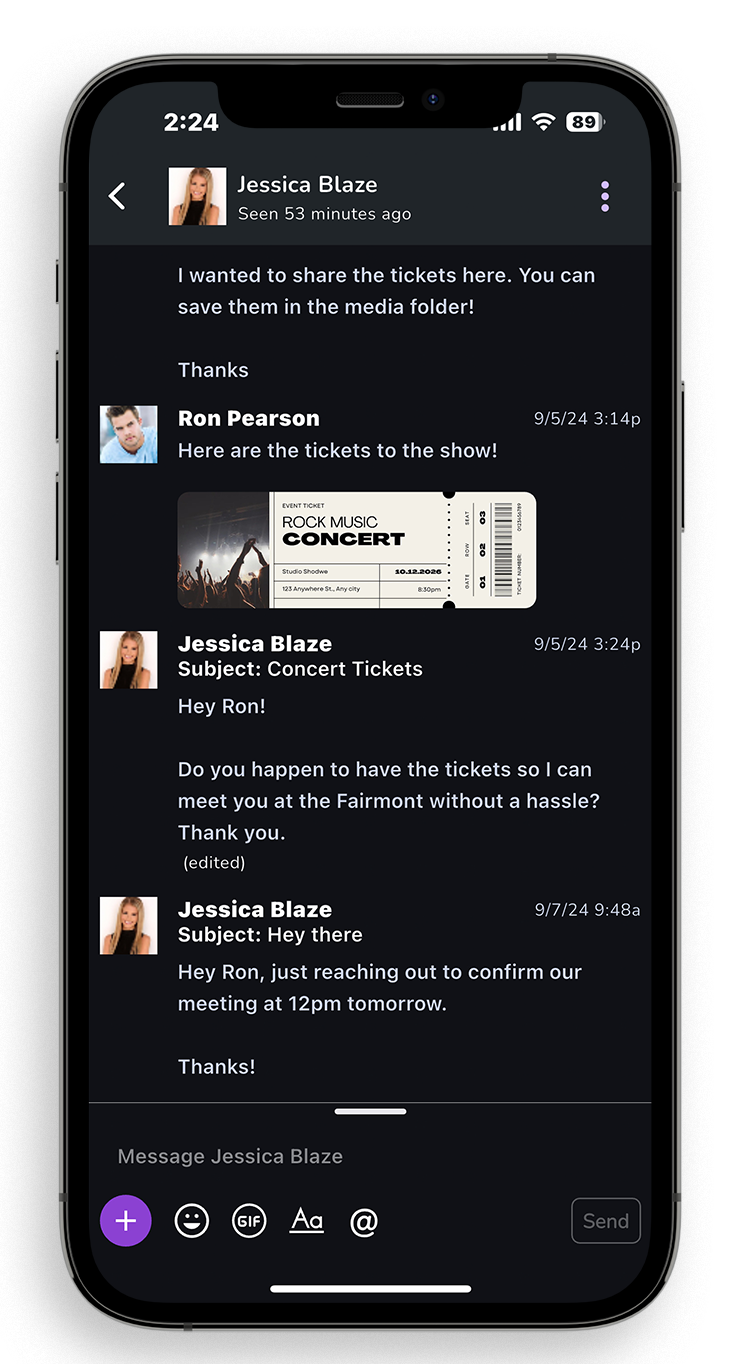
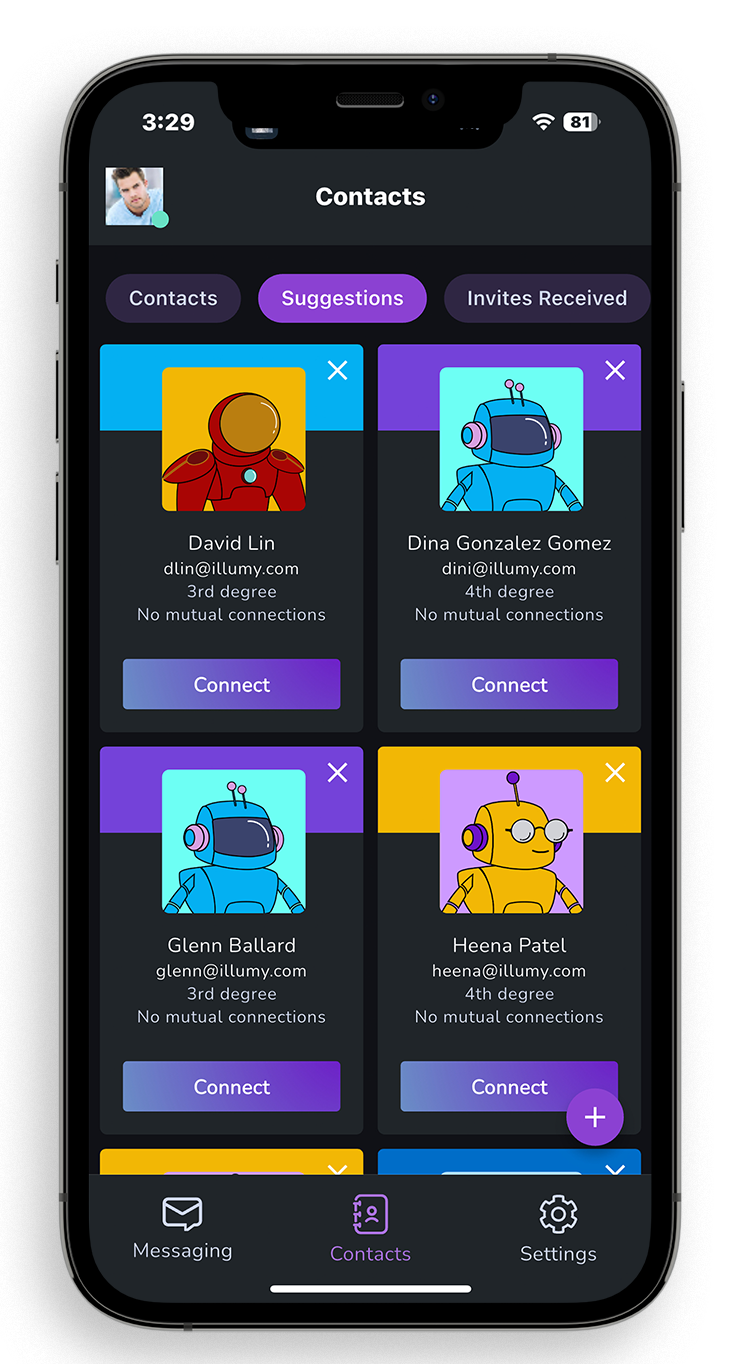
Solution
Design a responsive website that communicates value clearly and builds trust through simplicity, modern visuals, and strategic content hierarchy. By streamlining navigation and minimizing cognitive load, we support exploration and sign-ups for illumy’s unified inbox.
Key Takeaways
1. Empathy drives clarity: Above-the-fold must state “email + messaging + calling” together—fast.
2. Real-world interaction > assumptions: Analytics showed drop-offs when the unified story was hidden or split.
3. Content flow matters: Visual hierarchy that sequences inbox → benefits → apps → smart contacts supports comprehension and action.
Illumy Avatars
I designed a set of custom avatars for the Illumy platform to create a more personal and approachable user experience. The avatars were crafted to reflect diversity, clarity, and friendliness—helping users feel represented while navigating Illumy’s unified communication features. By integrating these avatars into the platform, we added a human-centered layer to the product that complemented the clean UI and supported stronger brand recognition.
- User: B2C, B2B
- August, 2022
- Graphic Designer (me)
- Visual Design: Figma, Adobe Creative Suite
- Duration
- 1 month
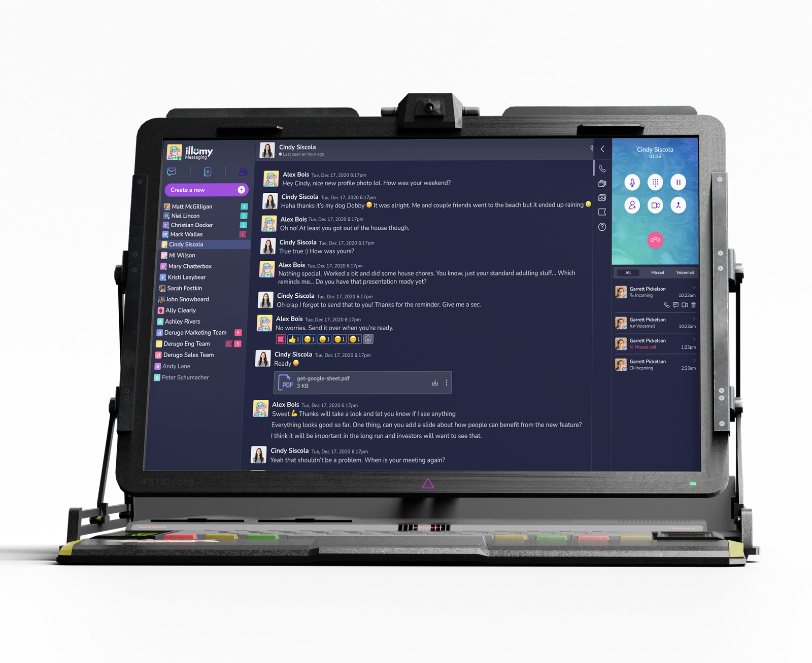
Illumy Call Screens
I designed the call screens for the Illumy platform to ensure a seamless, modern, and user-friendly experience. The layouts balanced clarity with functionality—highlighting participant details, call controls, and real-time status indicators without overwhelming the user. By focusing on simplicity, accessibility, and a clean visual hierarchy, the call screens reinforced Illumy’s mission to unify communication while maintaining trust and ease of use across voice and video interactions.
- User: B2C, B2B
- August, 2022
- Graphic Designer (me)
- Visual Design: Figma, Adobe Creative Suite
- Duration
- 1 month
Problem
1. How might we design call screens that feel seamless and intuitive, so users can focus on conversations instead of controls?
2. How might we reduce cognitive overload by simplifying the placement of call actions (mute, video, share, end) across both desktop and mobile?
3. How might we support different user roles—casual users, remote workers, and enterprise teams—who each have unique expectations for voice and video calls?
4. How might we balance a clean, modern interface with the technical depth needed for advanced features like screen sharing and multi-participant calls?
5. How might we build trust in the call experience by ensuring reliability, clarity, and a professional aesthetic that aligns with Illumy’s mission of unified communication?
Key Findings:
Similarities: Logos, testimonials, and “secure” messaging claims are everywhere—but often shallow.
Opportunities: Elevate the unified inbox narrative with clearer hierarchy: instant messaging, email, and calling in one view—plus mobile apps and “smart contacts.”
Learnings: Users want fewer tabs and less cognitive friction. Illumy’s “better together” story resonates when surfaced early and simply.
Differences: We emphasized trust signals, clarified the benefits of one inbox across devices, and showcased how “smart contacts” keep info current without hassle.
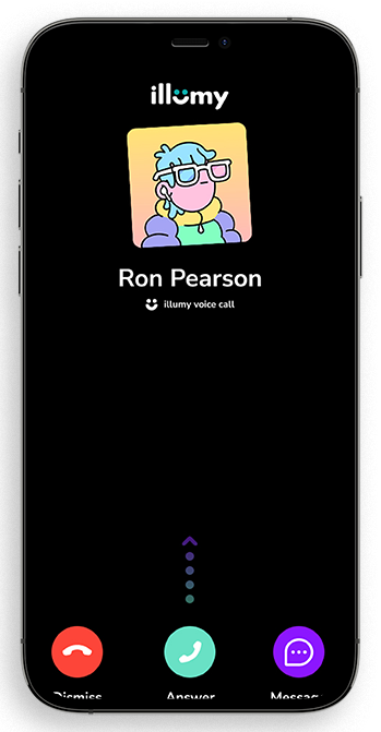
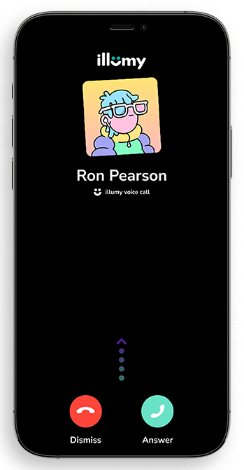
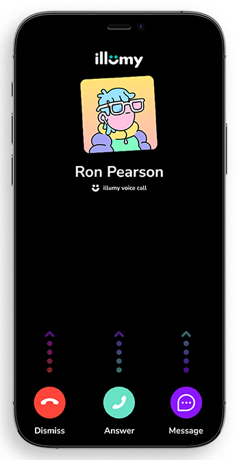
Final Outcome
The final call screen designs positioned Illumy as a modern, user-friendly communications platform. By simplifying controls, clarifying participant layouts, and optimizing for both desktop and mobile, the outcome delivered a seamless calling experience that built trust, reduced friction, and supported Illumy’s vision of unifying communication into one intuitive platform.
LinkedIn Social Graphics
To support Illumy’s launch, I created a series of LinkedIn graphics that introduced the platform’s vision of bringing email, messaging, and calling together in one place. The challenge was cutting through the noise of a crowded B2C/B2B social feed. By designing clean, vibrant visuals paired with concise messaging, the graphics highlighted Illumy’s differentiators—simplicity, privacy, and unified communication. Each asset was tailored to LinkedIn’s format to spark curiosity, encourage sign-ups, and build awareness among early adopters and professionals looking for a modern communications solution.
- User: B2C, B2B
- November, 2024
- Team: Garphic Designer (me)
- Tools
- Visual Design: Figma, Illustrator
- Duration
- 1 month
Hypothesis
If we design Illumy’s LinkedIn graphics with bold, simple headlines that highlight the unified inbox message—email, messaging, and calling together—paired with a single clear CTA, then present supporting content in scannable, visually engaging formats, we’ll capture attention in crowded feeds, increase sign-ups, and grow brand awareness within the first 60 days of launch.
Research
Competitive scans of leading communication platforms revealed a heavy reliance on bold visuals, motion, and clear CTAs to capture attention. Most competitors emphasized single features—like video calling or secure messaging—without showing how channels connect. For Illumy, this insight guided our approach: use animation and simplified flows to highlight the value of a unified inbox (email + messaging + calling), supported by a clear CTA to encourage faster sign-ups.