Logos and Icon Work
Visual DesignInizio Evoke
Healthcare Advertisement
UX Design Intern-2017
During my 7-week internship at Inizio Evoke, I focused on improving the user experience of their internal intranet platform.
Tasked with making information easier to find and more engaging for employees, I conducted informal usability feedback sessions and collaborated with the UX team to identify key pain points.
My primary contribution was designing low- to mid-fidelity wireframes that restructured the site’s navigation, simplified internal resources,
and highlighted frequently used tools. These wireframes laid the foundation for future iterations and helped align stakeholders on a more user-friendly direction for the platform.
Although my time was short, I gained hands-on experience in problem framing, rapid prototyping, and communicating design decisions—all within the unique context of a healthcare communications agency.
Lean vs. Traditional UX
Some core Lean objectives:
- Focus on detailed deliverables
- Focus on retrieving feedback
- Set of problem statements that can lead to assumption
- Assumption may not always be true but are a start to a solid foundation
- Create a hypothesis
Some core Traditional objectives:
- Mold the outcome for a better product with feedback received
- Research and design with limited time and money
Hypothesis
If we test our assumptions based on user feedback and insights from internal stakeholders, we can determine whether we're on the right path or need to pivot.
How Might We
1. How might we
redesign the Inizio Evoke intranet so employees can easily find what they need without feeling overwhelmed?
2. How might we
clarify the intranet’s purpose and structure so it aligns with daily use cases across departments?
3. How might we
design intuitive pathways based on user roles or tasks to improve access to core tools and resources?
4. How might we
surface the most important functionality—like announcements, documents, or forms—right when users log in?
5. How might we
identify and reduce the biggest friction points in product delivery for internal users navigating the platform?
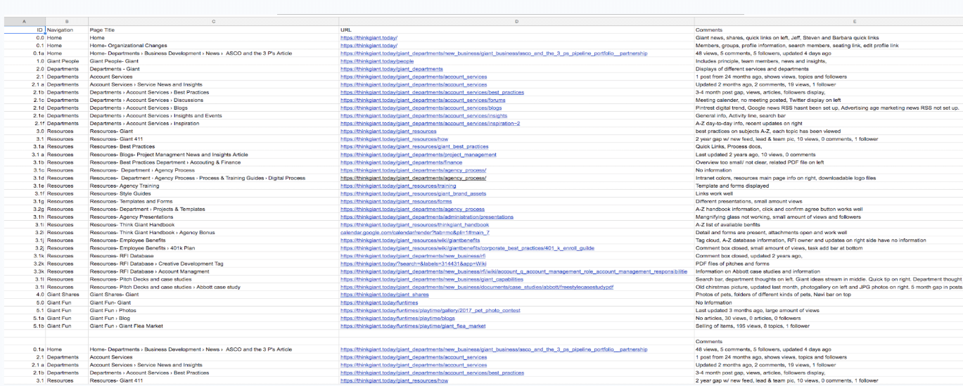
Content Audit
If we test our assumptions based on user feedback and insights from internal stakeholders, we can determine whether we're on the right path or need to pivot.
A key step in this process is conducting a comprehensive content audit—listing all site content in a centralized spreadsheet that includes navigation titles, page names, URLs, comments, and content hierarchy.
This audit helps uncover hidden pages, duplicates, and gaps in information, while offering a full or partial content inventory to understand how the intranet is being used.
By visualizing relationships between content and functionality, we can spot inefficiencies and prioritize improvements in structure and accessibility.
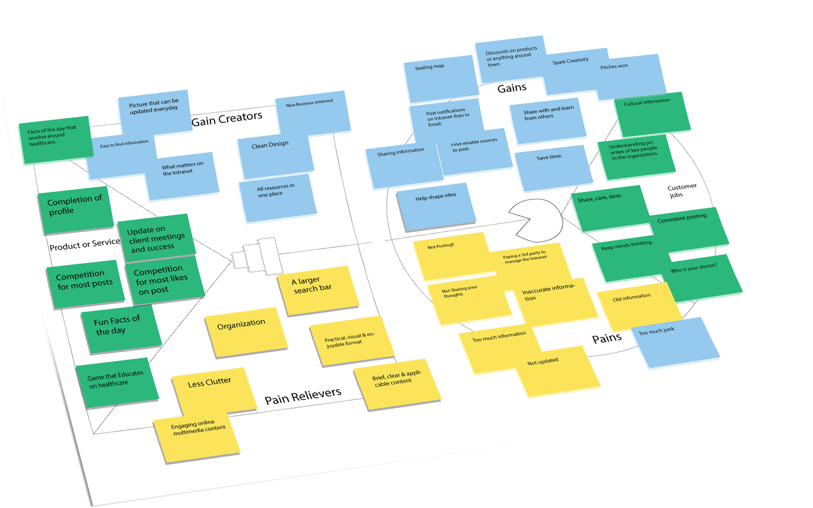
Value Proposition
If we test our assumptions based on user feedback and insights from internal stakeholders, we can determine whether we're on the right path or need to pivot.
A key step in this process is conducting a comprehensive content audit—listing all site content in a centralized spreadsheet that includes navigation titles, page names, URLs, comments, and content hierarchy.
This audit helps uncover hidden pages, duplicates, and gaps in information, while offering a full or partial content inventory to understand how the intranet is being used.
By visualizing relationships between content and functionality, we can spot inefficiencies and prioritize improvements in structure and accessibility.
From a value proposition standpoint, we observed that employees had key “jobs to be done,” like finding HR resources, team updates, and tools quickly—yet experienced negative emotions like confusion or frustration (pains) due to poor structure.
The redesigned intranet aimed to relieve these pains by simplifying navigation and introducing clarity (pain relievers), while adding features like quick links and personalized content (gain creators) to deliver positive utility and improved satisfaction.
UX Interviews
If we test our assumptions based on user feedback and insights from internal stakeholders, we can determine whether we're on the right path or need to pivot.
A key step in this process is conducting a comprehensive content audit—listing all site content in a centralized spreadsheet that includes navigation titles, page names, URLs, comments, and content hierarchy.
This audit helps uncover hidden pages, duplicates, and gaps in information, while offering a full or partial content inventory to understand how the intranet is being used.
By visualizing relationships between content and functionality, we can spot inefficiencies and prioritize improvements in structure and accessibility.
In early interviews with employees, we asked, “In your opinion, what purpose do intranets serve?” The responses helped validate user needs:
“To find information that can be used to help with any problems,” “a source of learning and communication for new and current employees,” and “a way to stay informed on business activities and upcoming events.”
From a value proposition standpoint, we observed that employees had key “jobs to be done,” like finding HR resources, team updates, and tools quickly—yet experienced negative emotions like confusion or frustration (pains) due to poor structure.
The redesigned intranet aimed to relieve these pains by simplifying navigation and introducing clarity (pain relievers), while adding features like quick links and personalized content (gain creators) to deliver positive utility and improved satisfaction.
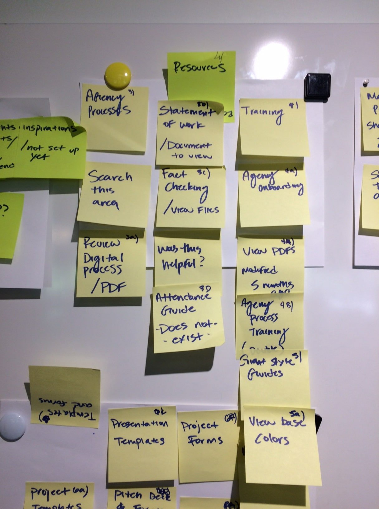
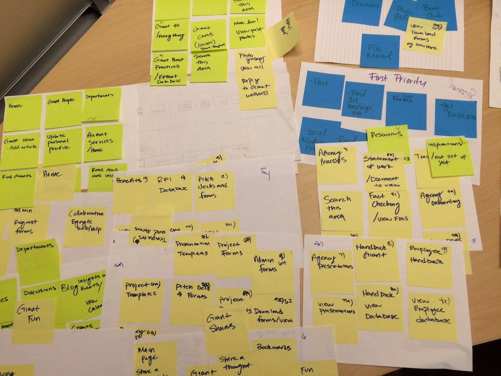
Affinity Mapping
Affinity mapping helped translate scattered feedback into a structured understanding of employee needs. We clustered dozens of sticky notes from interview sessions into recurring themes
such as Agency Processes, Training, Project Forms, Templates, Employee Resources, and Onboarding.
Notes like “Statement of Work,” “Pitch Deck Templates,” “View PDFs,” and “Update Profile” revealed the exact types of content users were seeking out—and showed us how
inconsistent labeling and layout made these hard to find. Many items like “Attendance Guide – does not exist” surfaced unmet content needs.
This process gave us a clear path forward: reorganize navigation around employee mental models, consolidate related assets (e.g., Guides, Forms, Templates),
and fill known gaps. These insights directly influenced our next steps—creating wireframes that simplified access to top-used tools and clarified content categories across the platform.
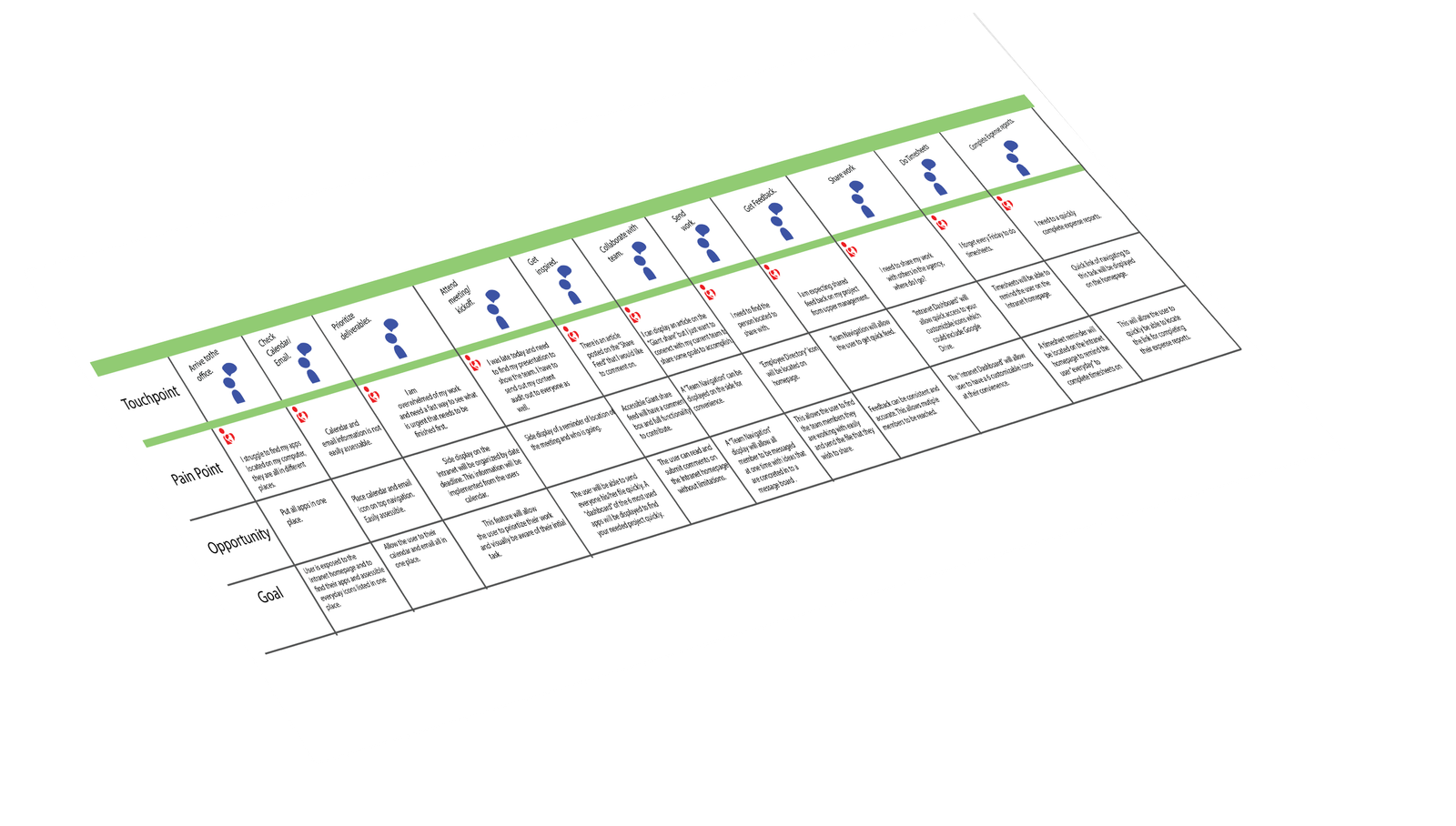
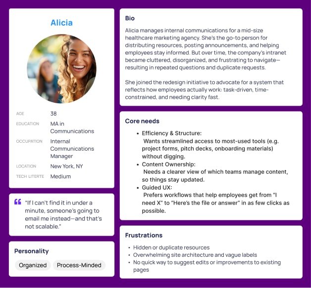
Persona
Affinity mapping helped translate scattered feedback into a structured understanding of employee needs. We clustered dozens of sticky notes from interview sessions into recurring themes
such as Agency Processes, Training, Project Forms, Templates, Employee Resources, and Onboarding.
Insights from personas like Alicia—an Internal Communications Manager juggling information requests—highlighted the urgency of reorganizing the intranet. She needed fast access to tools like pitch decks, attendance guides, and onboarding templates to reduce repetitive emails and scale internal communication.
Notes like “Statement of Work,” “View base colors,” and “Collaboration Engine” revealed how siloed content and inconsistent labels slowed down everyday tasks. Missing items like “Attendance Guide – does not exist” underscored gaps in the system.
This process gave us a clear path forward: simplify navigation based on how people like Alicia work, group similar content (e.g., forms, guides, presentations), and highlight top-used resources visually. These decisions directly shaped our wireframes and content strategy moving into the next phase.
New Hypothesis
If we restructure the intranet to reflect how employees actually work—by simplifying navigation, consolidating related resources, and surfacing high-use content—then employees like Alicia will spend less time searching and more time completing tasks. Based on user feedback and internal stakeholder insights, we expect this redesign to reduce duplicate requests, improve resource discoverability, and increase overall engagement with the platform.
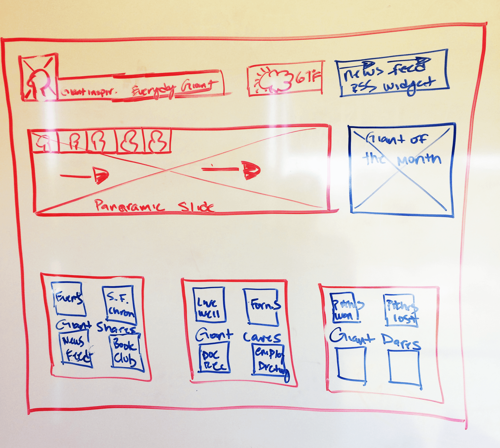
Layout Diagram
This early layout sketch was instrumental in bridging user feedback with structural design. Drawn after conducting interviews and affinity mapping, it visualized a modular homepage layout that prioritized real-time updates, quick access to tools, and personalized content blocks.
Elements like the panoramic slideshow, “Giant of the Month” spotlight, and quick-link boxes for events, forms, employee directories, and wellness resources were all directly inspired by user-stated needs for clarity, visibility, and community engagement. The sketch helped stakeholders align on content hierarchy and gave the design team a tangible starting point to move into wireframing.
Ultimately, this layout informed our decision to split the wireframe into a "Dashboard" and "Feed" view—ensuring that high-priority tools were always within reach while still creating space for culture-building content. It was a critical pivot point from raw research into scalable, employee-centered UI.
Wireframes
If we restructure the intranet based on employee goals and behaviors—providing quick access to essential tools, highlighting timely announcements,
and offering personalized dashboards—then users will navigate with more confidence and efficiency.
The new wireframes reflect a shift from scattered content to a modular, task-oriented layout. Features like “Quick Links,” customizable dashboards,
and a split “Dashboard / Feed” view were directly influenced by affinity mapping and interviews. We also introduced persistent access to posts, forms, and directories,
which were the most-requested areas in user feedback.
By streamlining content access and placing high-value tasks front and center, we anticipate a reduction in email requests for basic resources,
increased usage of the platform’s self-service tools, and improved satisfaction among employees managing daily workflows.
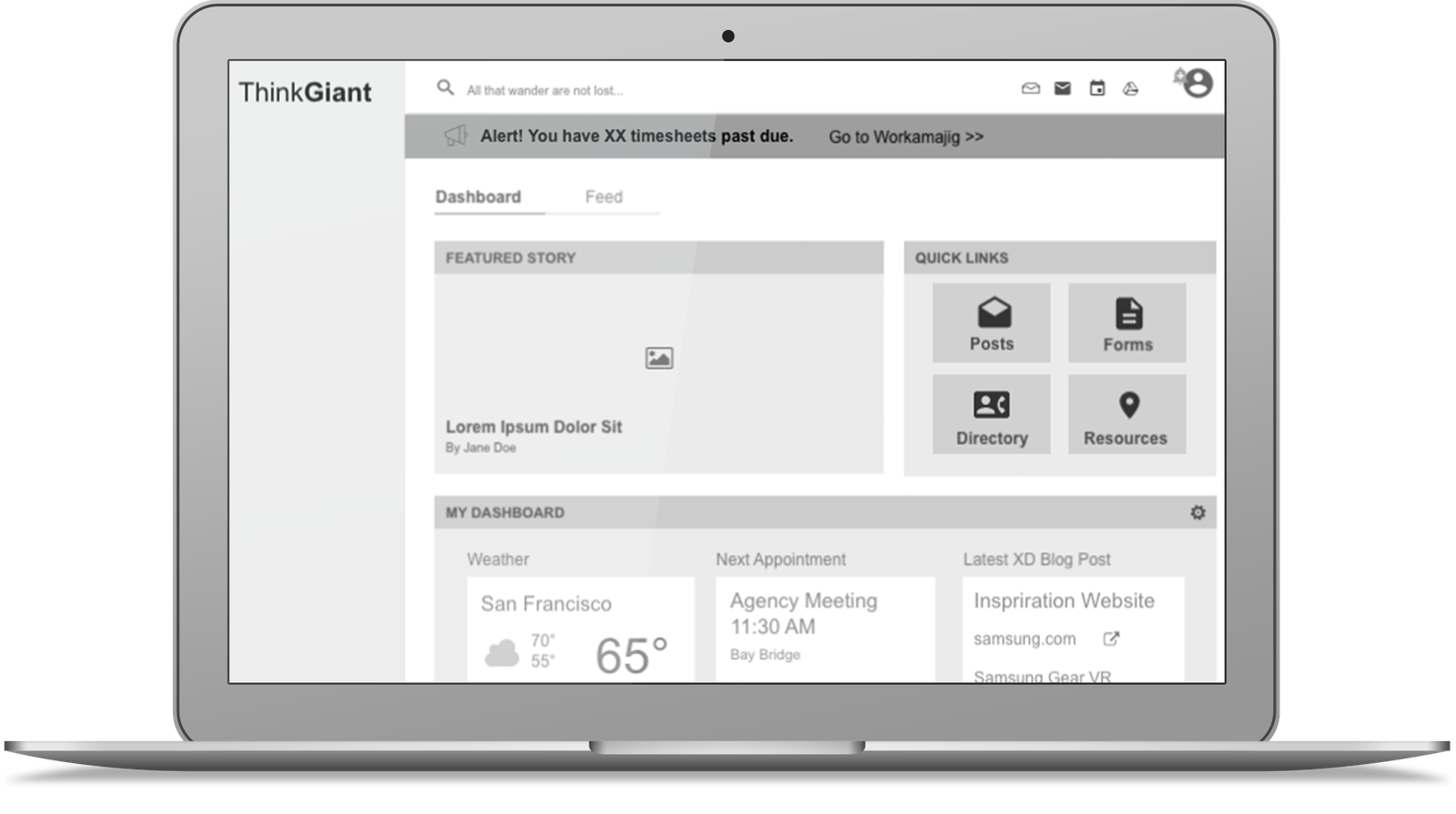
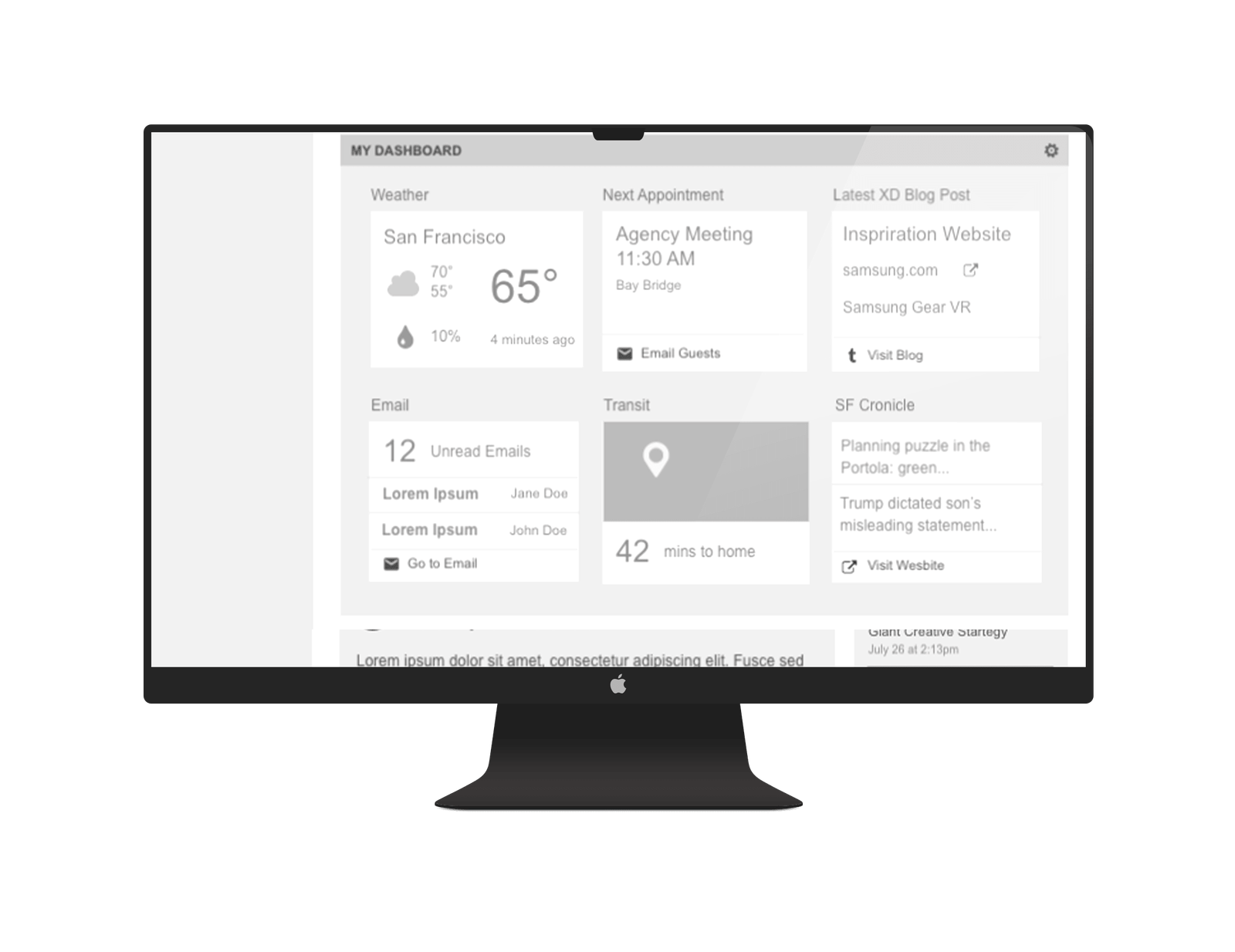
Key Insights
User interviews and affinity mapping revealed that employees were often frustrated by outdated content, unclear navigation, and duplicate resources across the intranet. They wanted faster access to everyday tools—like forms, onboarding materials, training docs, and project templates—without relying on search or emailing colleagues.
To address this, we designed wireframes that prioritized user tasks over organizational structure. We created a modular layout with clearly labeled sections, including quick links for instant access to top-used items like forms, posts, and resources, personalized dashboards that surface meetings, weather, unread emails, and blog updates, and a split view for Dashboard and Feed to separate internal tools from community updates.
We also ensured persistent navigation access to core areas such as the directory and announcements, and removed visual clutter that previously overwhelmed new hires and internal communicators.
These improvements align the intranet with how people actually work: fast, focused, and frequently multitasking. As a result, we expect fewer support tickets, faster employee onboarding, and stronger engagement with shared resources across departments.