Graphic Design Marketing Intern
Livermore Amador Valley Transit AuthorityBus Wrap and Logo
As the sole marketing intern at Wheels Bus, I stepped in to lead the marketing department during a transitional period—after the entire marketing staff had moved on from the company. Tasked with keeping key projects alive, I redesigned the Wheels logo and created a refreshed bus wrap that maintained brand consistency while introducing a cleaner, more modern visual system. I ensured the new design honored the original color palette and community recognition, while applying a professional polish that could scale across signage and digital materials. This work helped the organization maintain public visibility and brand integrity until they could hire a full-time replacement.
Logo Redesign
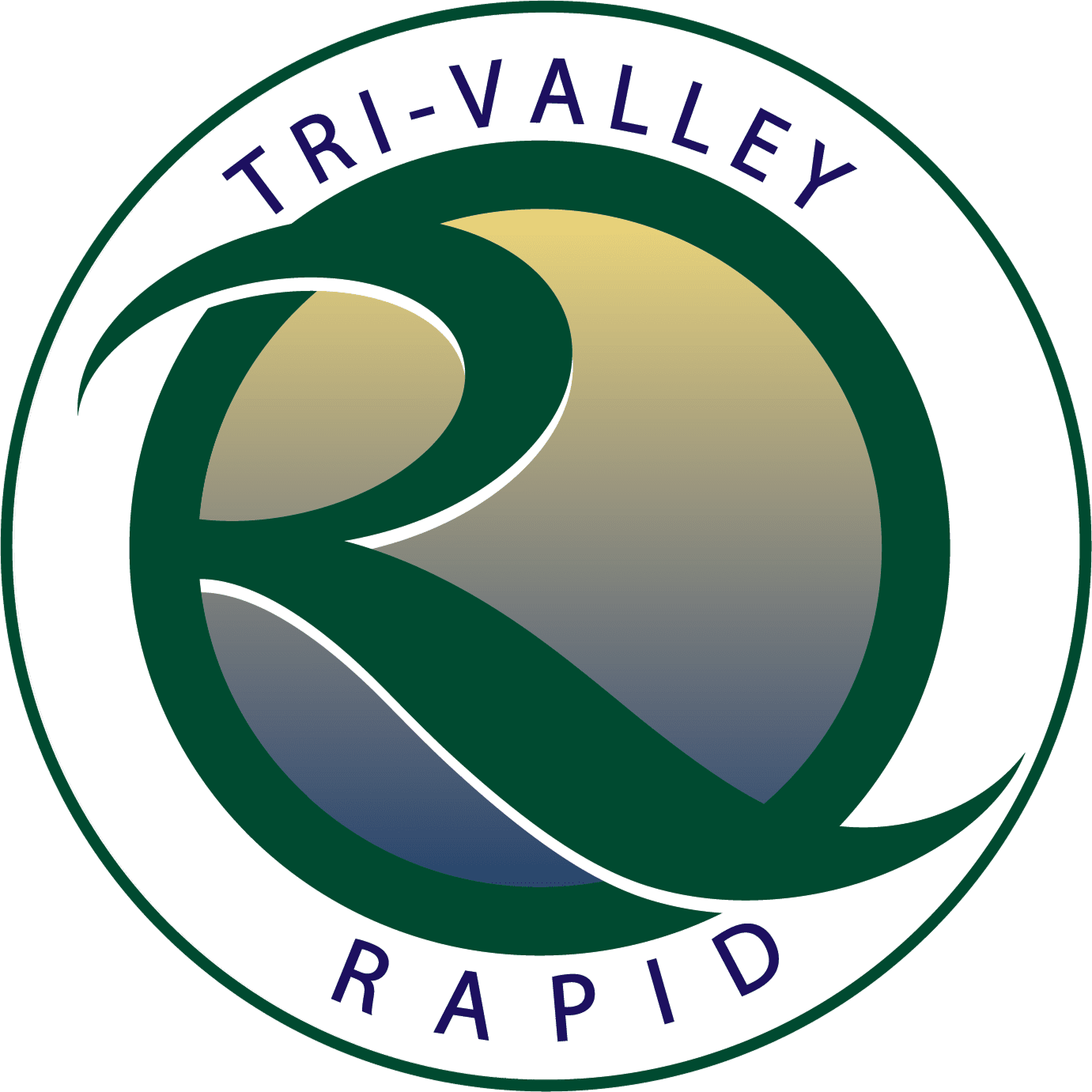
The goal was to refresh the existing identity while subtly aligning it with the aesthetic of the Tri-Valley Rapid “R” logo. This meant preserving the legacy and recognition of the original red “Wheels” mark while integrating a cleaner, more fluid design inspired by the Rapid system's swooping curves.
I recreated the logo entirely in Adobe Illustrator, using vector-based techniques to ensure scalability and precision. I carefully modeled the “W” to echo the stylistic energy of the green “R”—introducing motion and harmony across both brands. The final version maintained the signature red and blue color palette, but with smoother edges, a more modern shape, and visual compatibility with regional transit design.
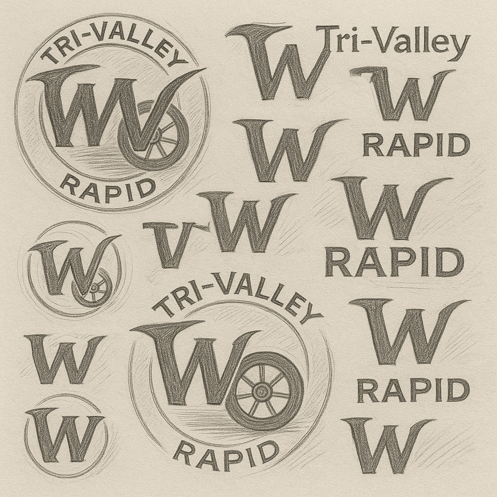
Sketches
To bring visual cohesion to the Wheels brand while aligning it with the Tri-Valley Rapid identity, I began by sketching different variations of a new “W” mark.
My goal was to capture the energy and curvature of the Rapid system’s “R” while preserving the legacy of the original Wheels design.
These quick sketches explored how the sweeping motion of the “R” could translate into a more fluid, motion-driven “W.” By analyzing how the “R” curves cut across and loop back into itself,
I drafted matching angles and flowing lines that felt visually related but unique.
Once a direction was clear, I recreated the “W” in Adobe Illustrator using the Pen Tool and Bézier curves, maintaining the Wheels red and integrating subtle geometry that echoed the Rapid brand.
The result was a refreshed, scalable vector mark that brought continuity to the transit system's overall identity while standing confidently on its own.
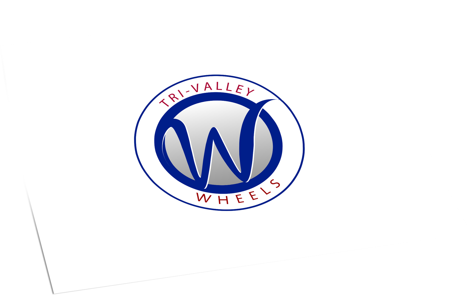
Final Results
After multiple feedback iterations and refinement sessions, I finalized the redesigned “W” into the new Tri-Valley Wheels logo that is still in use today. I worked directly with the Director of Transportation to ensure the logo balanced brand recognition with regional cohesion and modern design sensibilities.
The final mark maintained the original red and blue color scheme, while integrating a refined “W” that mirrored the swooping elegance of the Rapid system’s “R.” We paid close attention to symmetry, stroke weight, and spatial balance so that the logo could scale seamlessly across vehicle wraps, signage, and print materials.
Collaborating closely with executive leadership and presenting each design phase helped ensure alignment across departments. The outcome was a modernized identity that honored the legacy of the Wheels brand while bringing it into visual harmony with the broader Tri-Valley transit network.
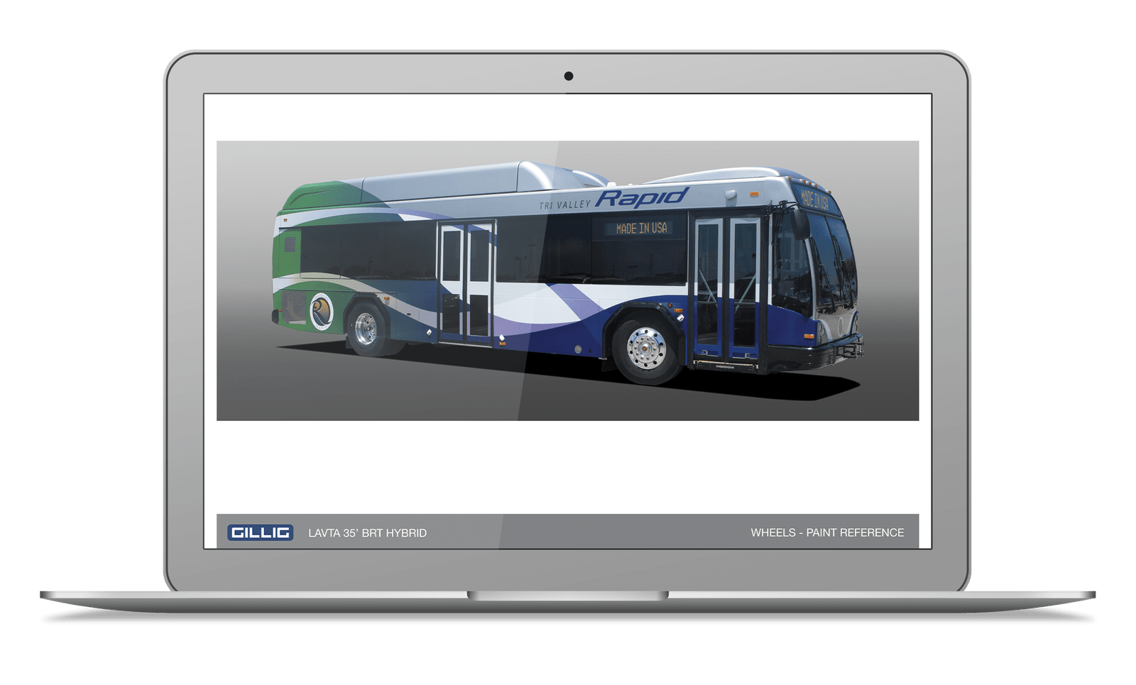
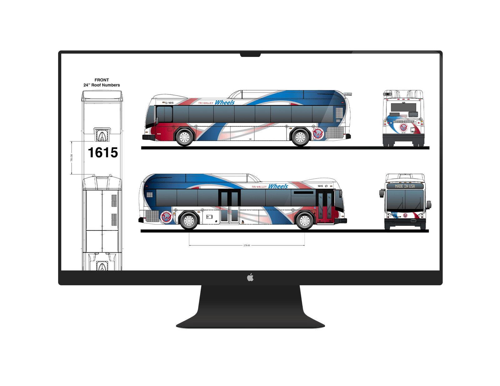
Bus Wrap Design
To ensure the wrap fit the physical dimensions and mechanical constraints of the vehicle, I used GILLIG’s official bus design templates—shown here—to draft and align the wrap artwork with precision. I translated curved motion elements from the Rapid bus design into the Wheels layout, replacing angular cuts and heavy shadows with sweeping arcs and balanced gradients.
The color palette—featuring deep blue, red, and silver—was selected based on public survey results that gauged community preference for boldness, professionalism, and visibility. This not only created aesthetic harmony but also boosted brand recall for commuters across the Tri-Valley area.
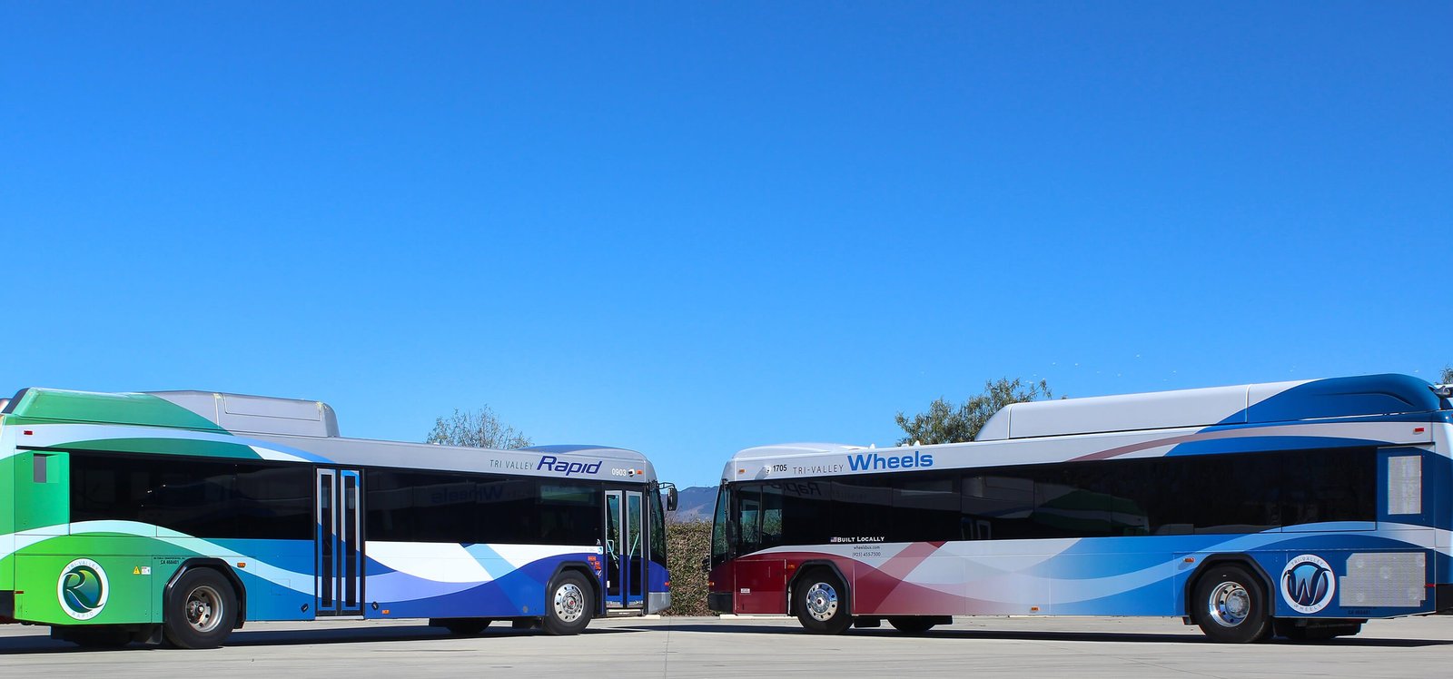
The final result is a design that feels sleek and modern on its own while visually pairing well with the green Rapid buses—positioning the Wheels fleet as a proud and integrated part of the regional transit network.
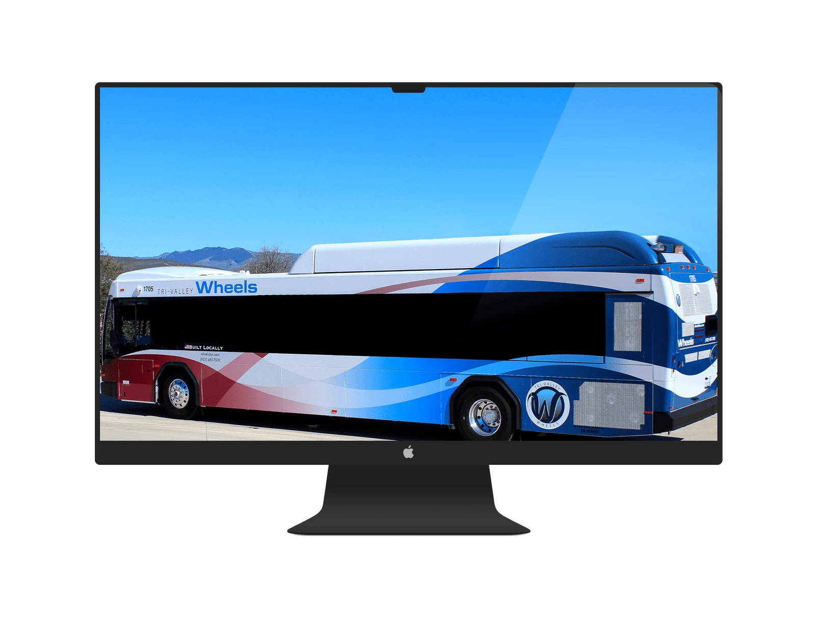
Final Designs
After reviewing the results of an anonymous community survey, I was able to select a color palette that reflected public preferences for visibility and modern appeal. From those insights, I matched the final logo design to the selected scheme—featuring deep blue, red, and silver—to create a cohesive and memorable identity.
The final result is a design that feels sleek and modern on its own while visually pairing well with the green Rapid buses—positioning the Wheels fleet as a proud and integrated part of the regional transit network.
Accomplishment
I’m incredibly proud of this project. I can confidently say that I designed the bus for LAVTA, and now every time we drive by one, my son knows that I created the logo and the wrap design. It’s a moment of pride I’ll carry with me for years.