Graphic Designer
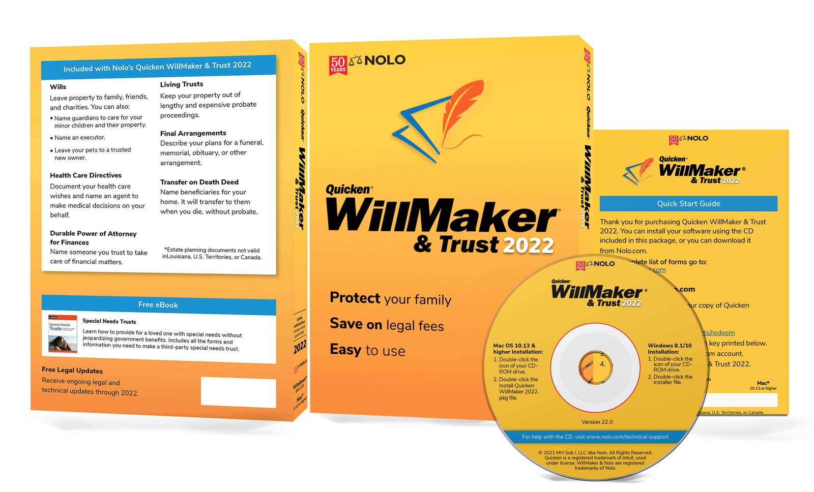
Rebranded Quicken WillMaker with a modular UI kit, ensuring consistent experiences across channels and products.Box, CD, Logo Redesign and Marketing Graphics
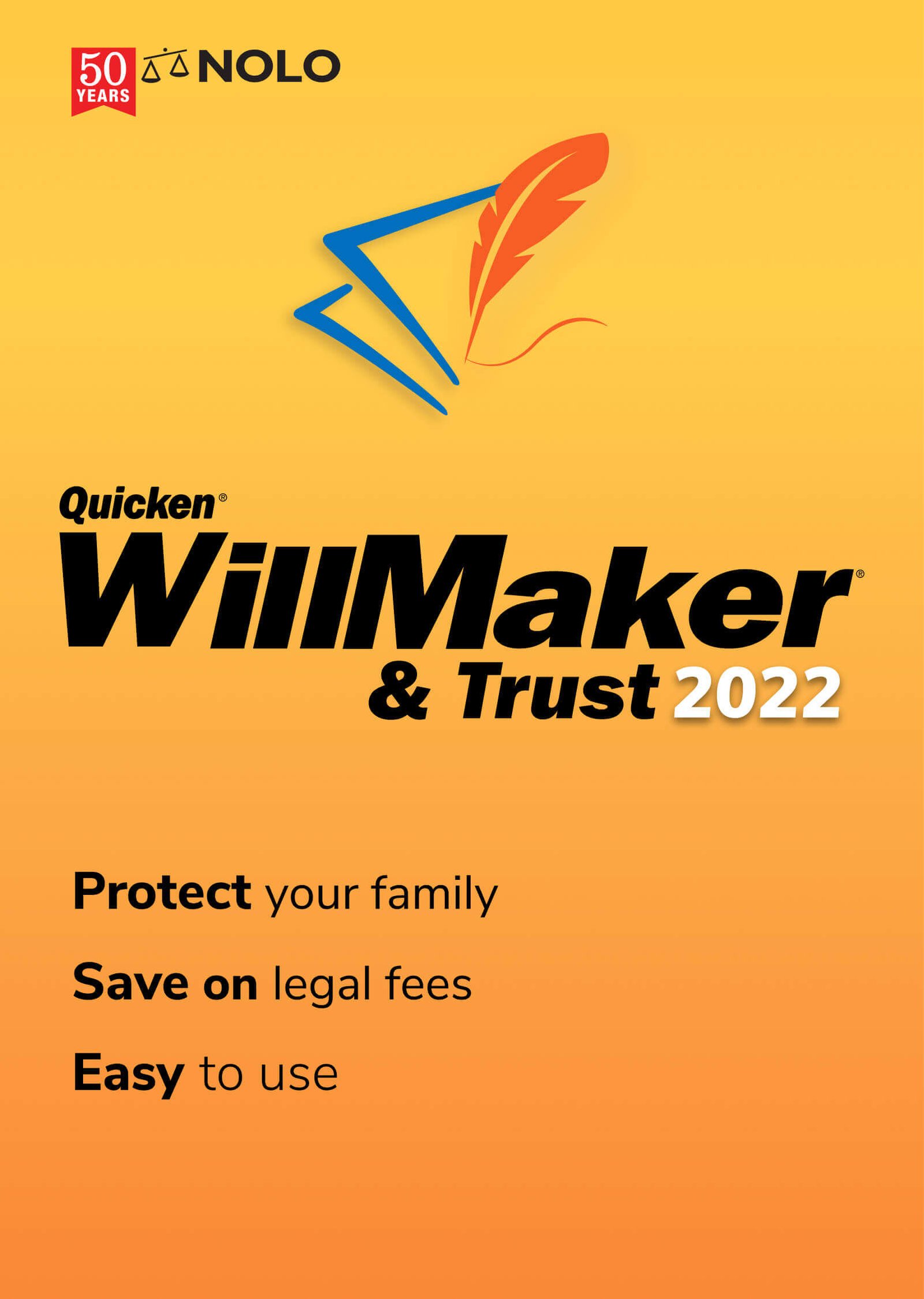
Quicken WillMaker & Living Trust 2021 is the easiest way to create your estate plan, whether you're just getting started or you want to update your previous arrangements. This powerful software guides you through the process from beginning to end, giving you the practical and legal information you need to make the best decisions for you and your family.
- User: Estate planners
- March, 2021
- Team: Product Manager, Developer, Marketing Team, UI/UX Designer(me)
- Tools
- Visual Design: Adobe Illustrator, Photoshop and Figma
- Duration
- 6 months


How Might We
1. How might we
have the user feel a sense of ease with our product?
2. How might we
provide a visual that shows security?
3. How might we
influence the user that our product is reliable?
4. How might we
solve for basic concerns, such as leaving a home, investments, a small business, and personal items to your loved ones.?
Hypothesis
If we design the experience with a clean visual hierarchy, subtle motion, and human-centered storytelling, then users will feel more engaged, trust the product’s professionalism, and be more likely to explore the content deeply—resulting in higher retention and interaction.
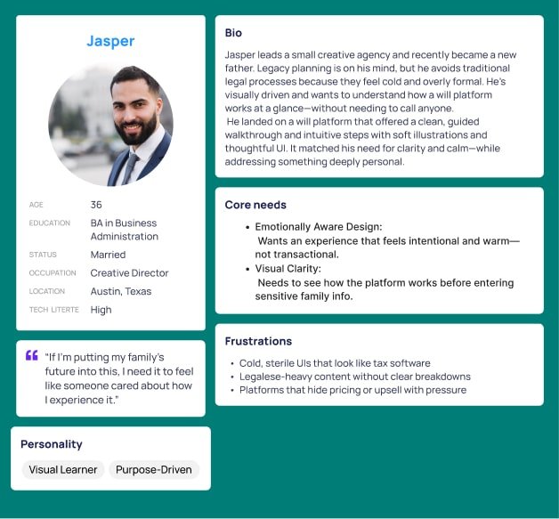
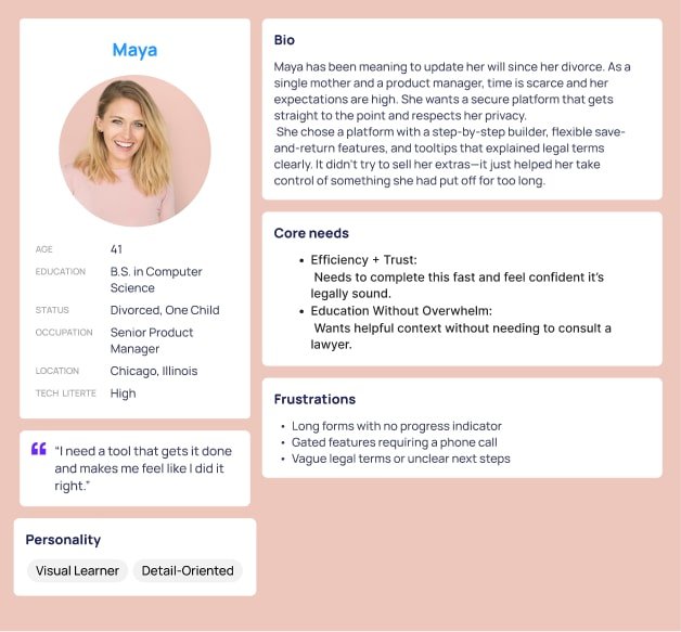
Persona
Using session recordings, heatmaps, and completion funnel data, we identified two key drop-off points: users were abandoning the will creation flow at the legal
jargon stage and again when asked to schedule a call. To better understand the "why," we conducted moderated interviews on UserTesting.com with individuals actively exploring estate planning tools.
Through this, we uncovered two core persona groups: one emotionally motivated by legacy
and design clarity (Jasper), and one efficiency-driven and detail-focused (Maya). These insights guided our redesign approach—using clean layouts,
light animation, and human-centered language to match their expectations and increase trust, clarity, and follow-through.
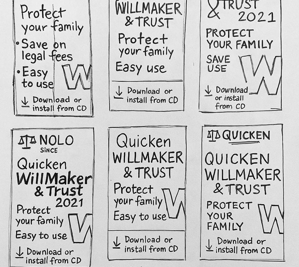
Sketches
We started out with a few quick sketches to see where the general direction will go with the design. We wanted to show a light feel and professionalism to the product when the user looks at it.
Final Result
We began with rough, exploratory sketches to quickly visualize layout ideas, typography treatments, and icon concepts. This allowed us to test multiple directions without getting too attached to any one idea early on.
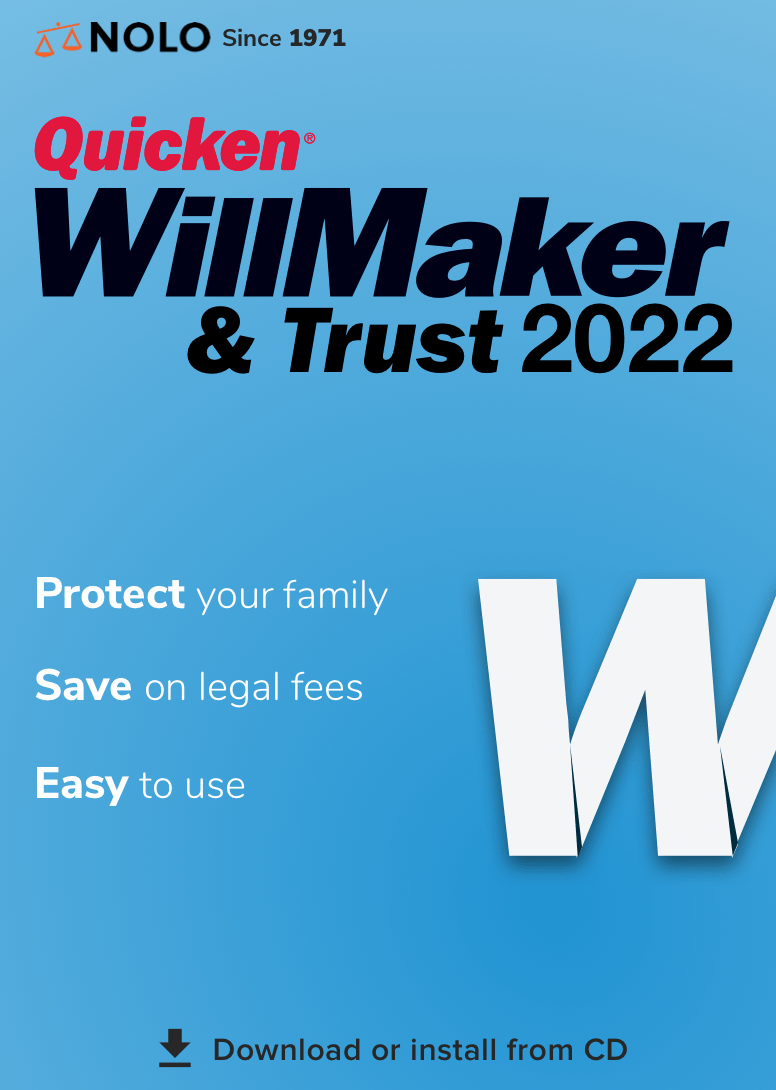
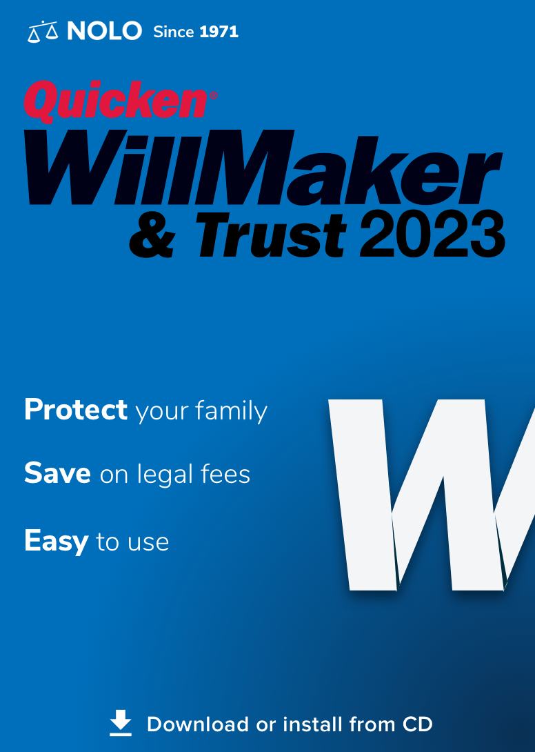
Once we identified the strongest visual themes, we moved into Adobe Illustrator to refine the designs. There, we built vector versions of our sketches, experimented with color palettes, font pairings, and spatial balance to maintain clarity while evoking trust and professionalism.
The final designs combine clean typography, warm gradients, and a modern layout that feels approachable and reliable—reflecting the tone users expect from Quicken WillMaker.
Designer Feedback
After creating multiple design iterations based on our initial sketches, I presented the concepts to fellow designers and our project manager. While the structure was clear, the feedback pointed out that the design felt too similar to Microsoft Office branding—especially with the use of gradients and typography.
This helped push the direction further toward something more unique, with a stronger visual identity that felt both trustworthy and emotionally approachable. We began refining the color palette, iconography, and layout to better reflect the brand’s value: clear, calm, and credible.
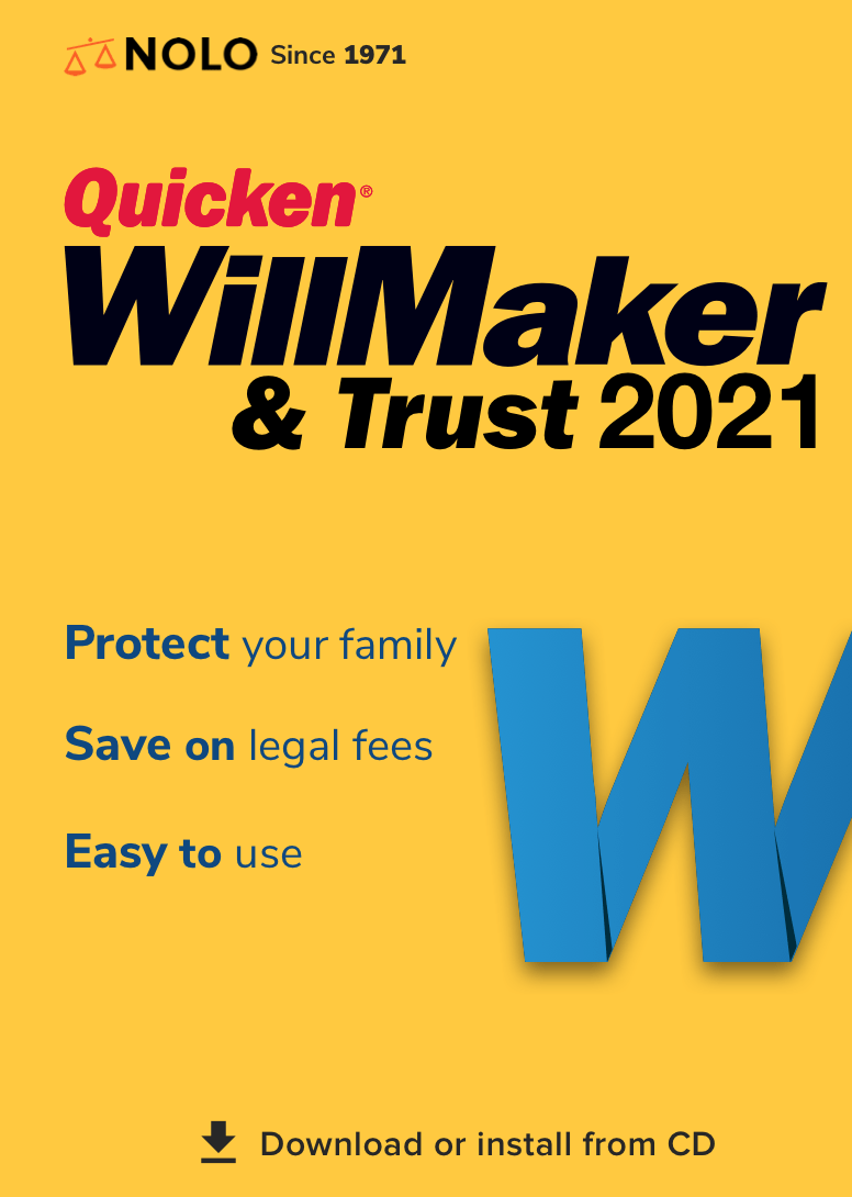
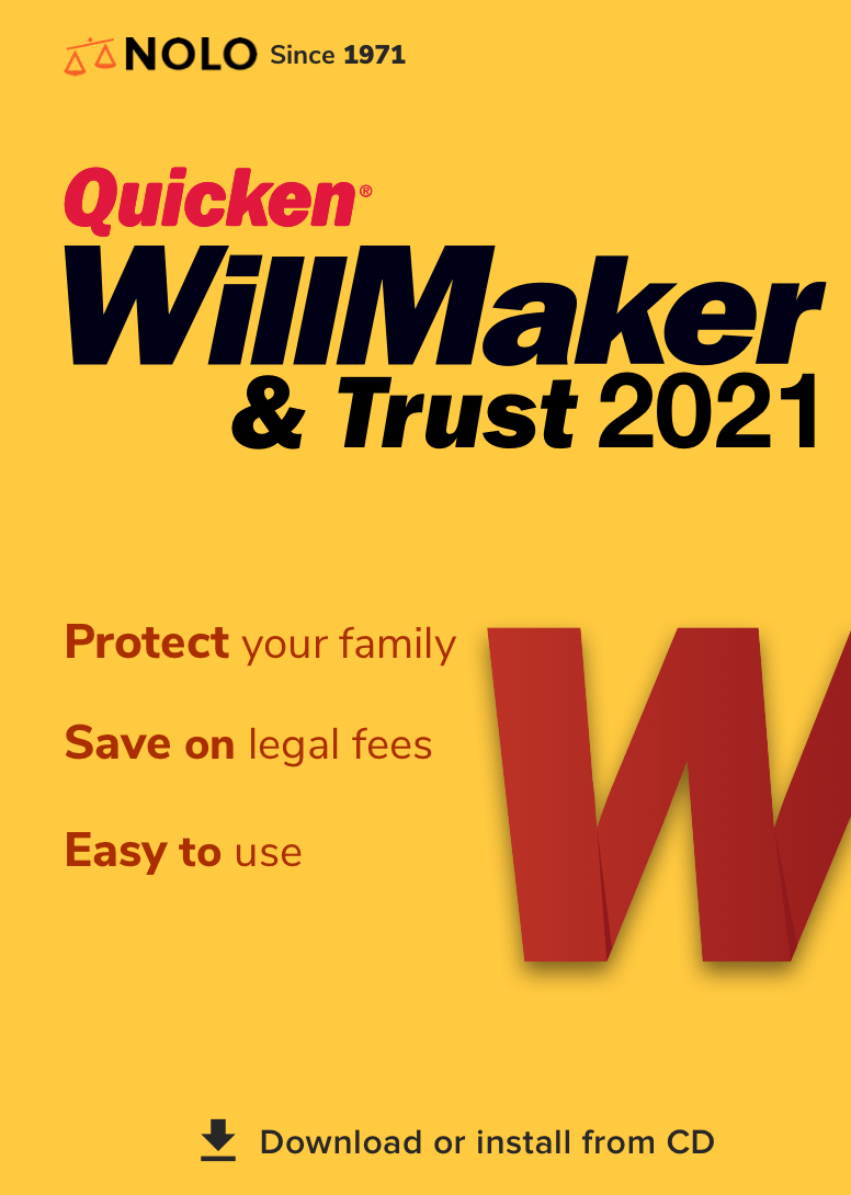
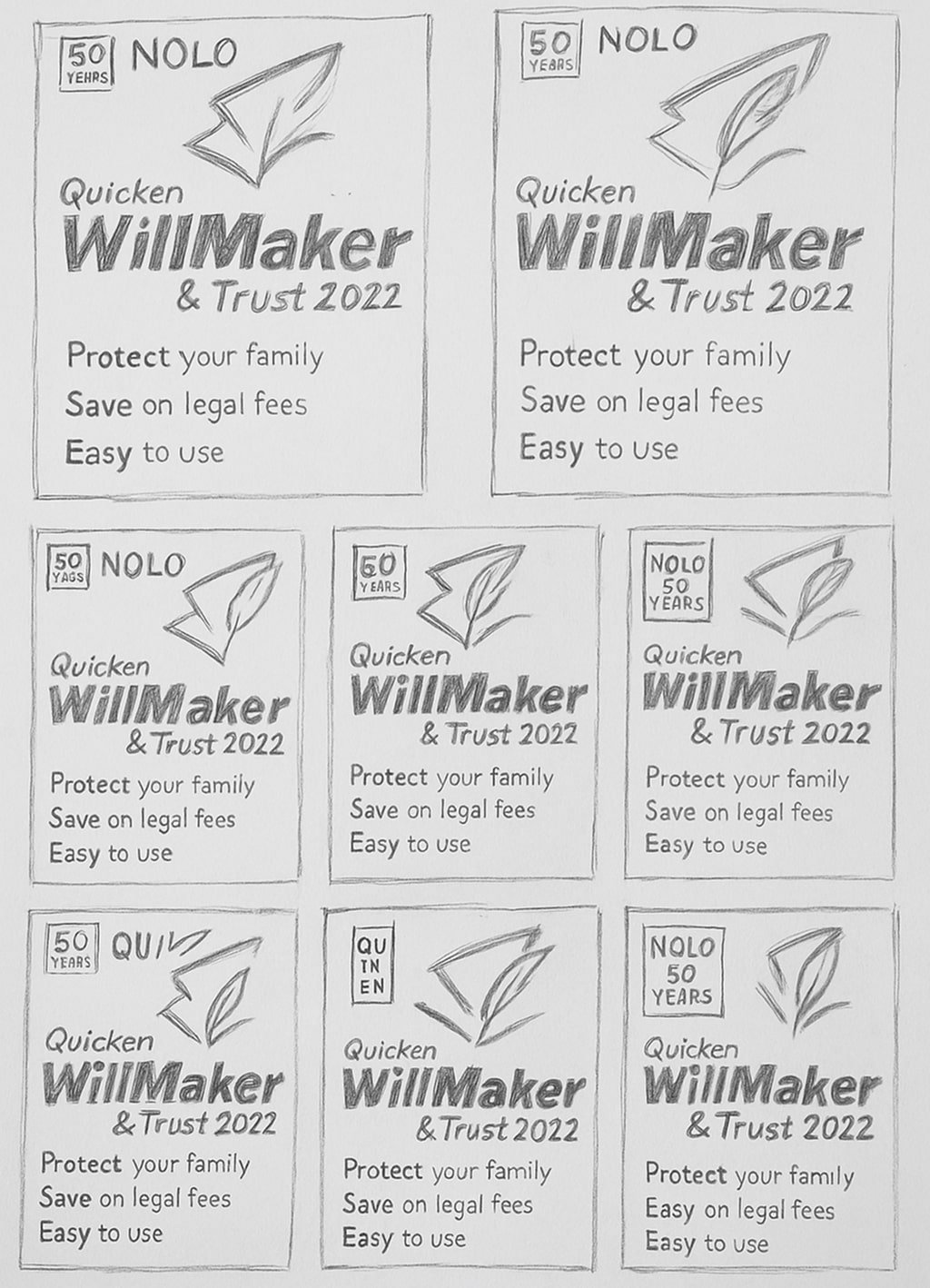
Round 2 Sketches
After presenting the initial concepts, we received feedback from stakeholders requesting a fresh visual approach—including a potential new logo. To explore this direction, I went back to the sketchbook and created another round of quick, messy explorations focused on alternate box layouts and branding elements.
This second round of sketches allowed us to rethink the product’s personality—shifting away from traditional visuals and leaning into something more modern, friendly, and distinct from competitors. The goal was to balance professionalism with warmth while aligning with updated brand goals.
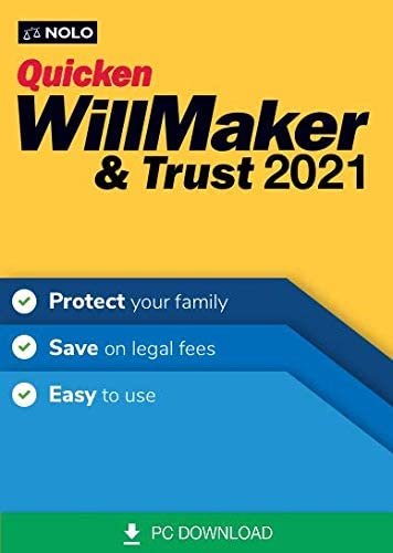
Before
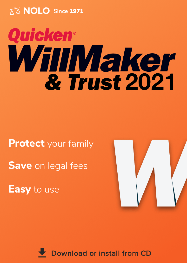
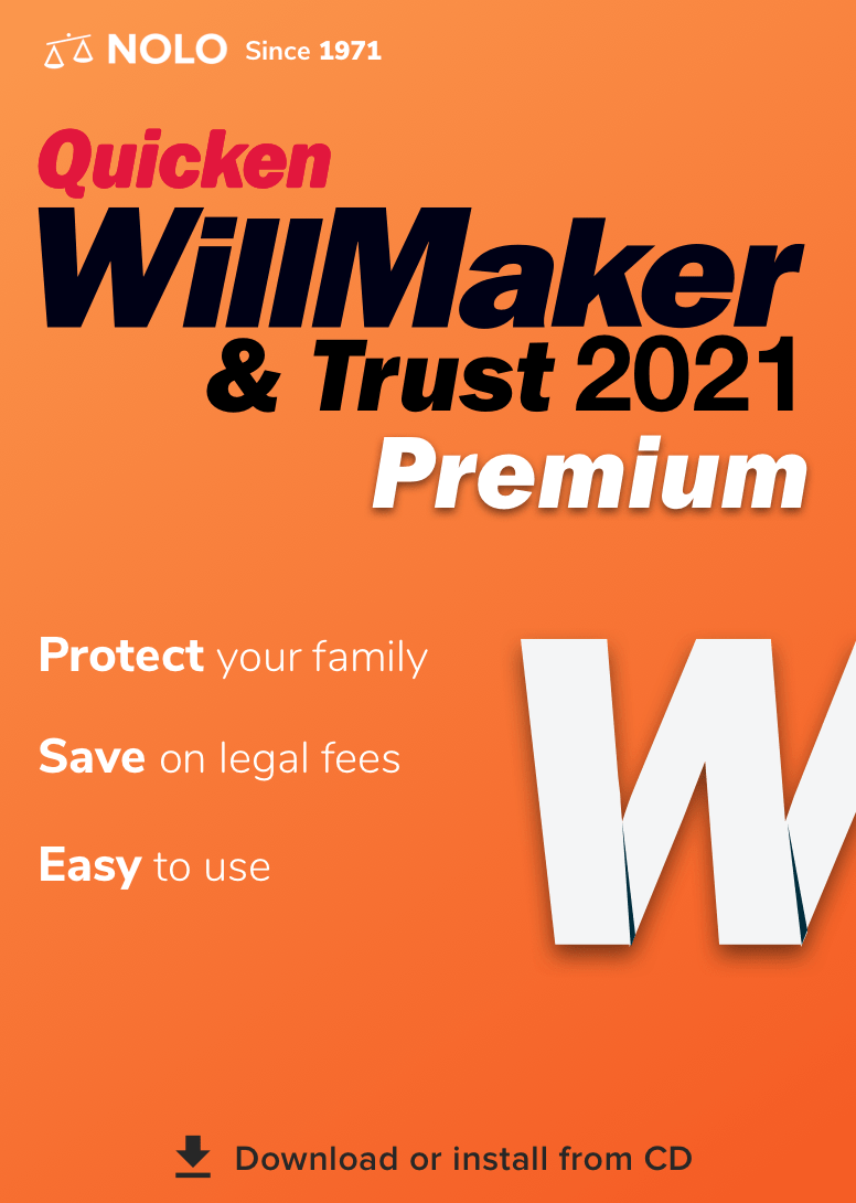
Solution
Our design direction was driven by user research and testing insights that showed trust, simplicity, and clarity were key to purchase decisions—especially for older, non-digital-native audiences.
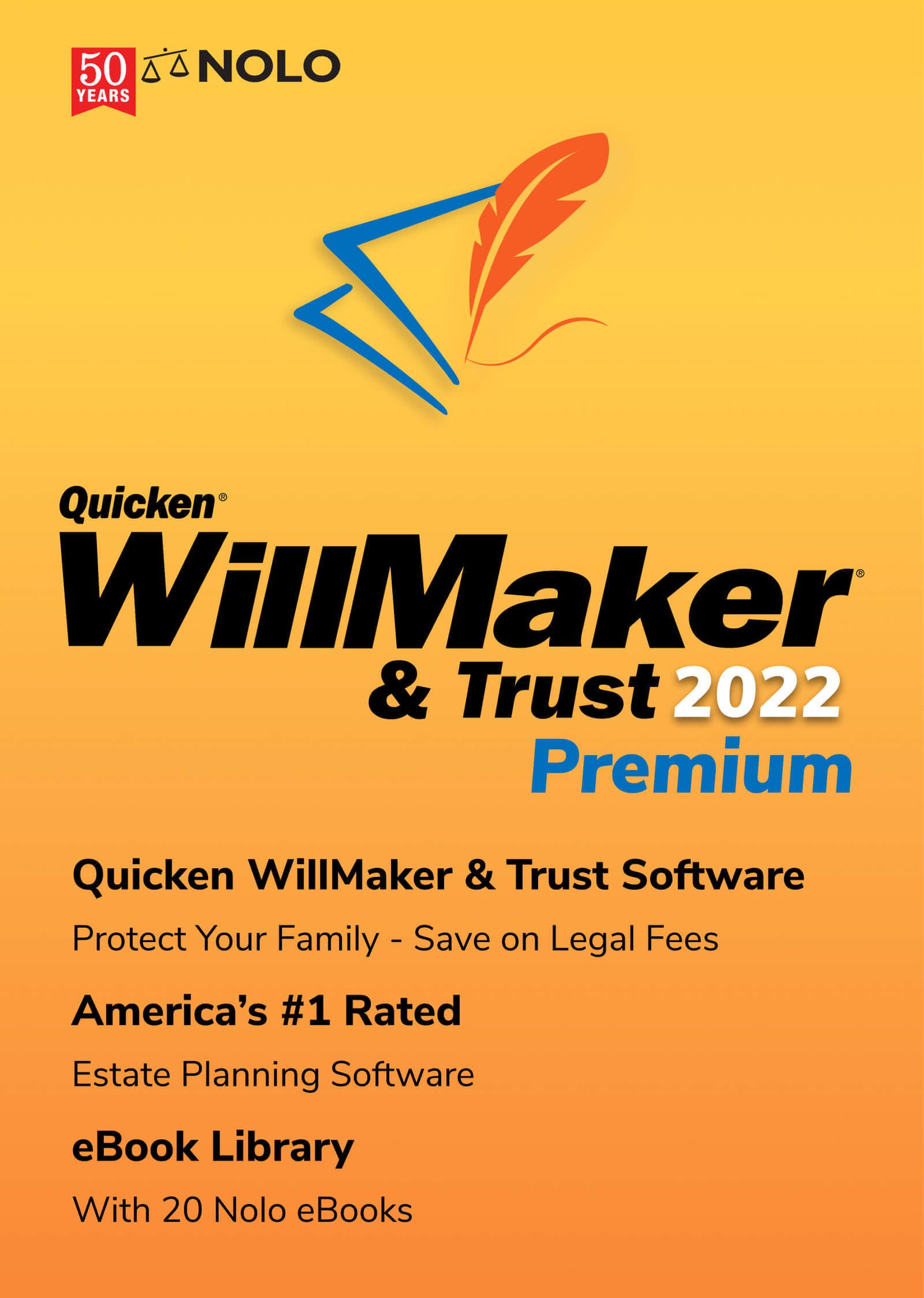
The packaging was updated to highlight core emotional value props like “Protect your family” and “Easy to use” up front, supported by high-contrast typography and structured layout. The CD icon remained critical for in-store visibility and audience familiarity, while a refreshed feather logo and warmer gradient made the box feel more modern and secure.
The Premium edition emphasized added value through visual hierarchy and product tiers—guiding retail buyers quickly to the best-fit option.
As a result, the redesigned UI, packaging, and brand messaging contributed to a 33% increase in product sales over a three-year period.